A+E NETWORKS UPFRONTS
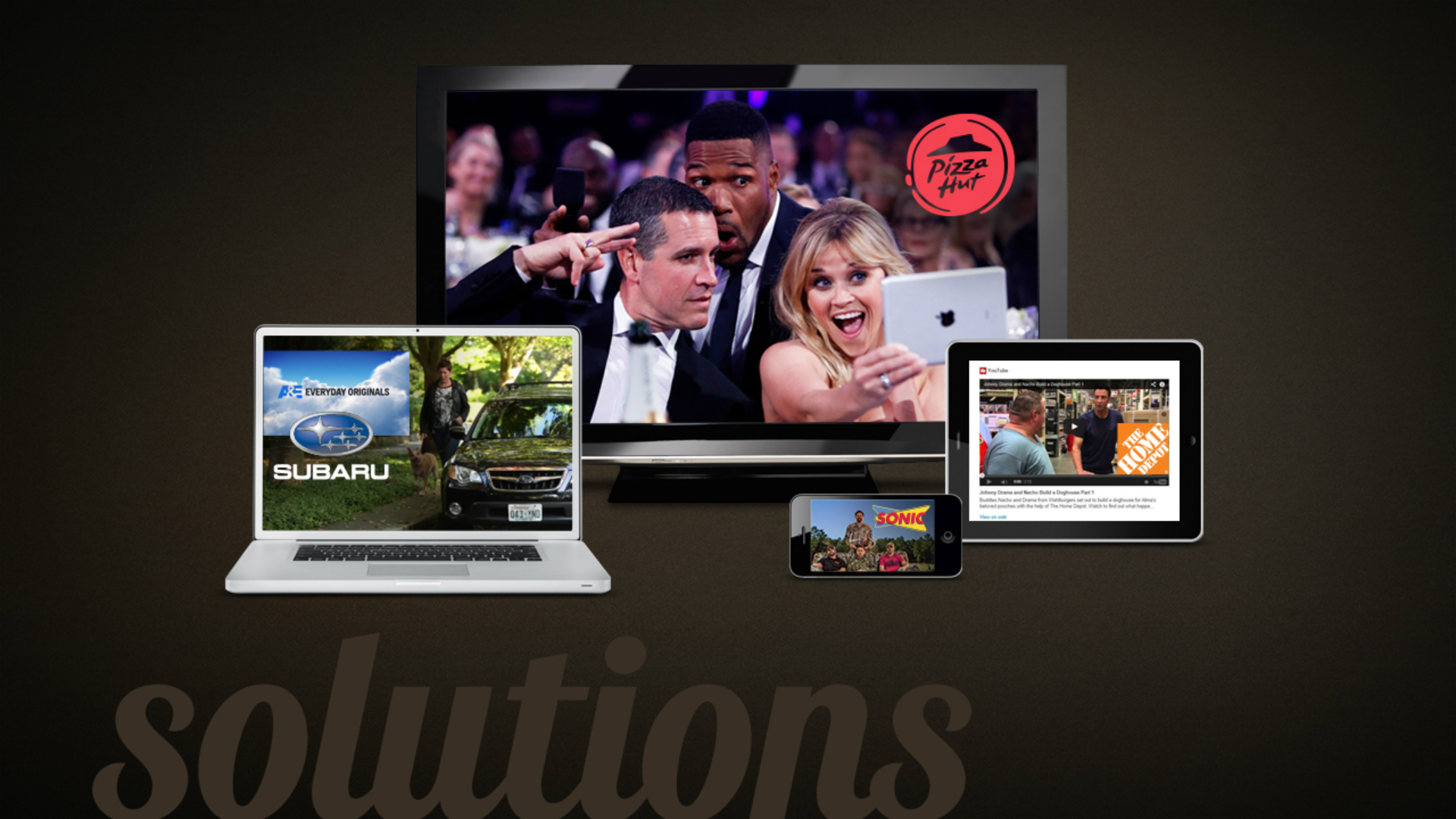
A+E Networks needed powerful Upfront Presentations for each of their four major brands (HISTORY, A&E, Lifetime and FYI) that were unique, yet still felt like part of the A+E family. We rose to the challenge and created a series of dynamic and engaging presentations, animations, and an overarching theme that brought everything together. These materials were shown both on gigantic screens at the A+E Upfront Event, and used by all A+E Sales Teams throughout the year to showcase the networks’ programming and advertising opportunities.
INTRO ANIMATION
All four Upfront Presentations began with this Intro Animation that we developed. The A+E Networks logo was brought to life and used as a vehicle to introduce each brand. We modeled it in 3D, and gave it quick and playful motion, combined with dynamic camera panning. Each quadrant of the plus represented a different brand, creating a clear visual hierarchy and common thread throughout all presentations.
HISTORY
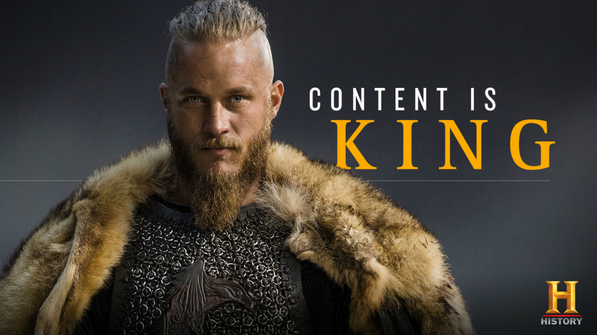
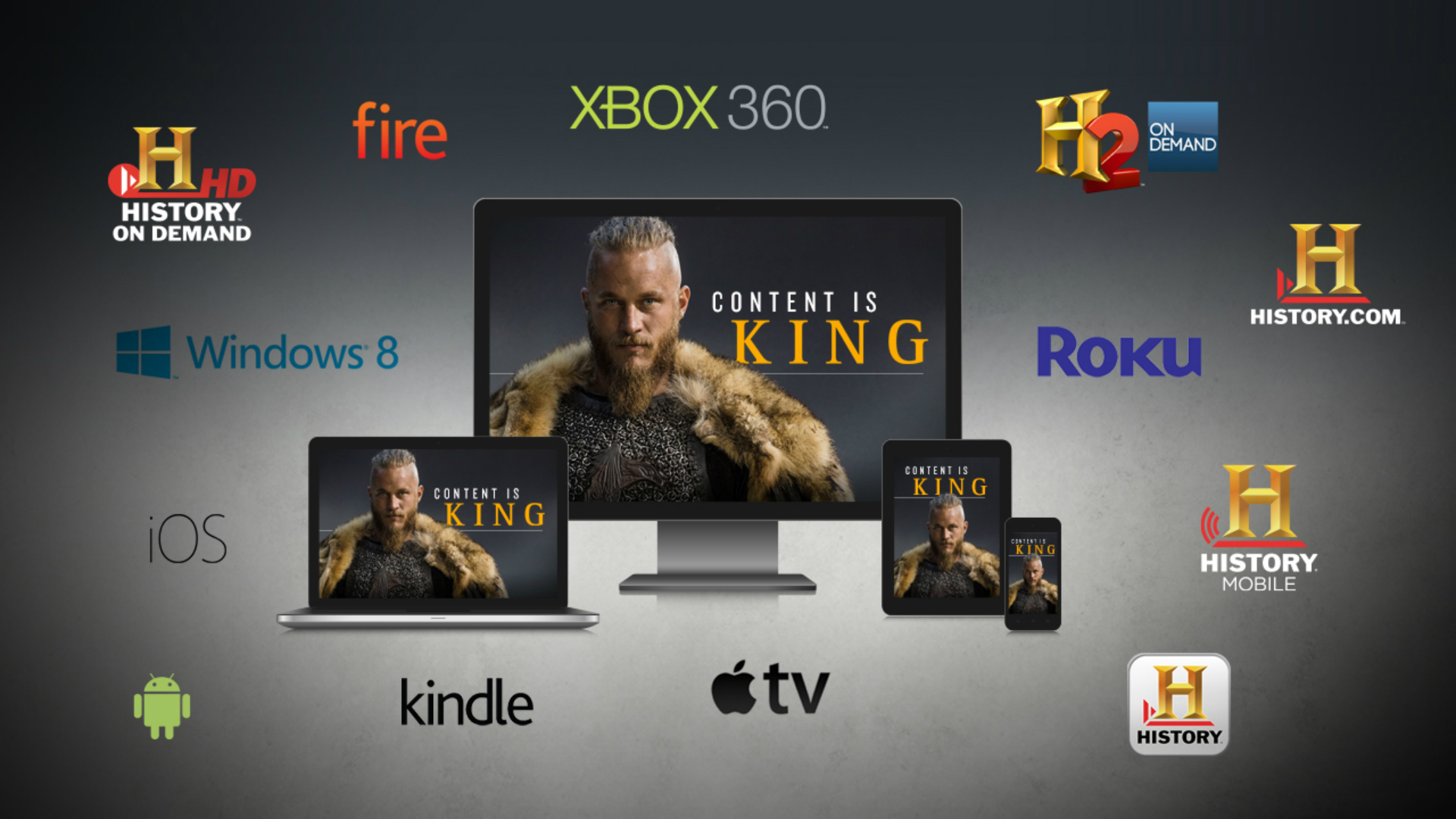
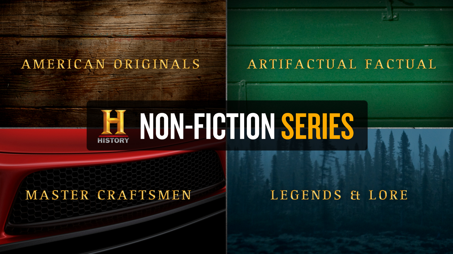
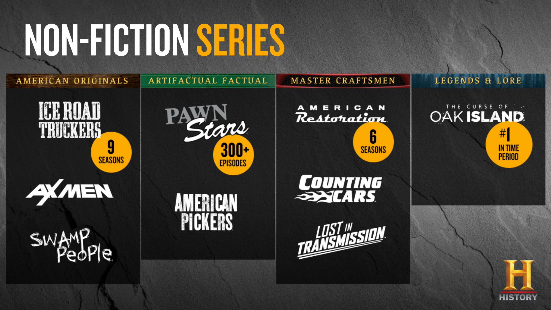
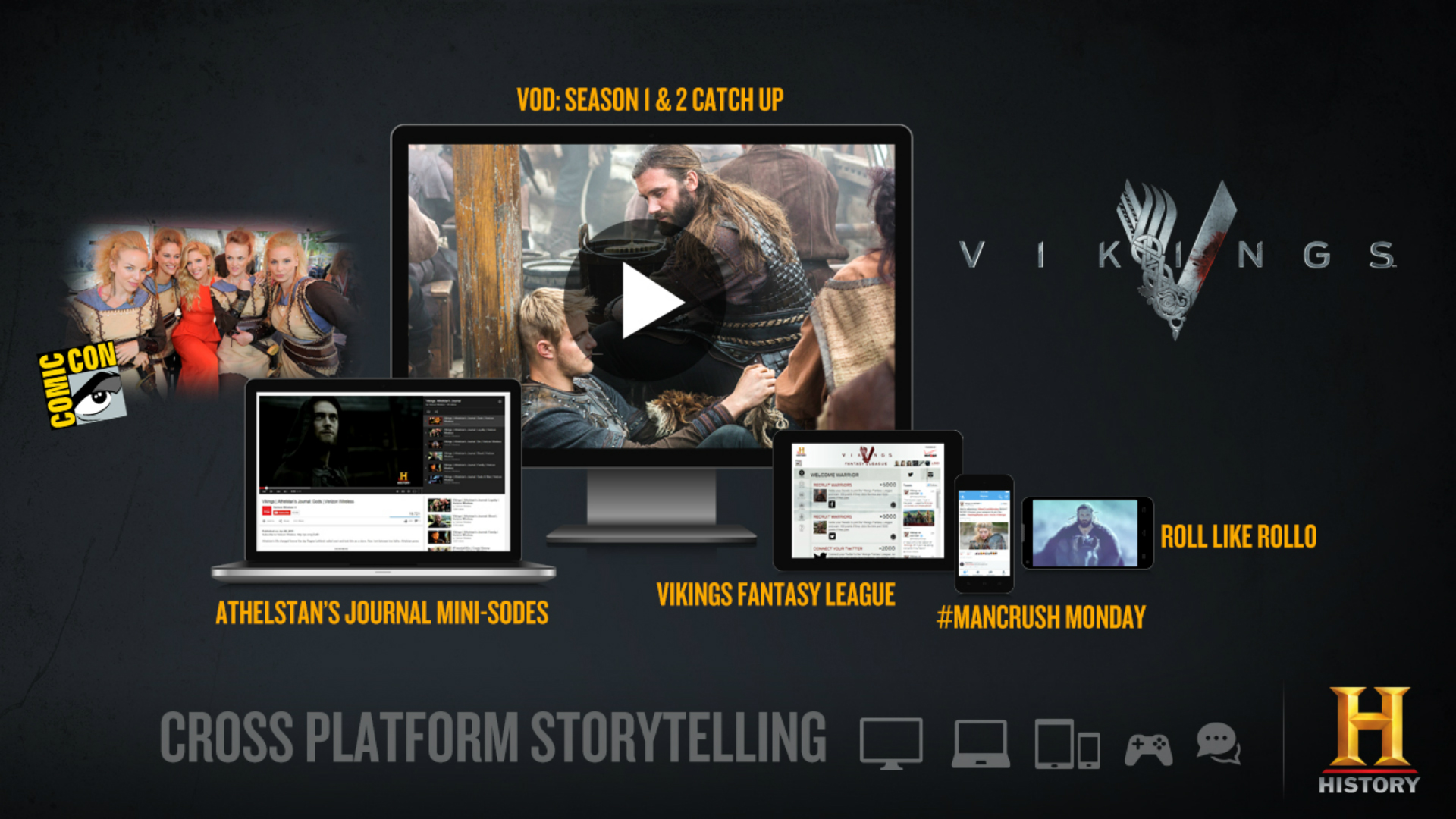
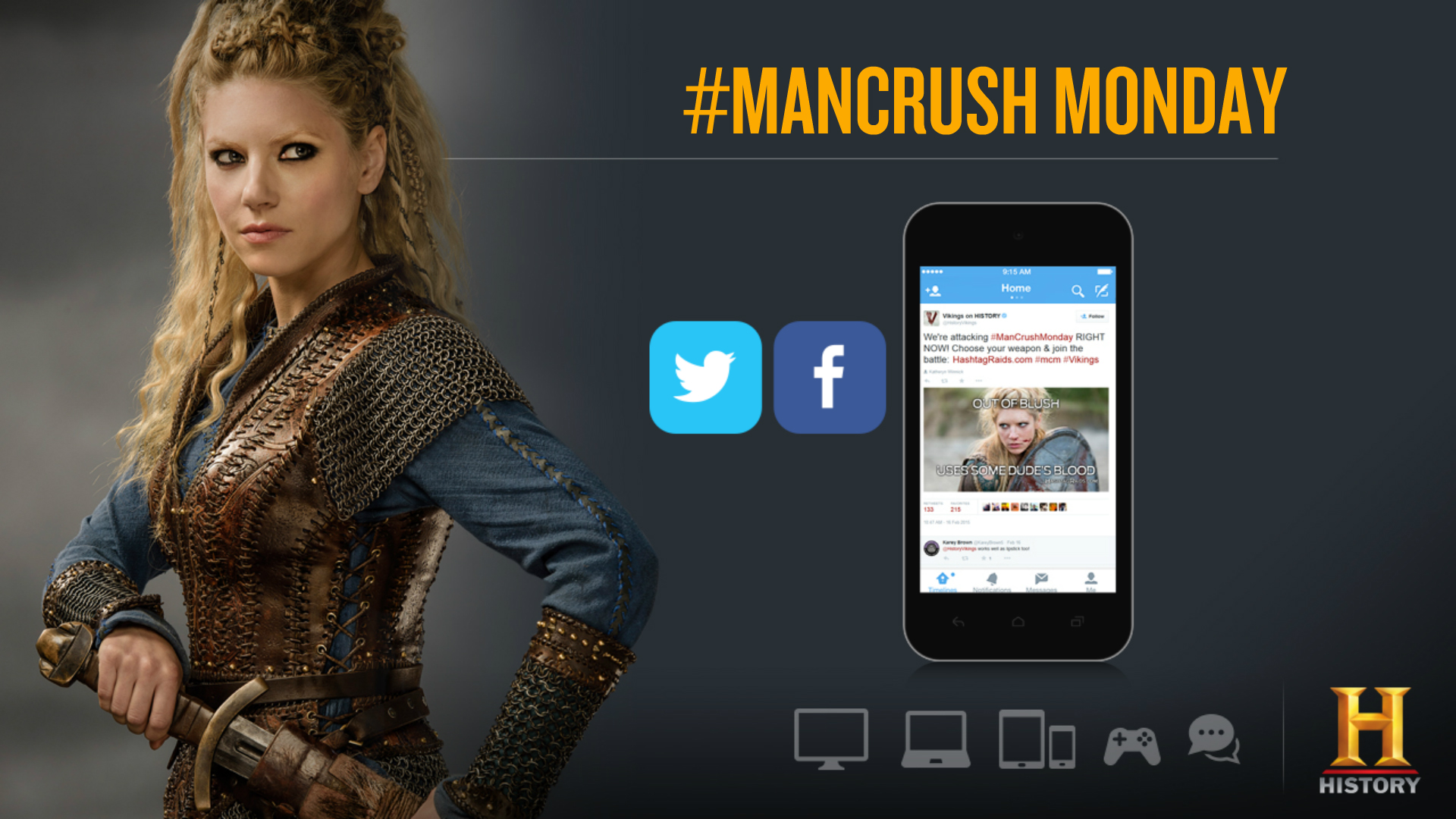
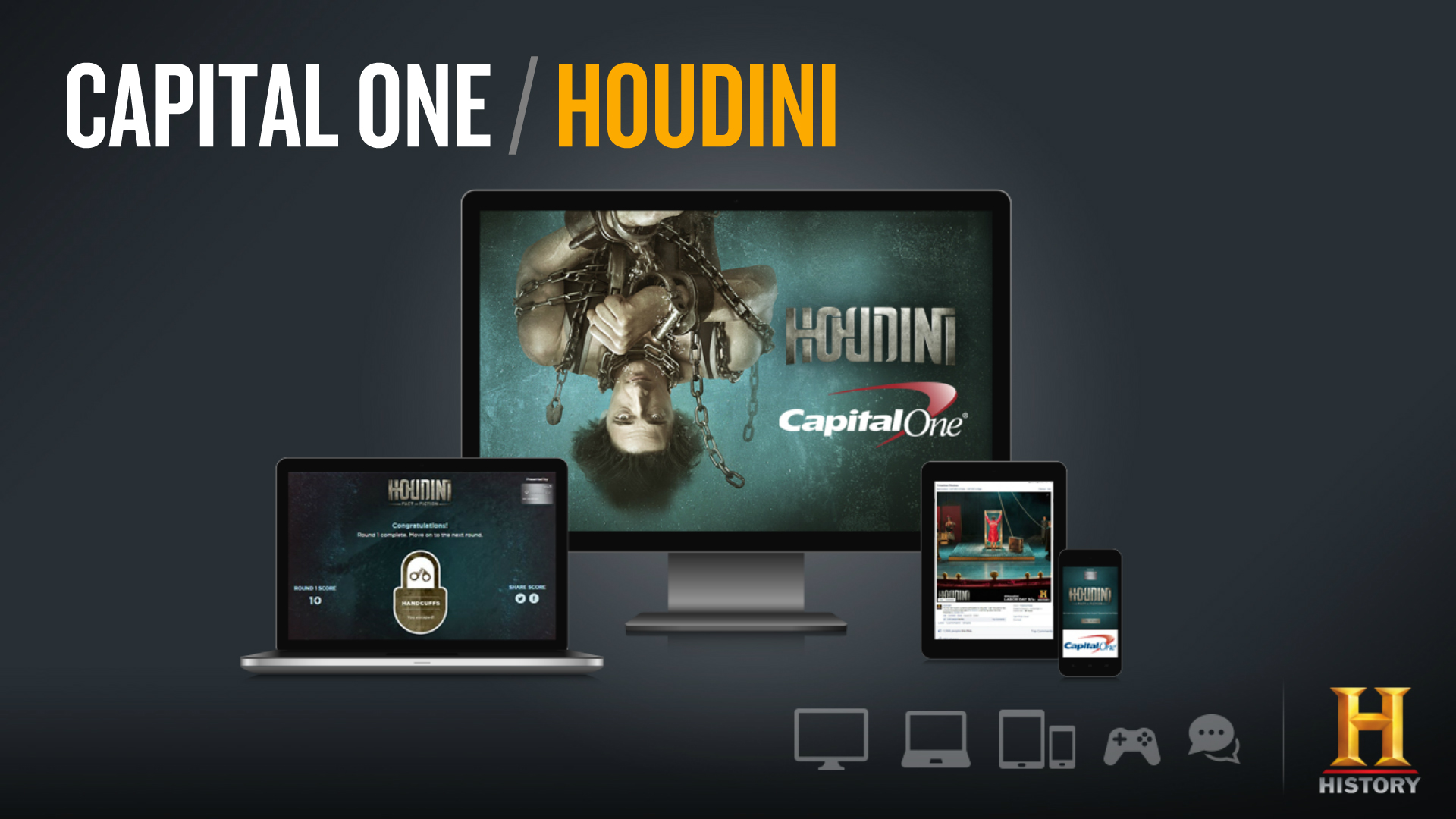
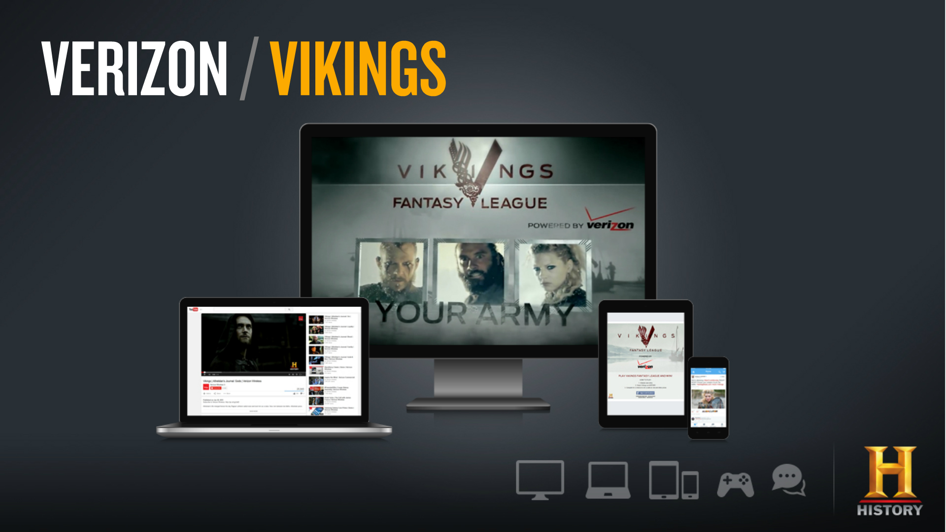
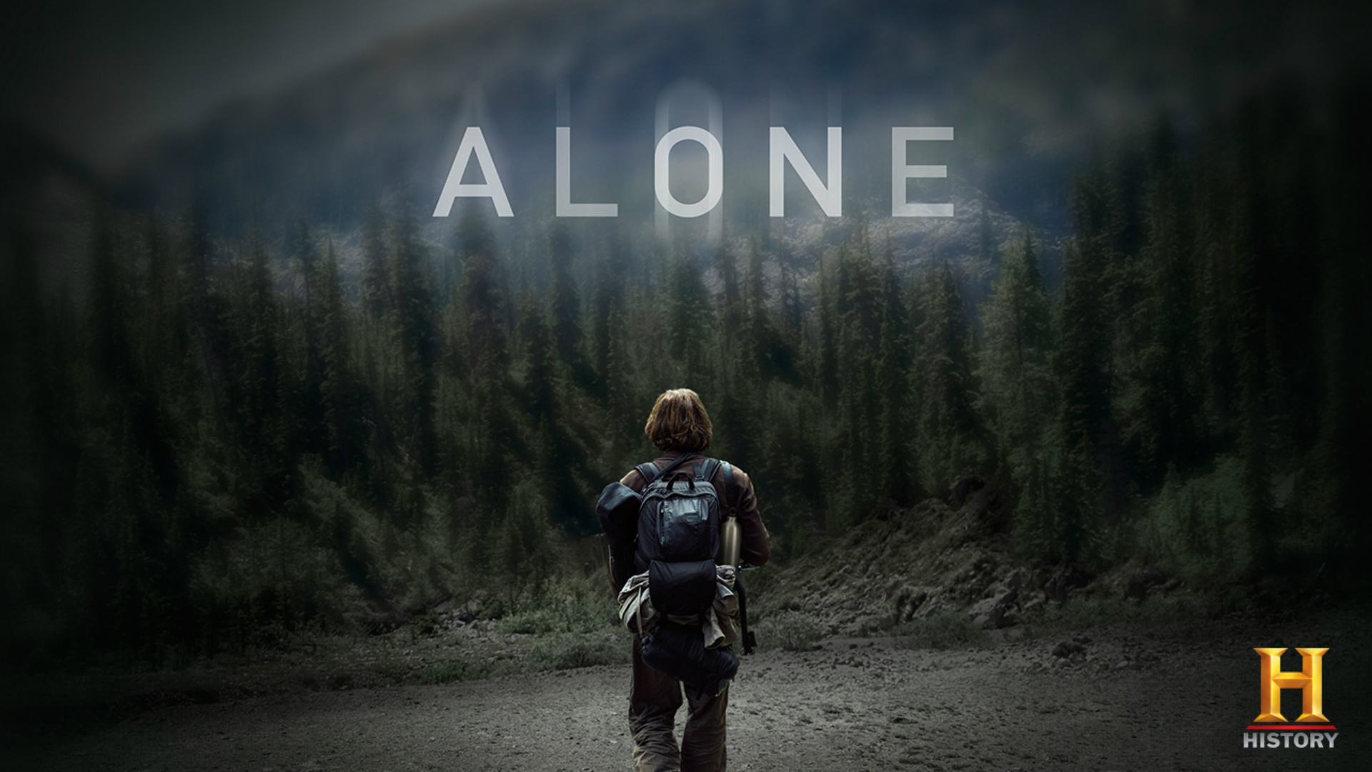
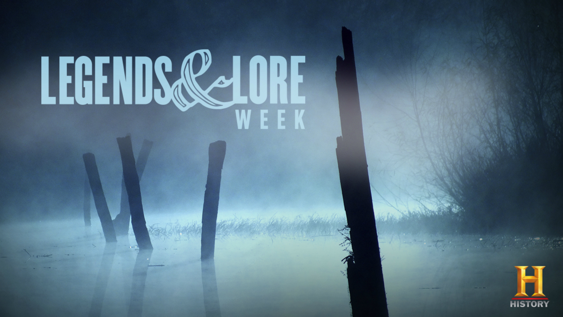
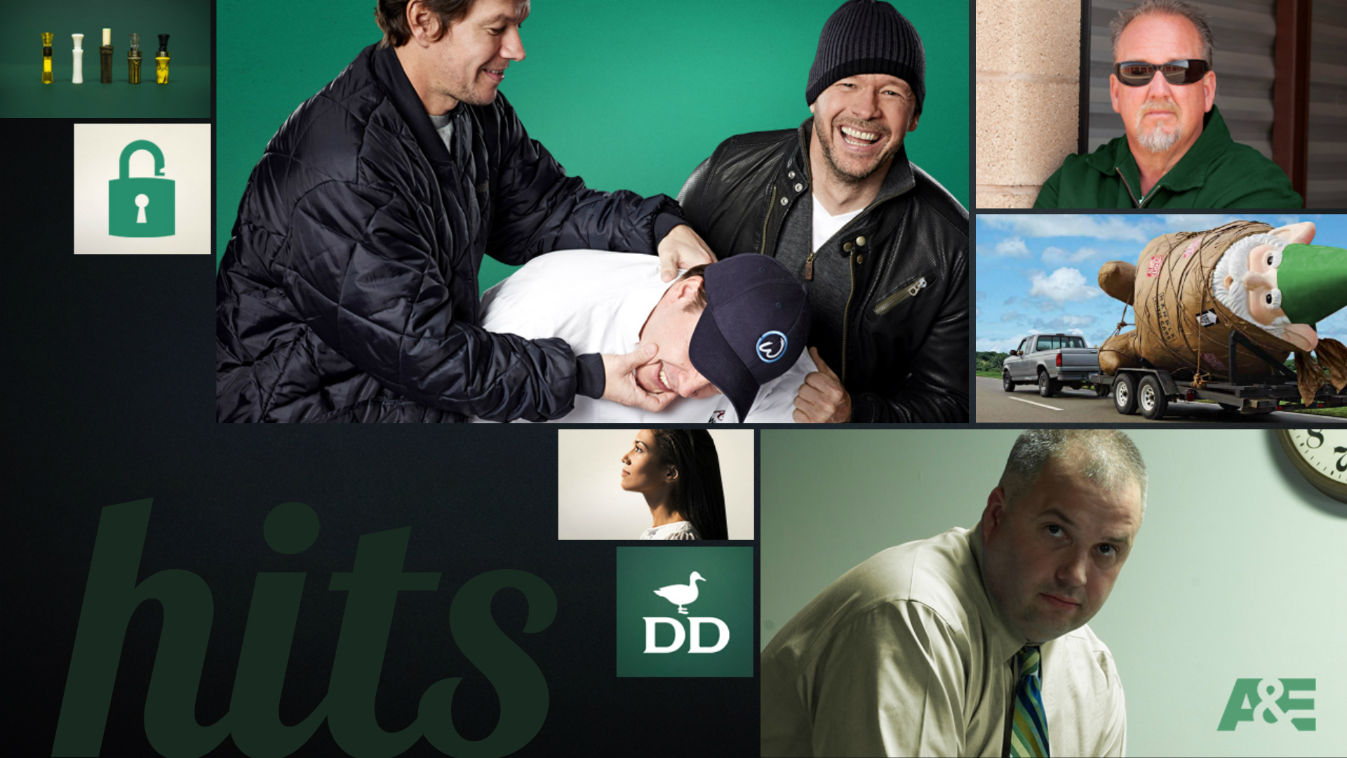
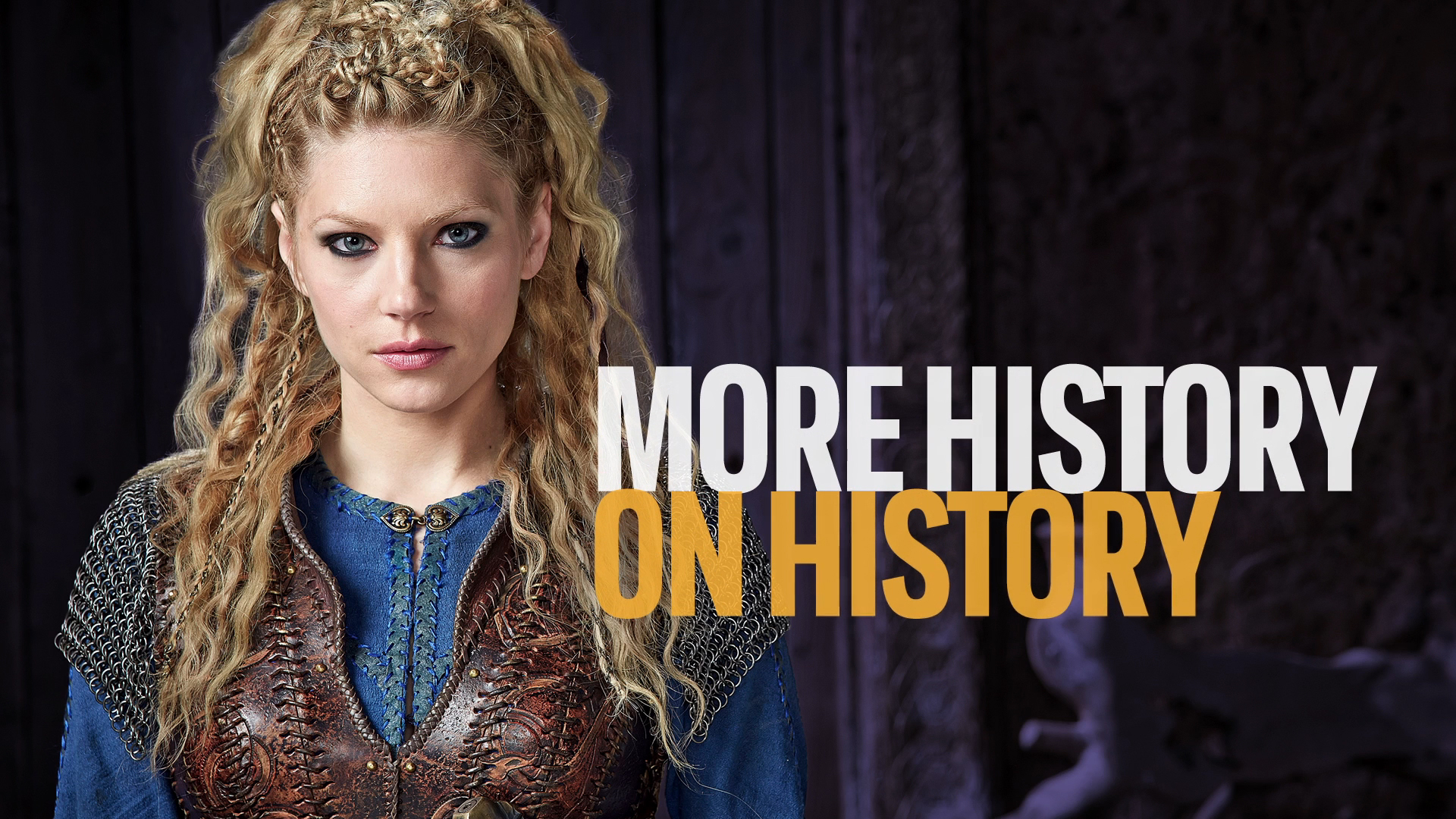
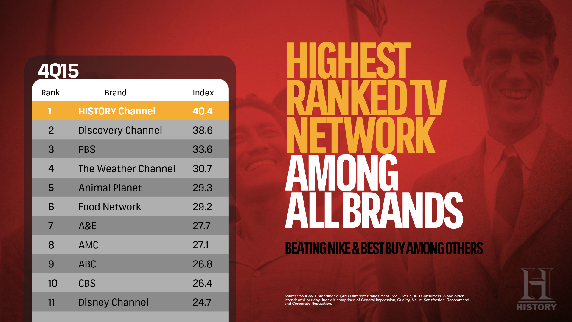
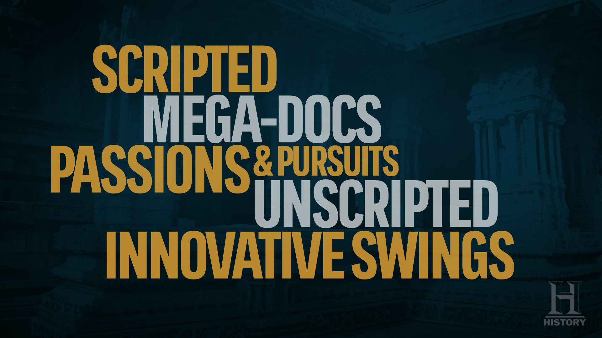
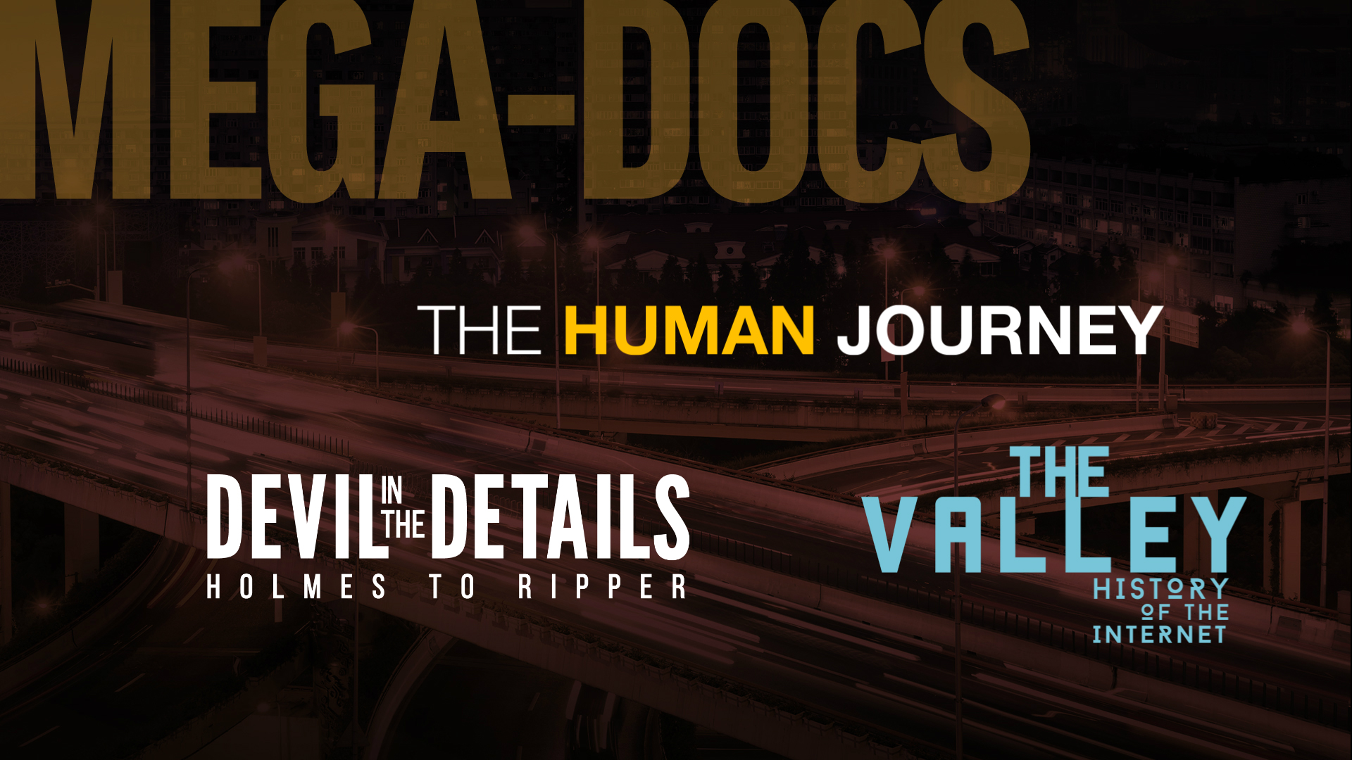
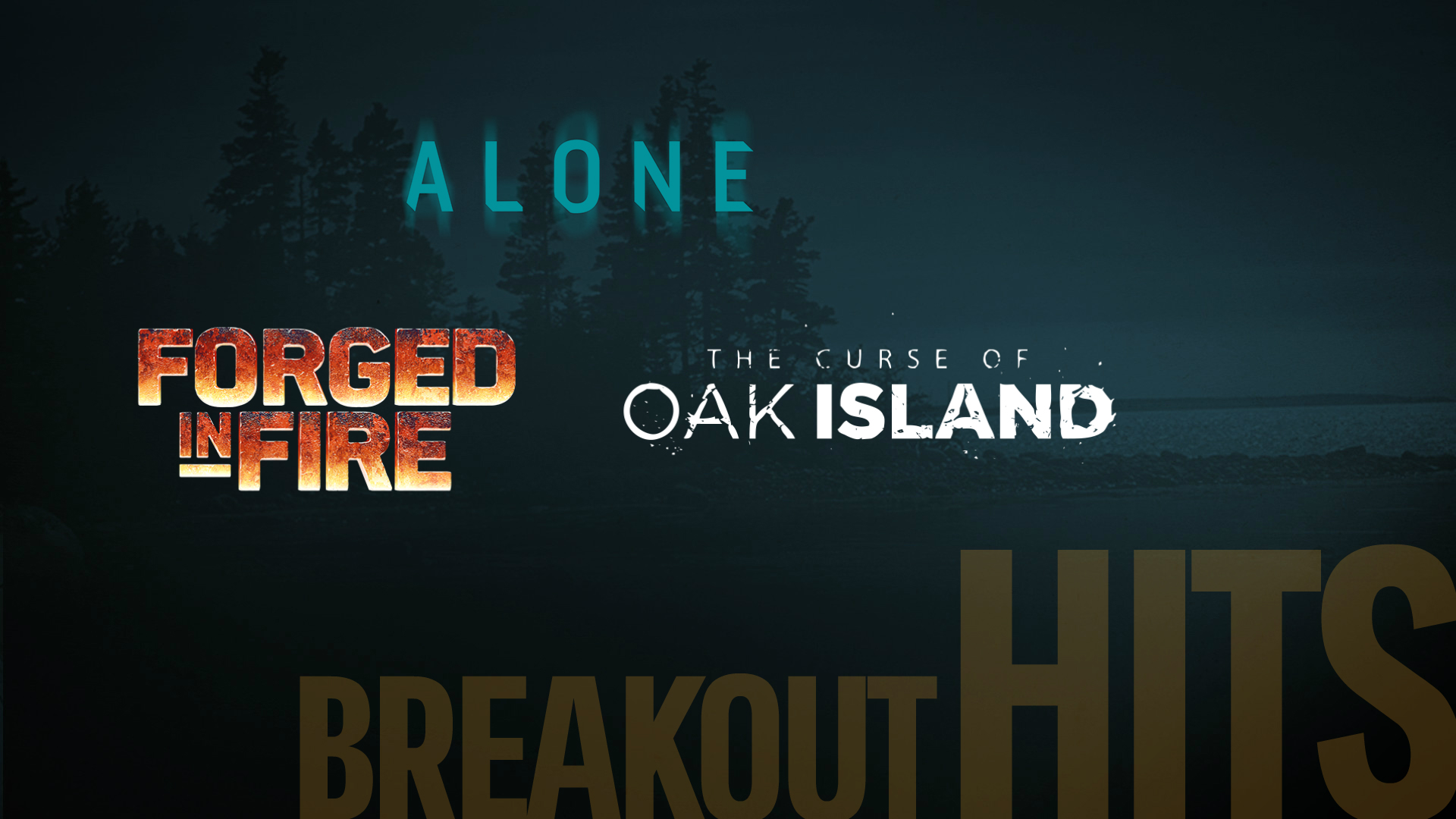
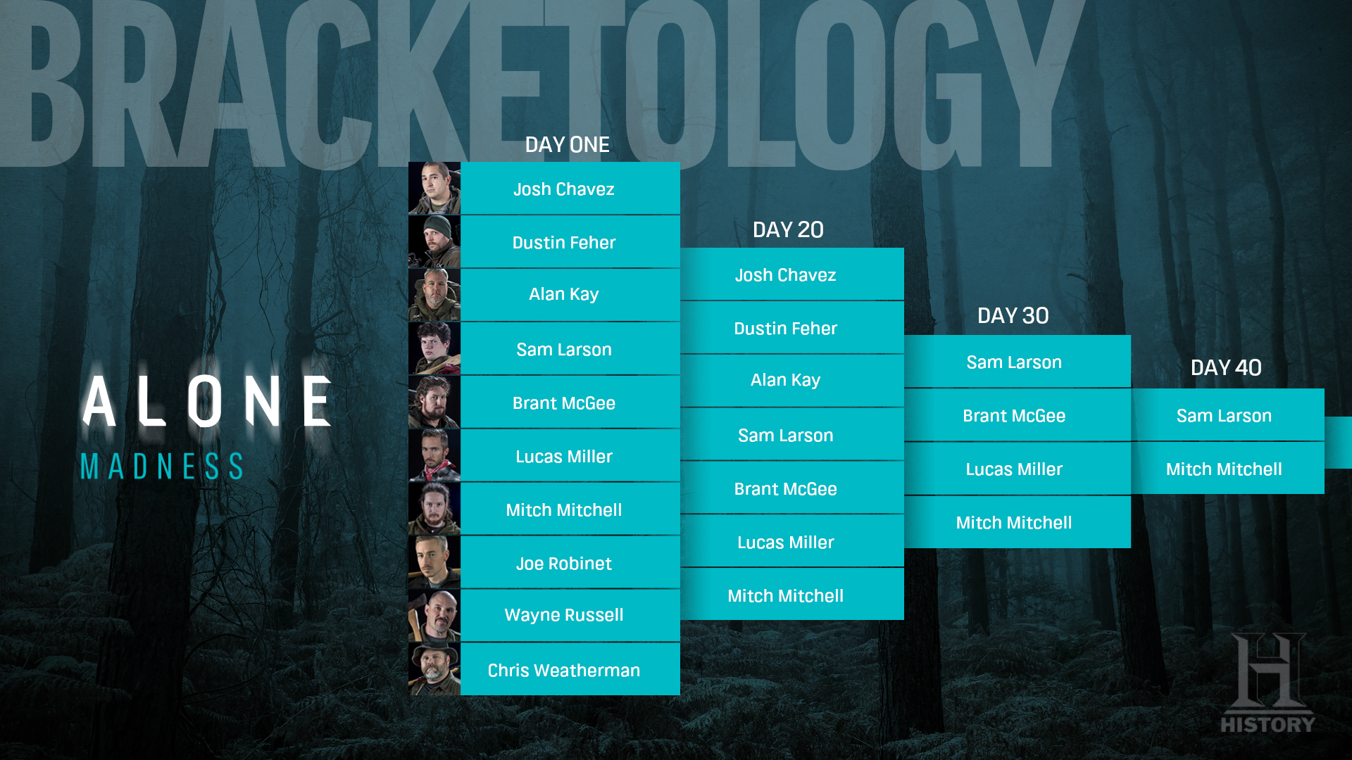
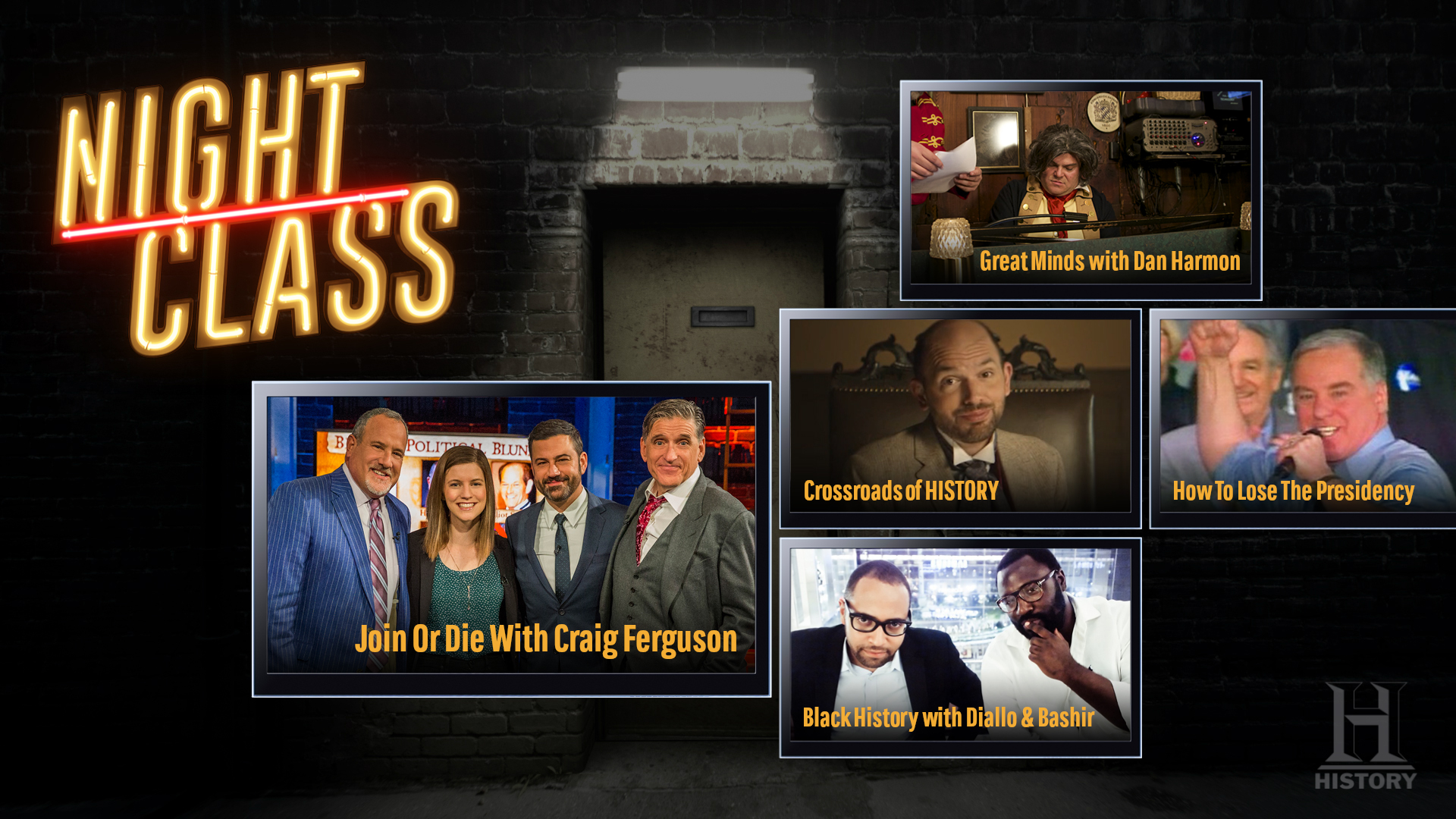
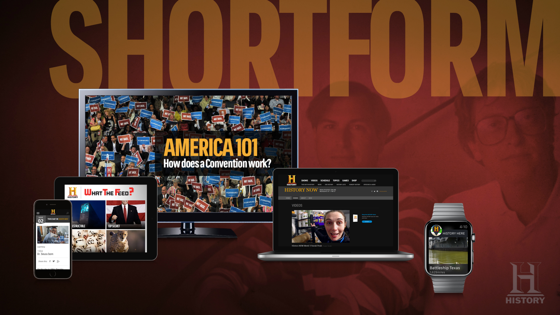
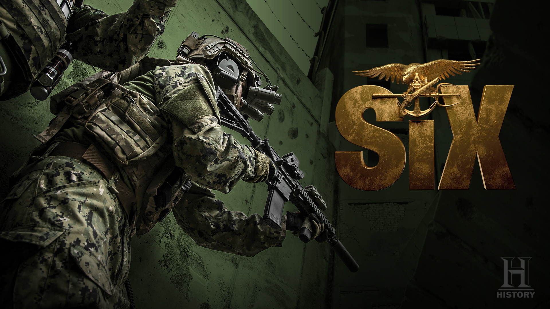
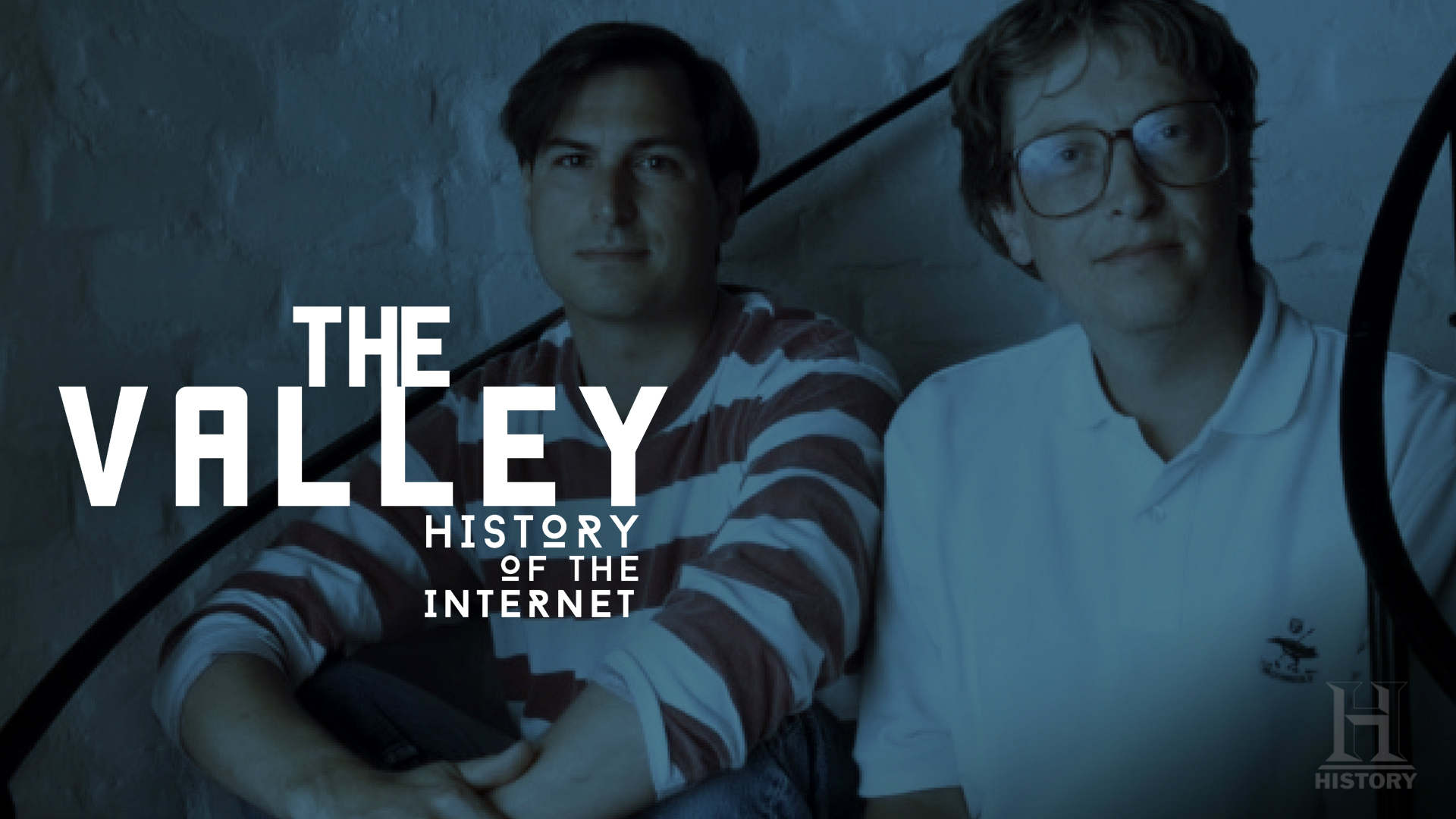
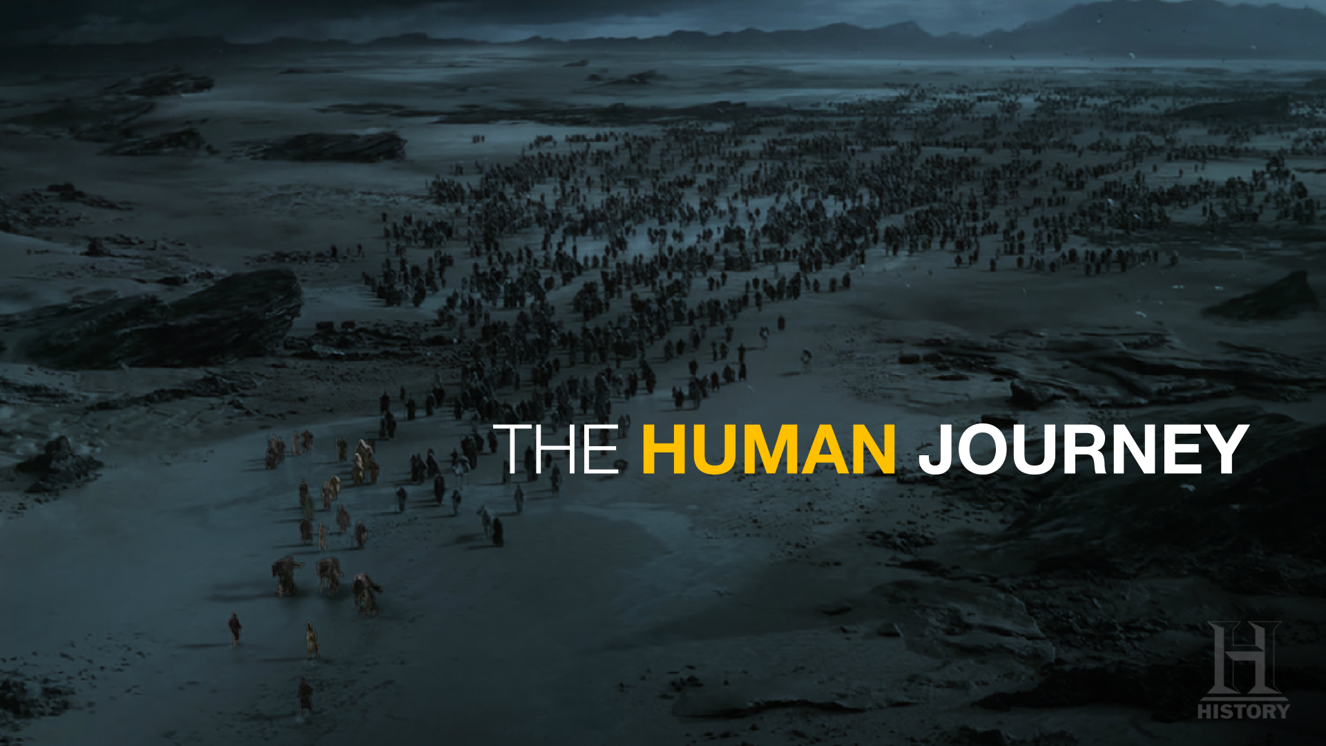
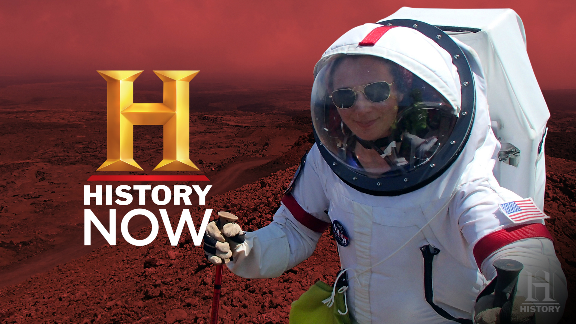
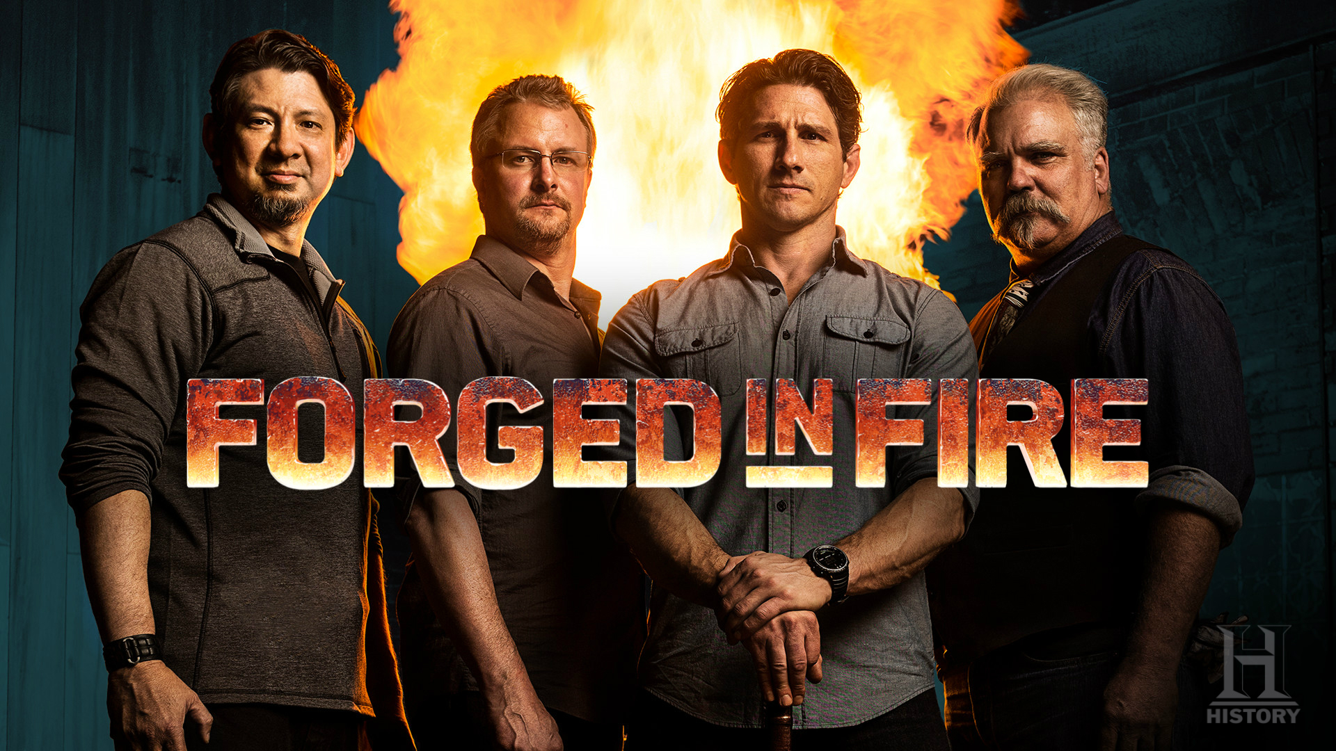
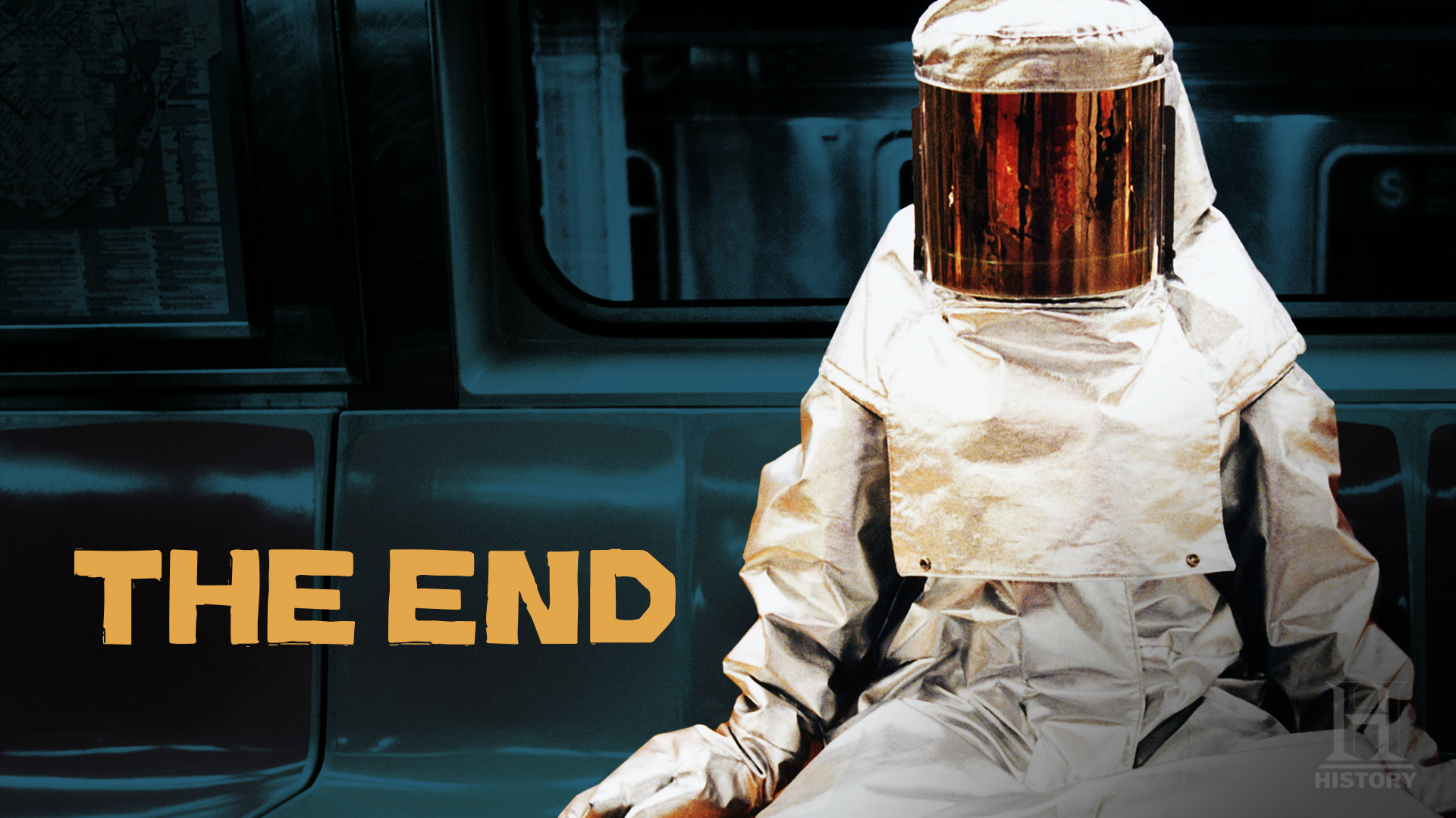
The HISTORY Upfront Presentation embodied the boldness of their brand, and told the story of what they had to offer in a unique and engaging way. Complex themes and advertising packages were distilled down to simple, easy to understand slides, which grabbed the viewers’ attention through powerful visuals. HISTORY’s new on-air branding was also seamlessly integrated, ensuring cohesion across all touch points. Please click or swipe through the slides below:
BRAND SLIDES
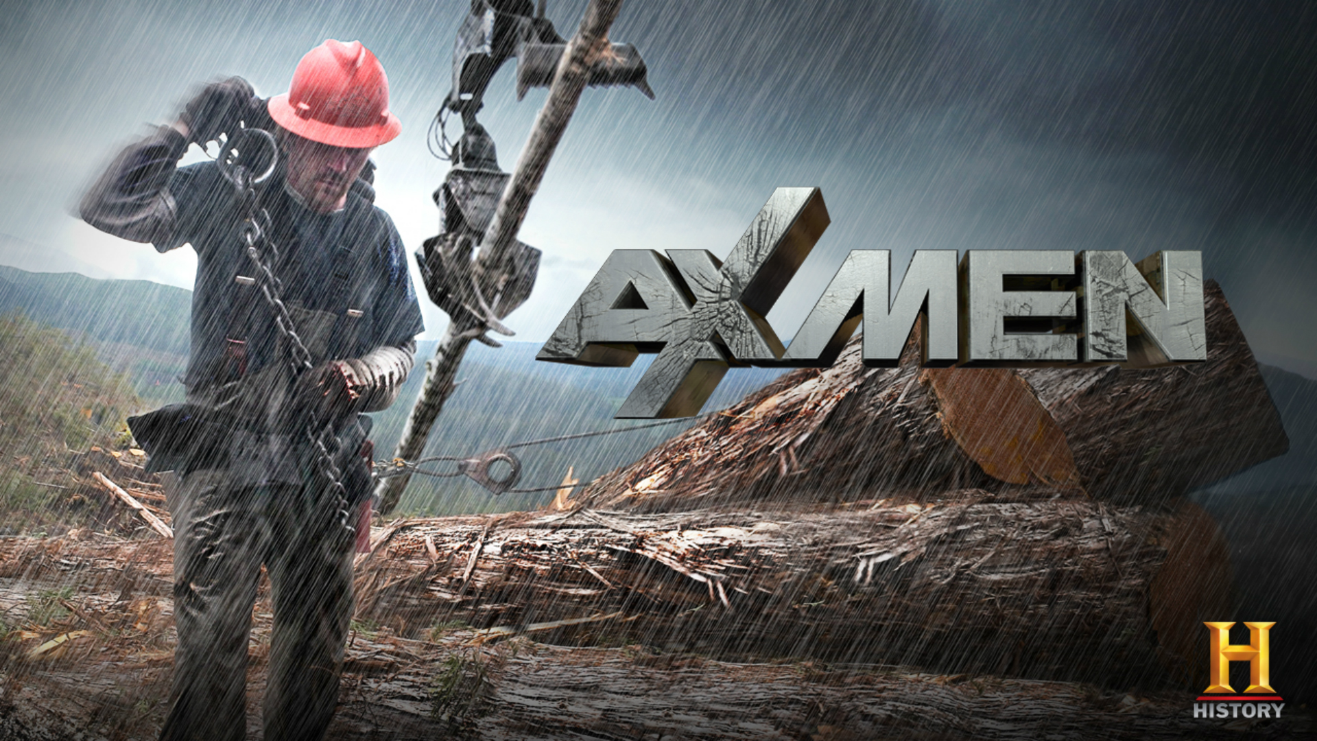
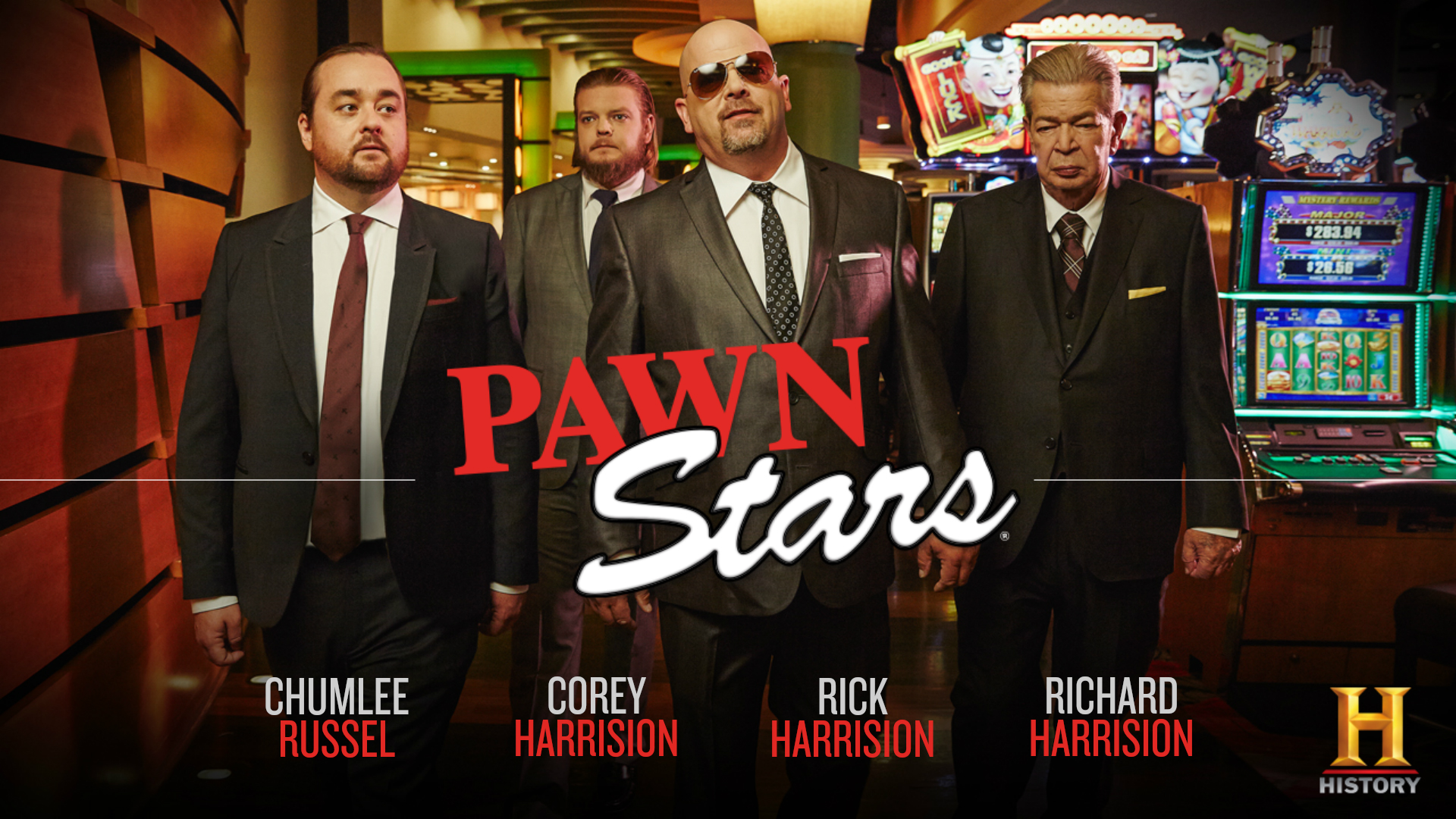
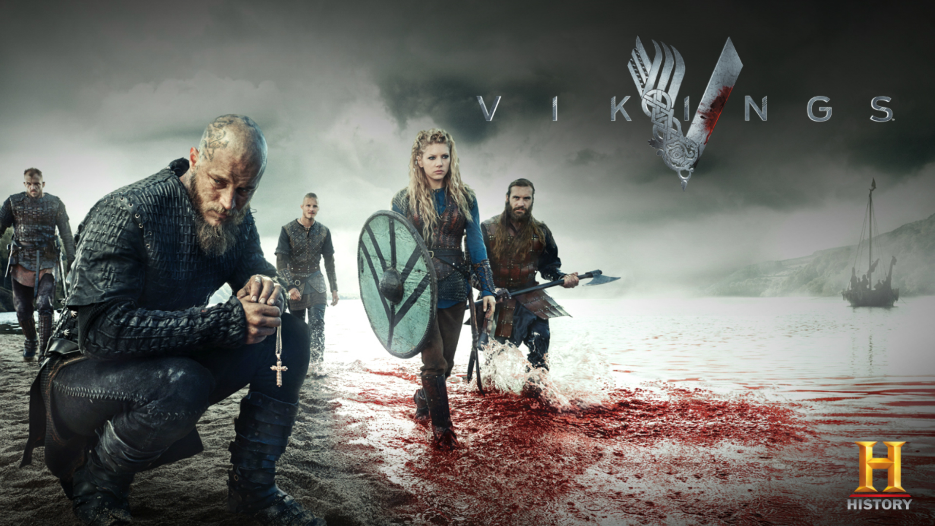
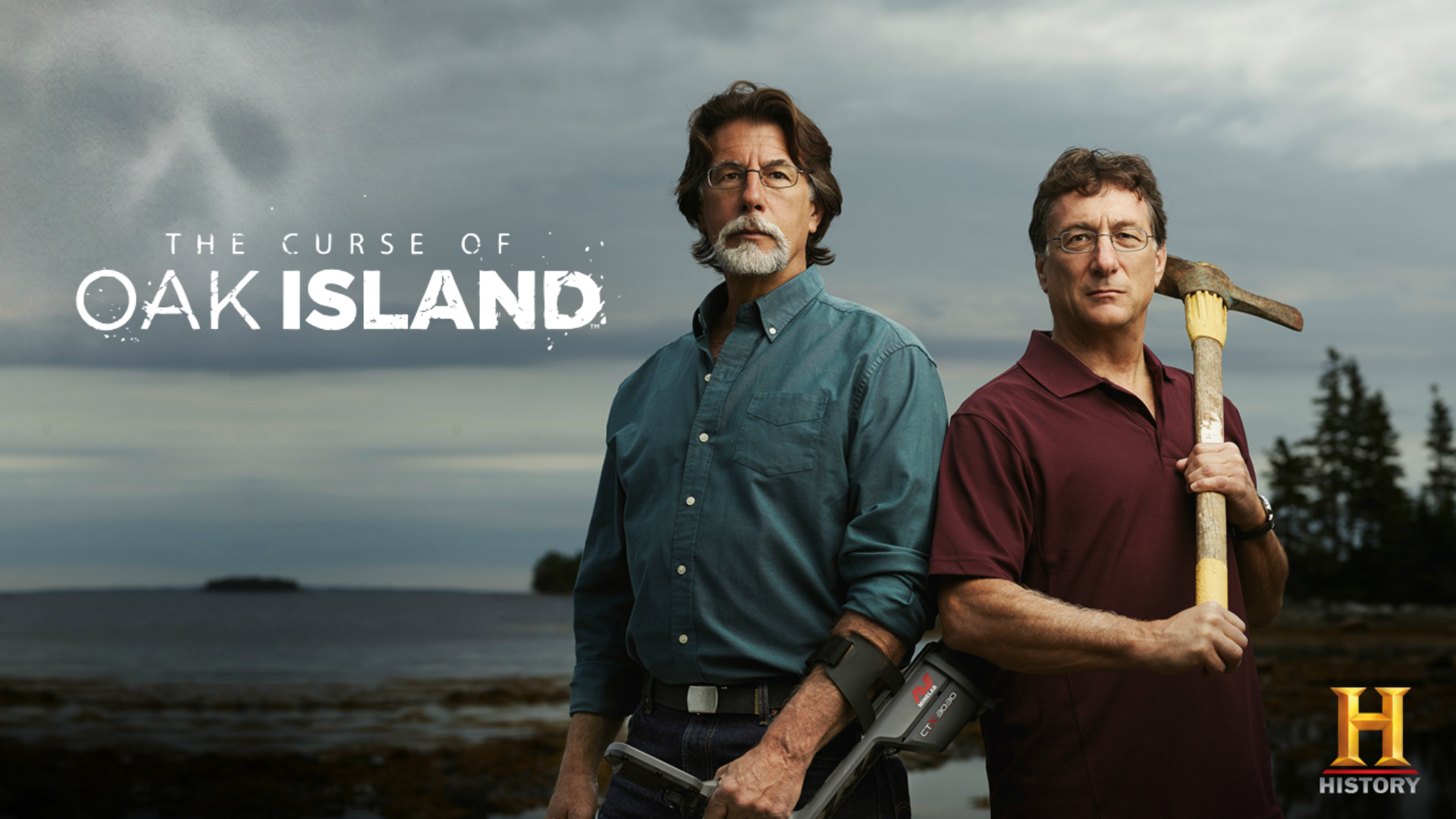
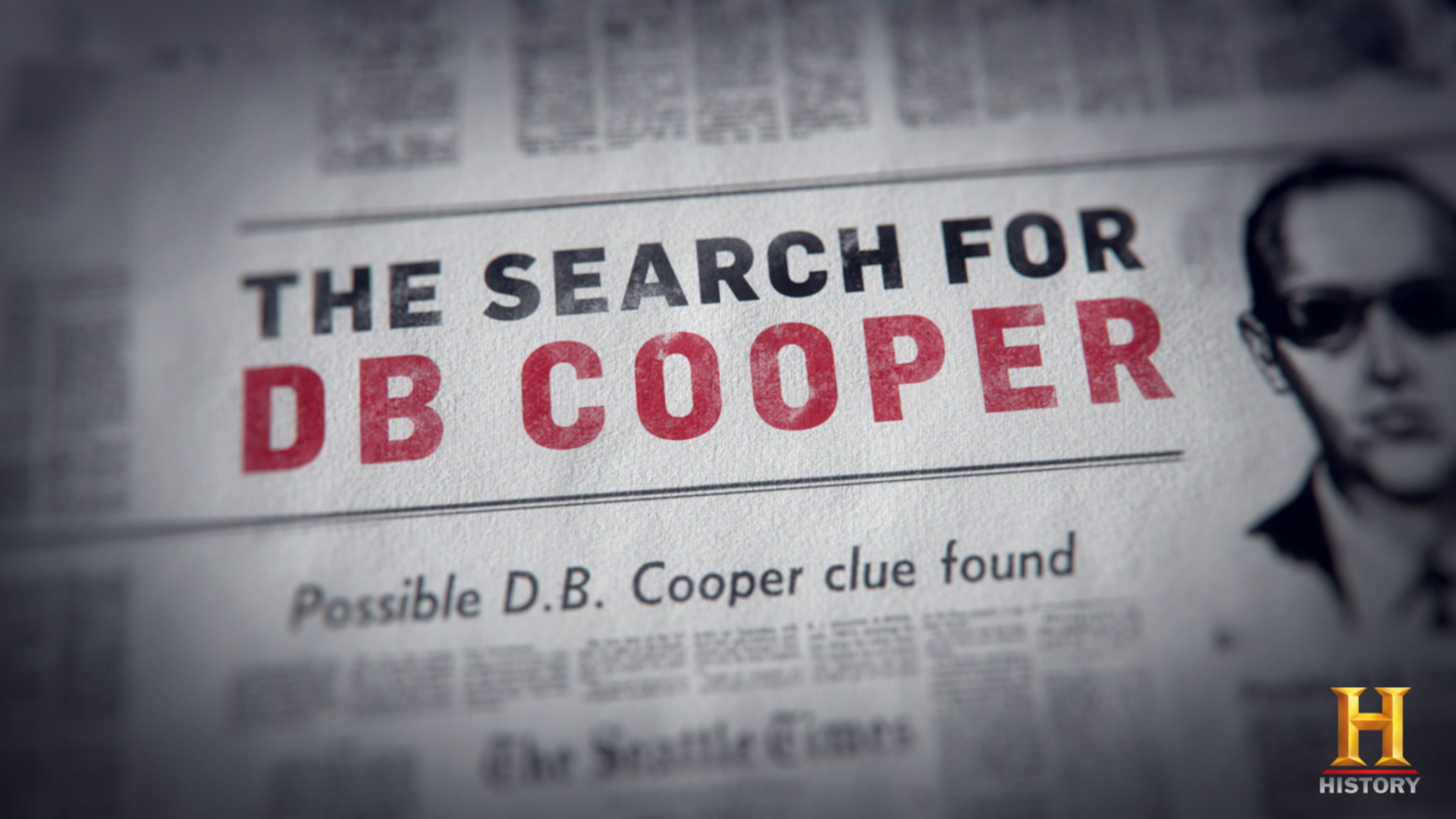
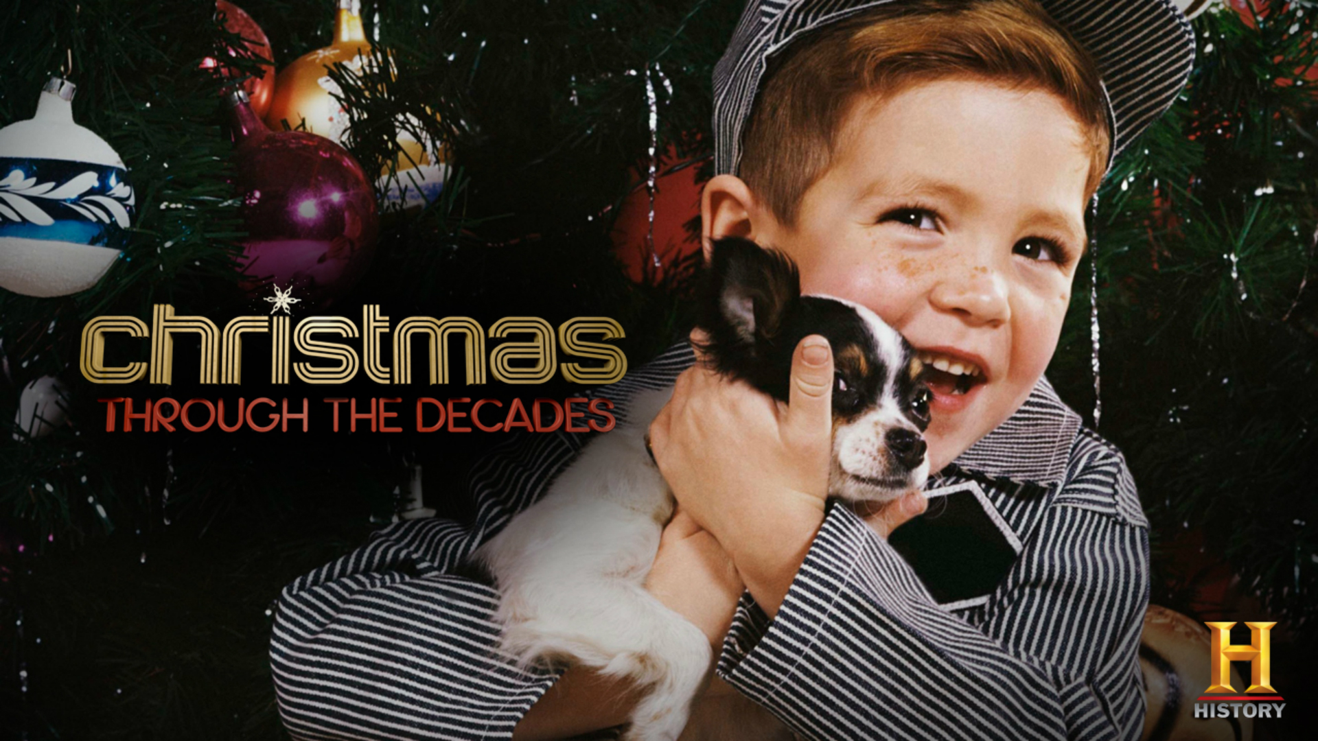
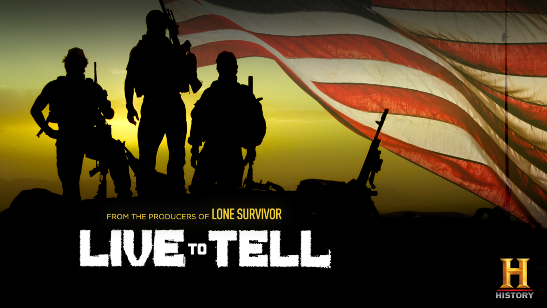
PROGRAM SLIDES
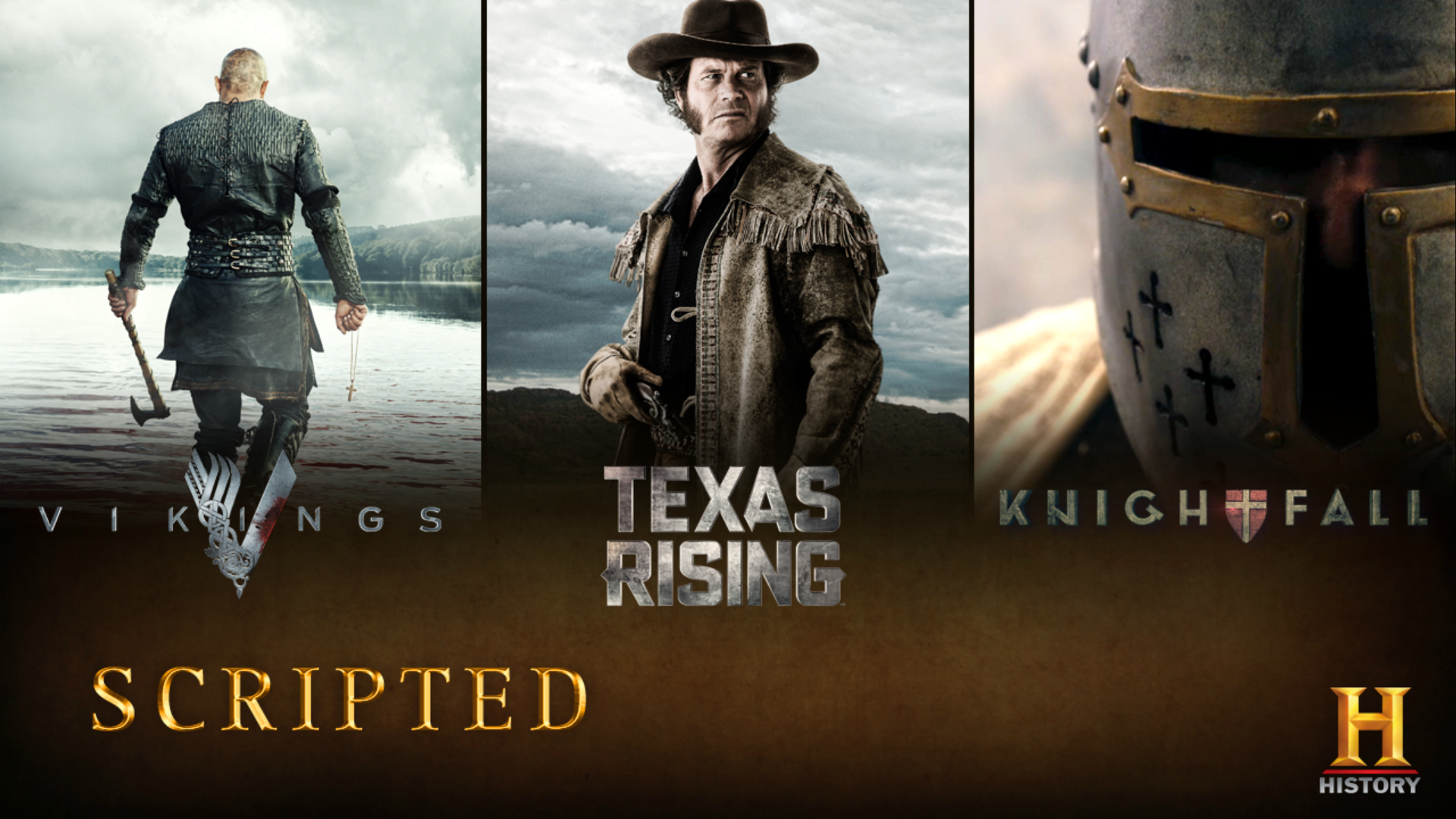
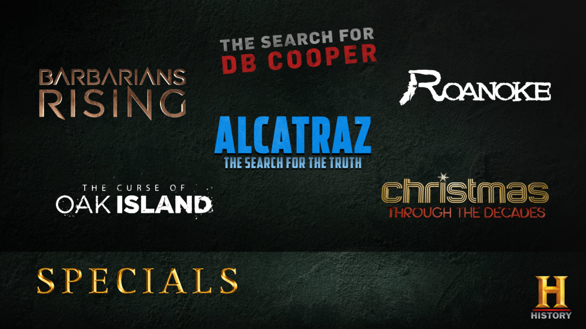
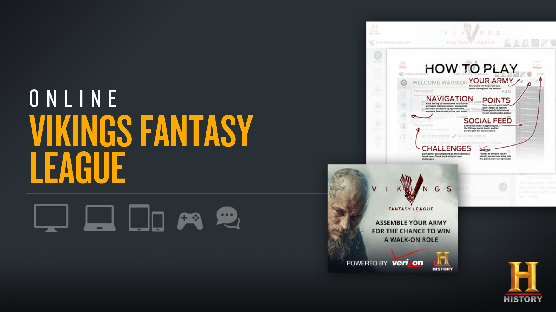
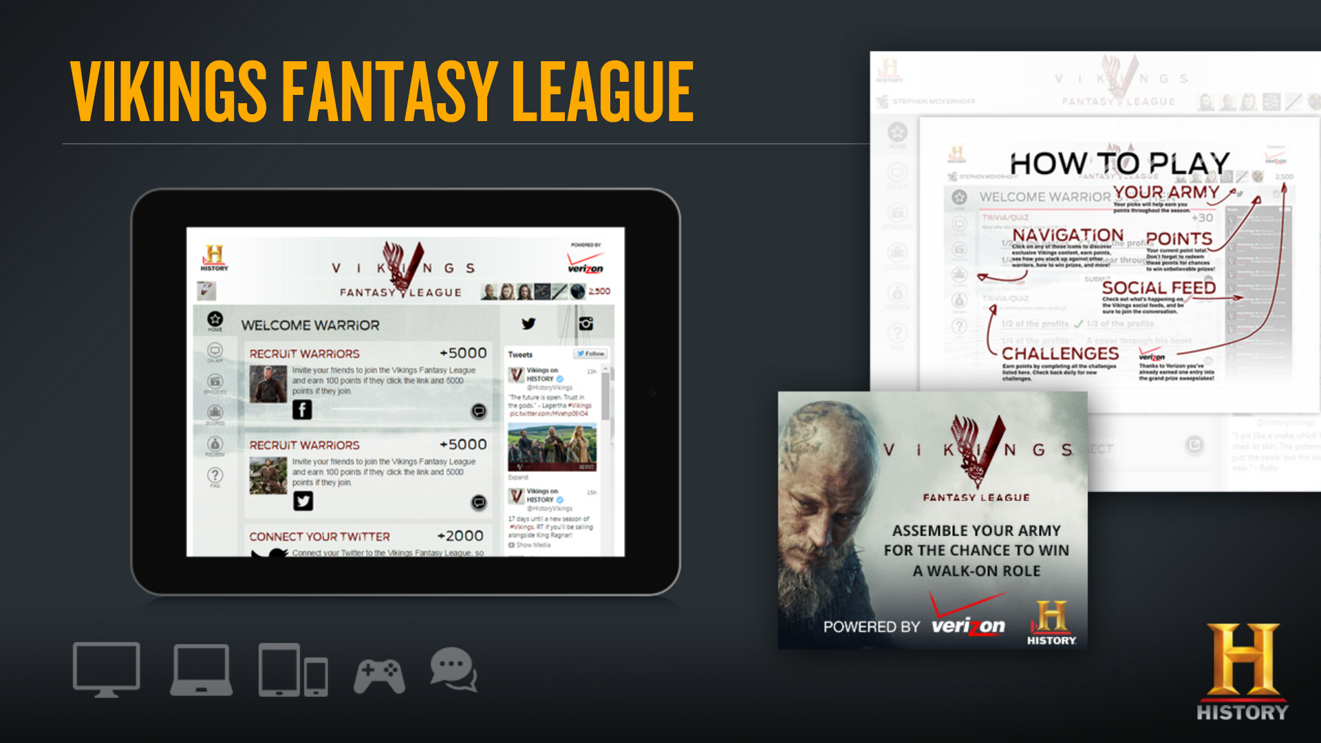
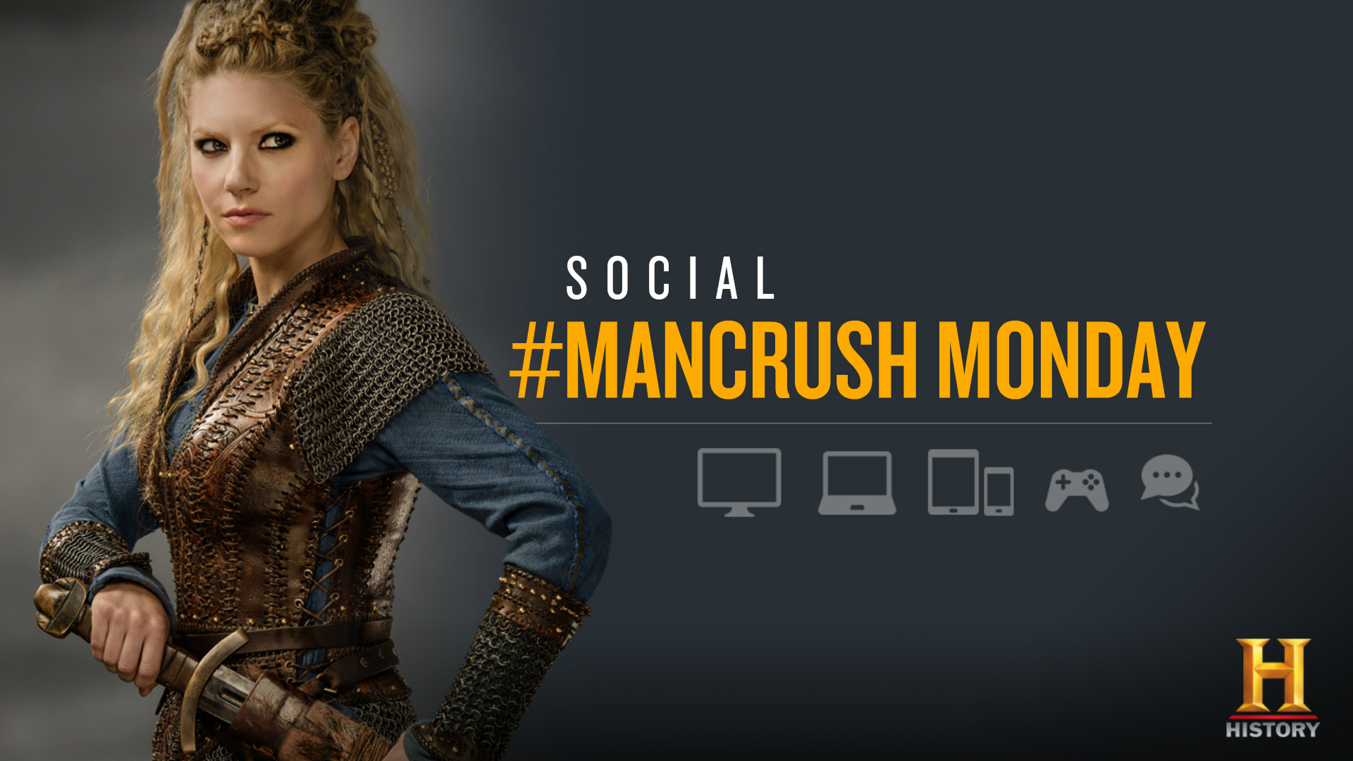
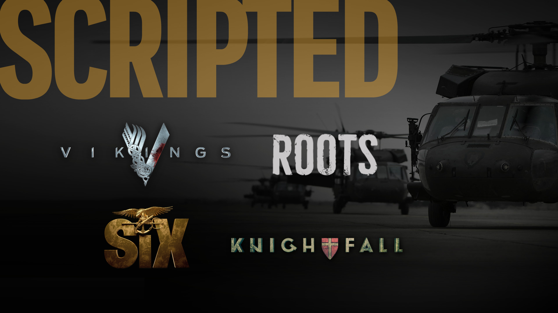
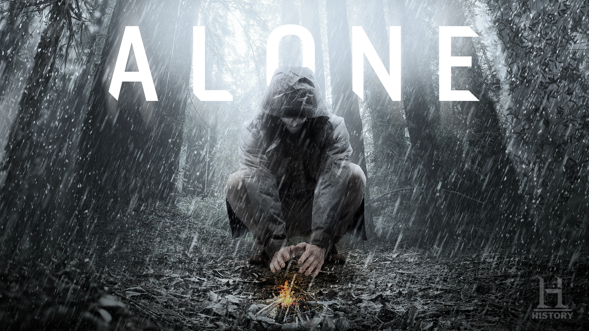
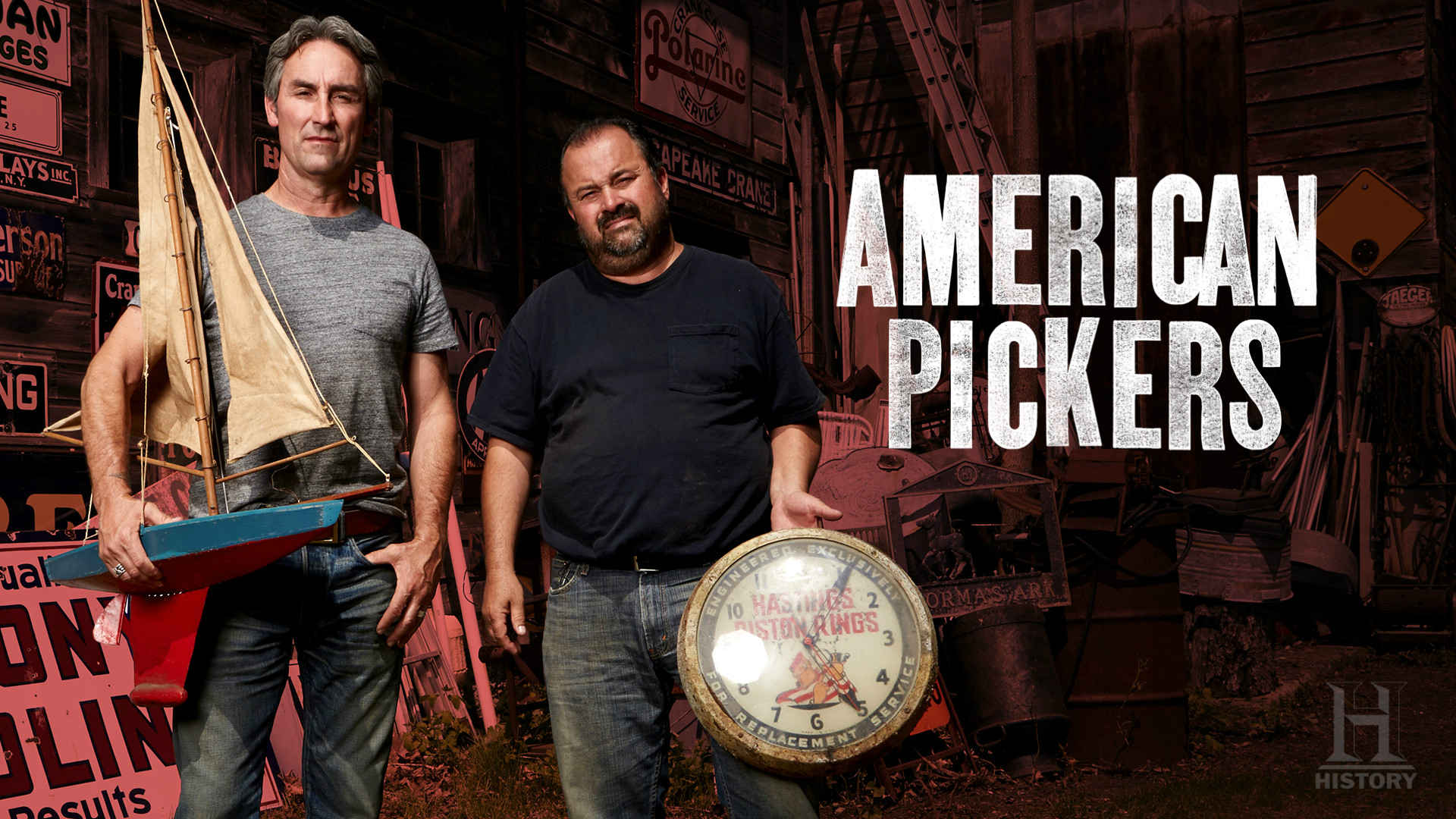
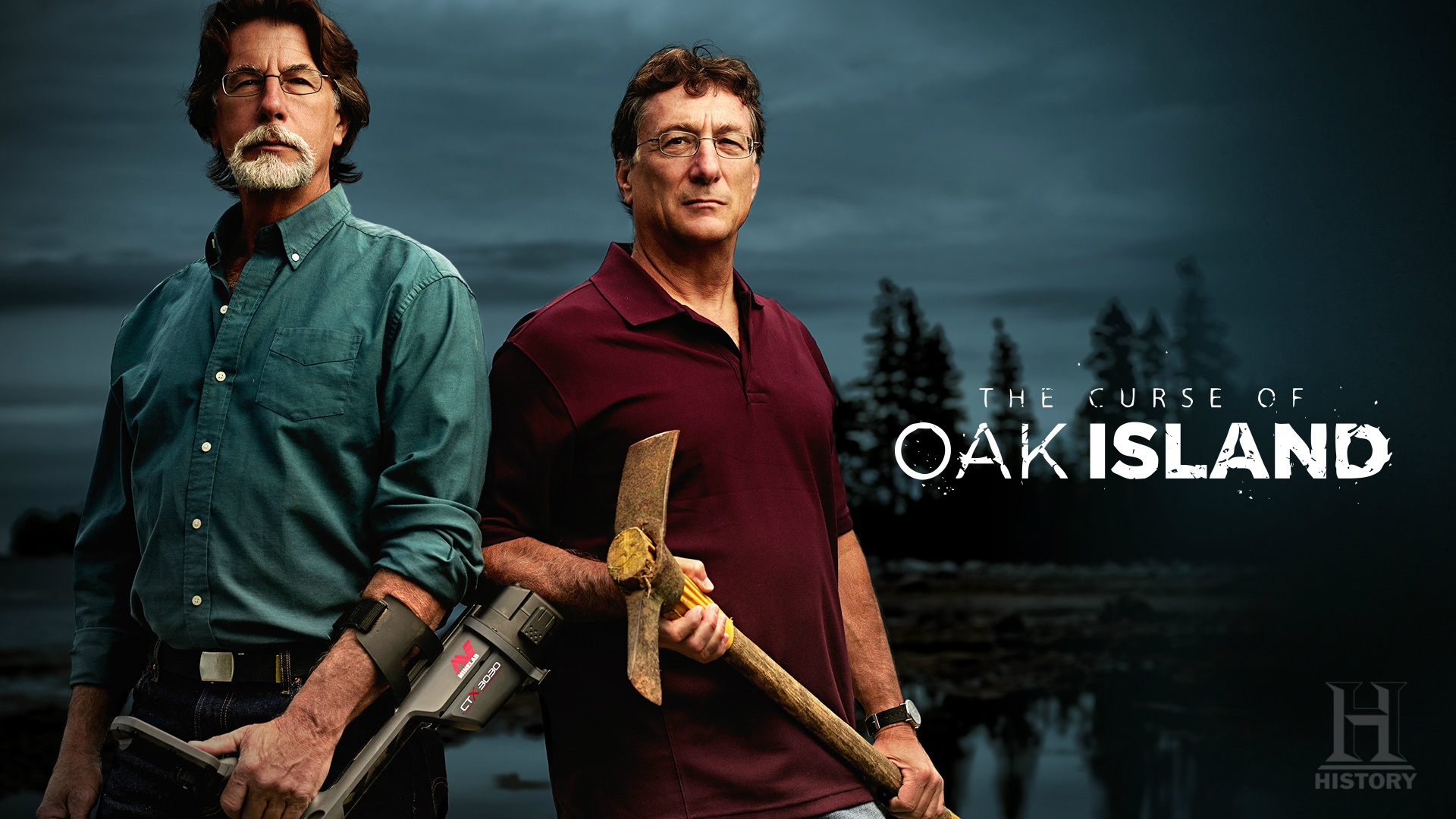
The core of all television networks is programming, and HISTORY had lots of it to showcase. We created slides to present their key programs in such a way that the viewer could understand what they were all about at a glance. And some shows were still in the concept phase, with no images or film available. With just a text description of the show, we developed slides that brought the concepts to life – and often influenced the way they ultimately looked. Please click or swipe through the slides below:
ANIMATIONS
We also created a dynamic animation style for the presentation, and developed various short transitions and clips to bring it to life and create more interest.
A&E
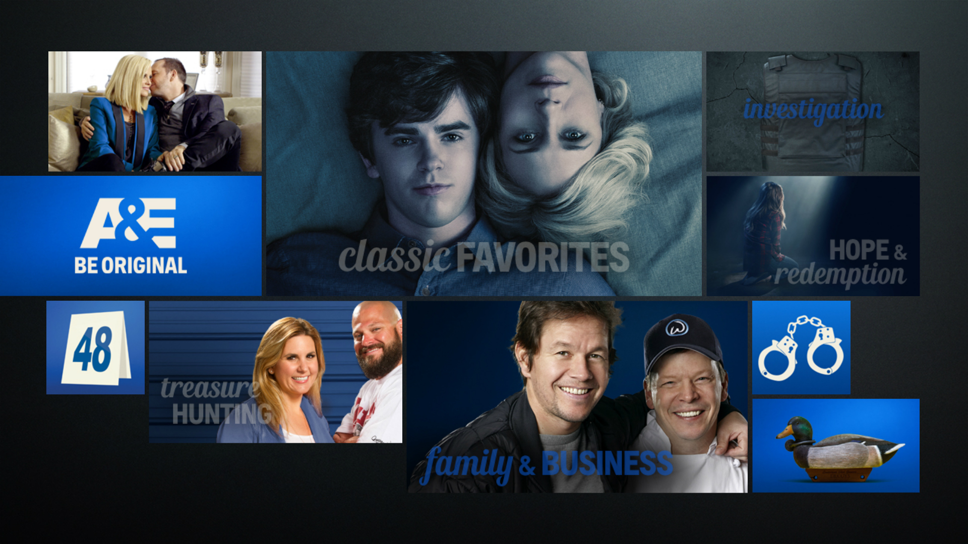
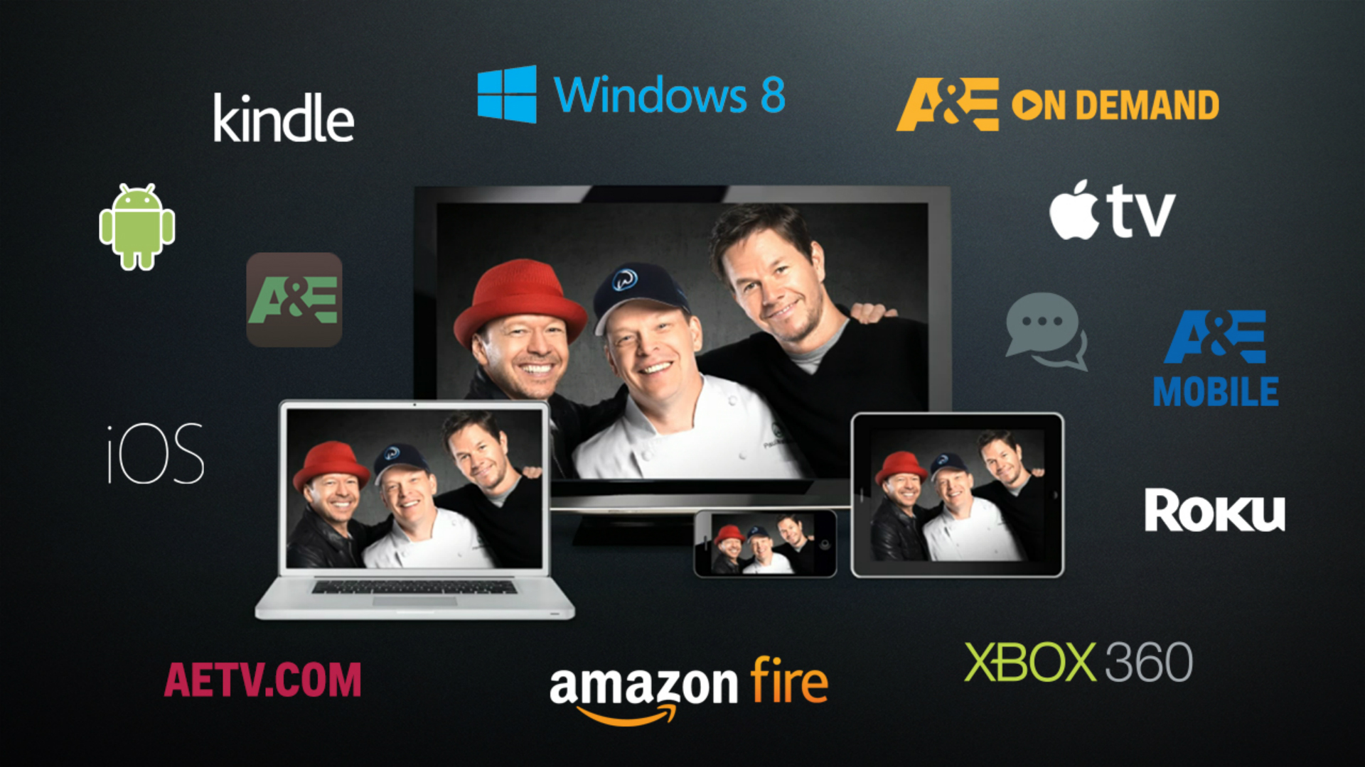
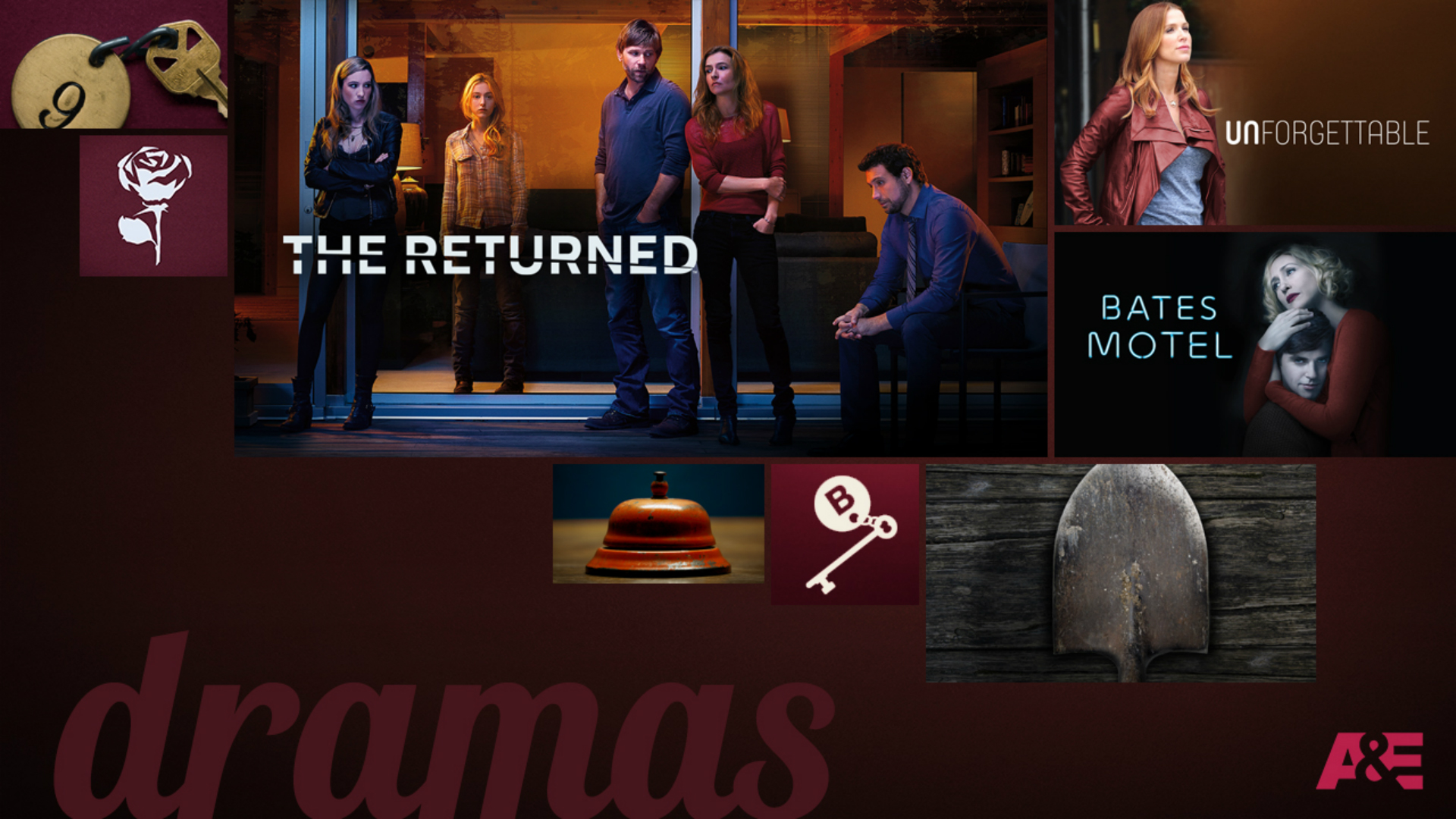
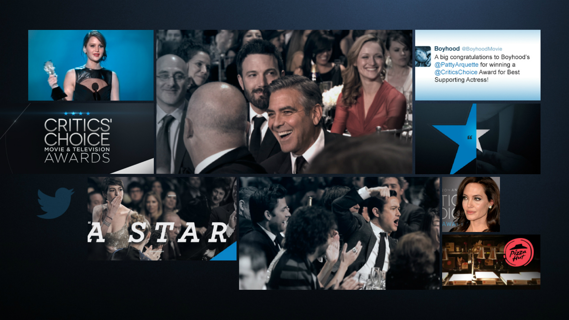
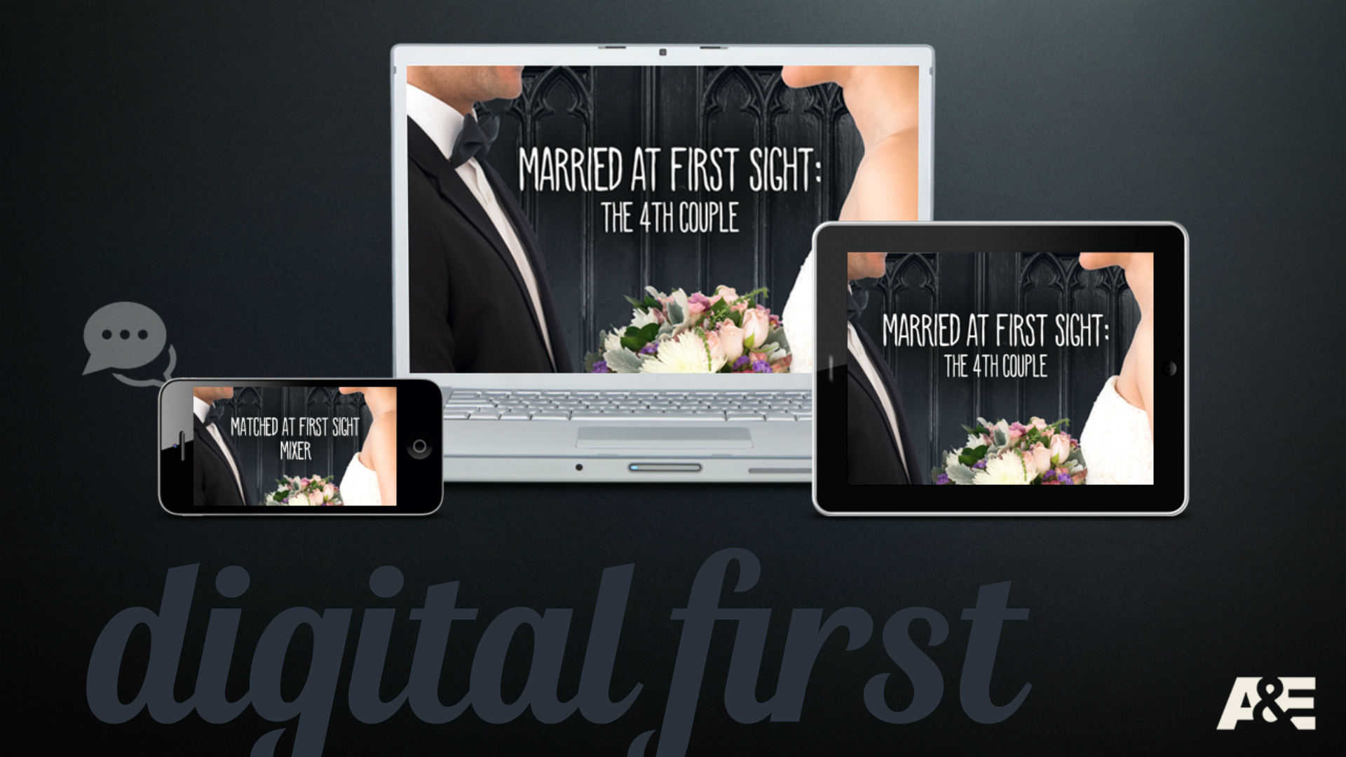
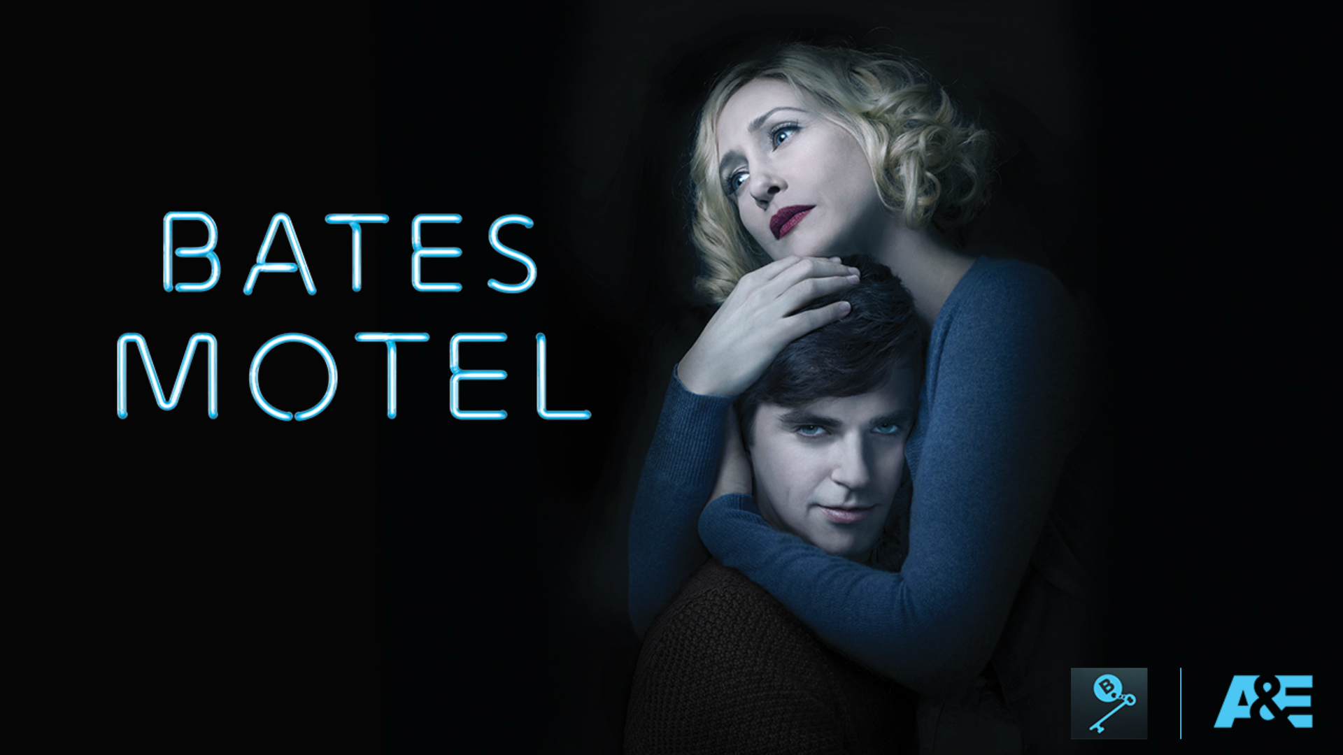
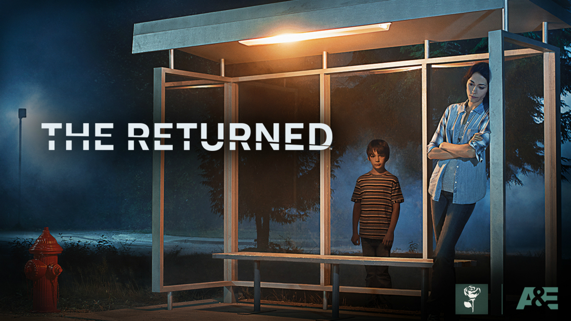
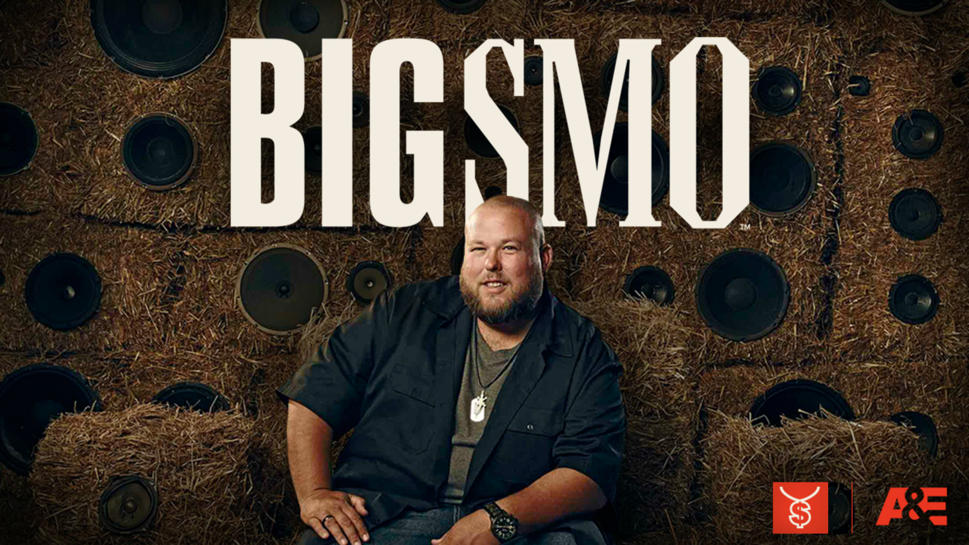
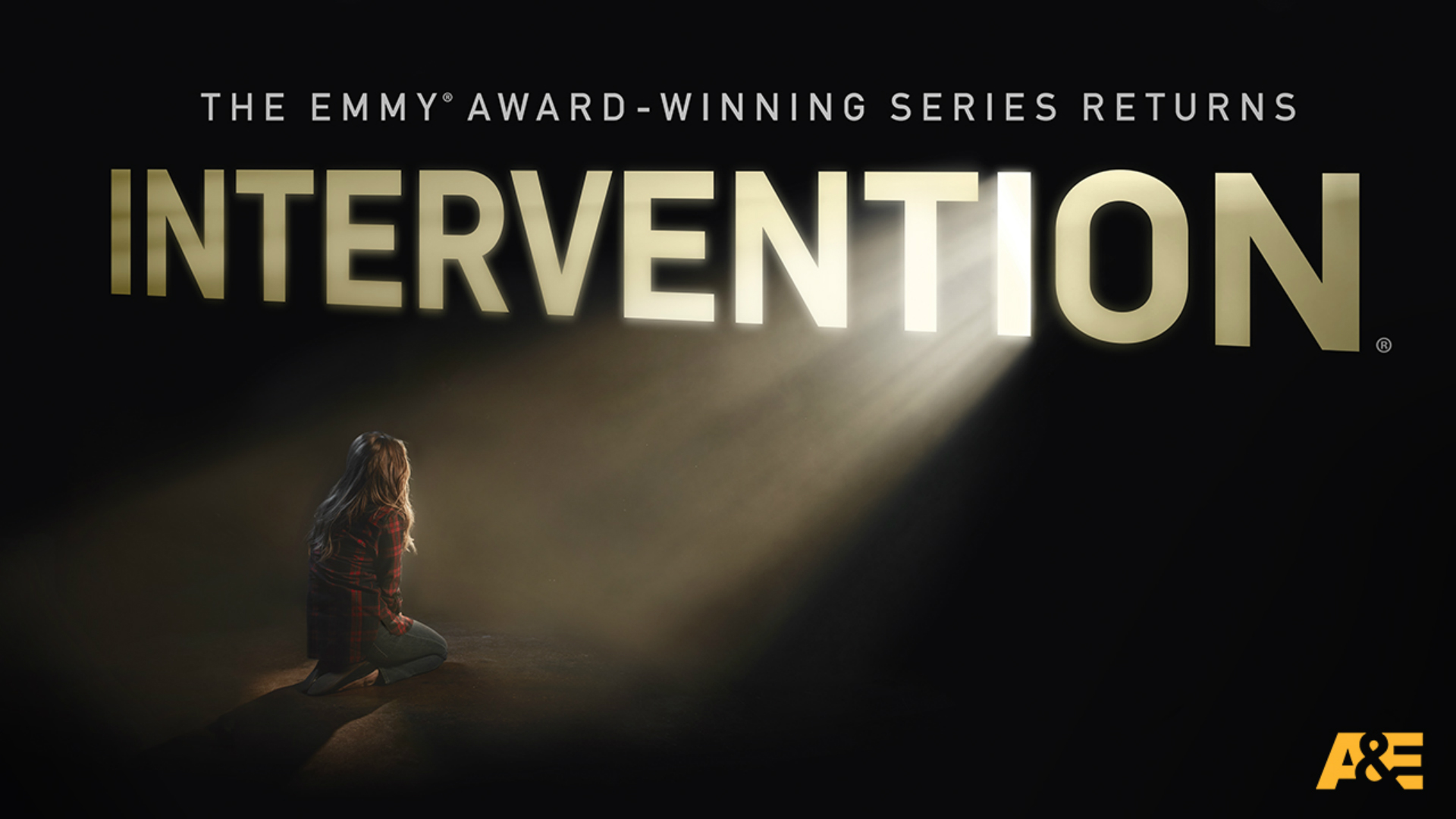
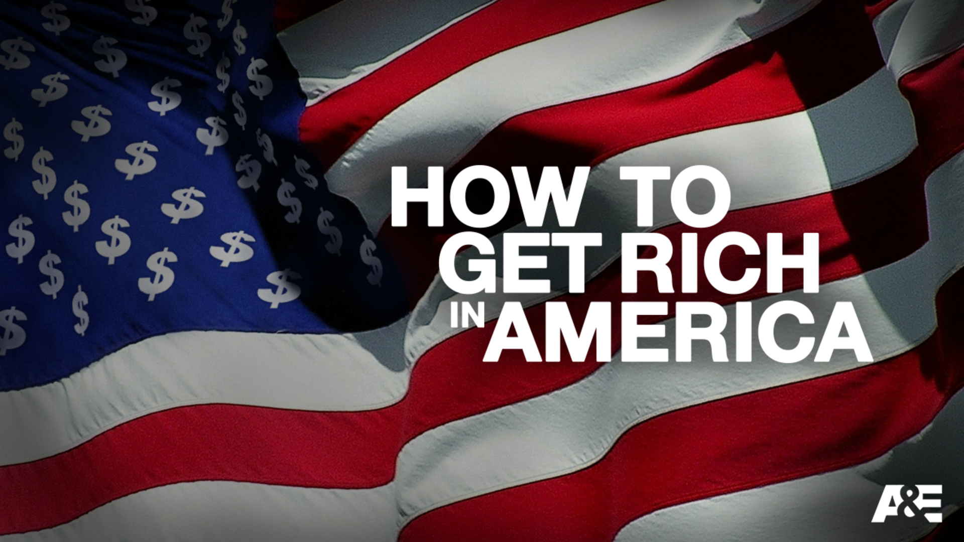
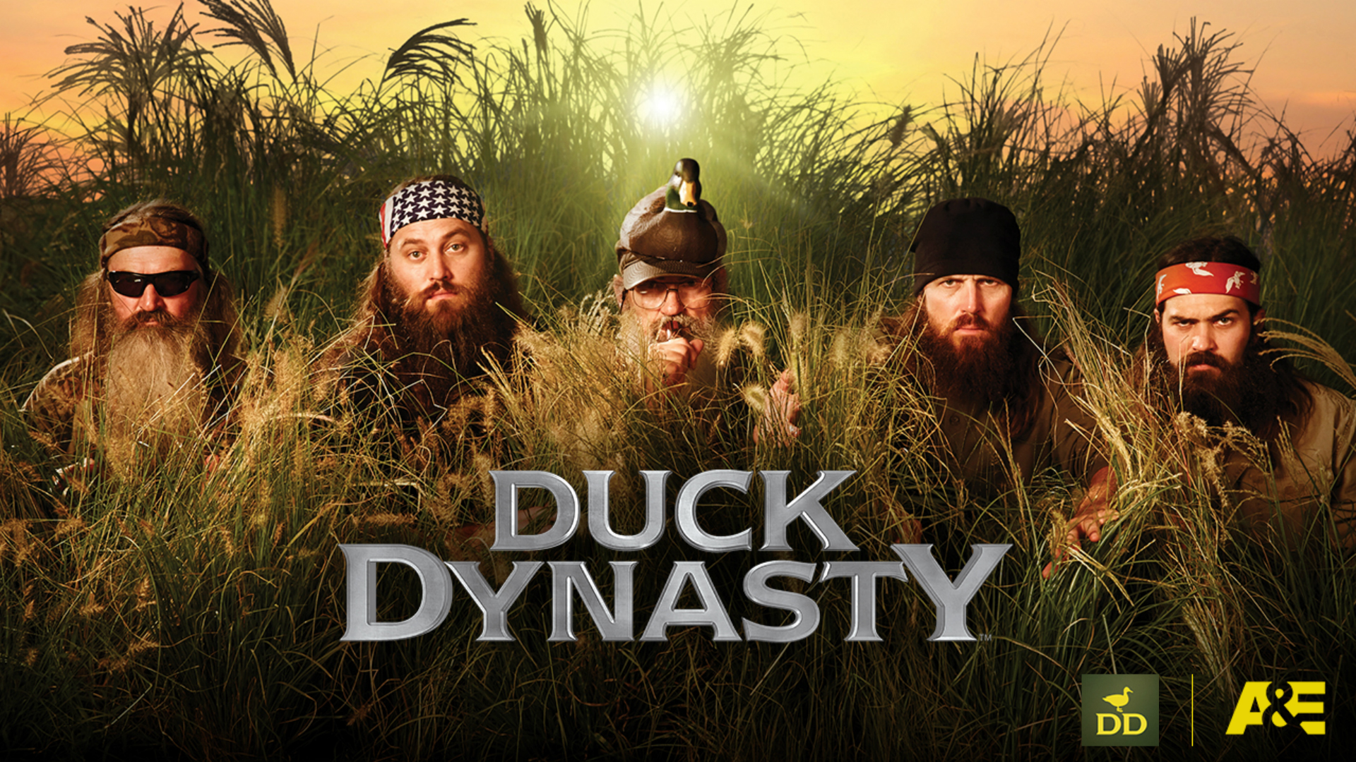
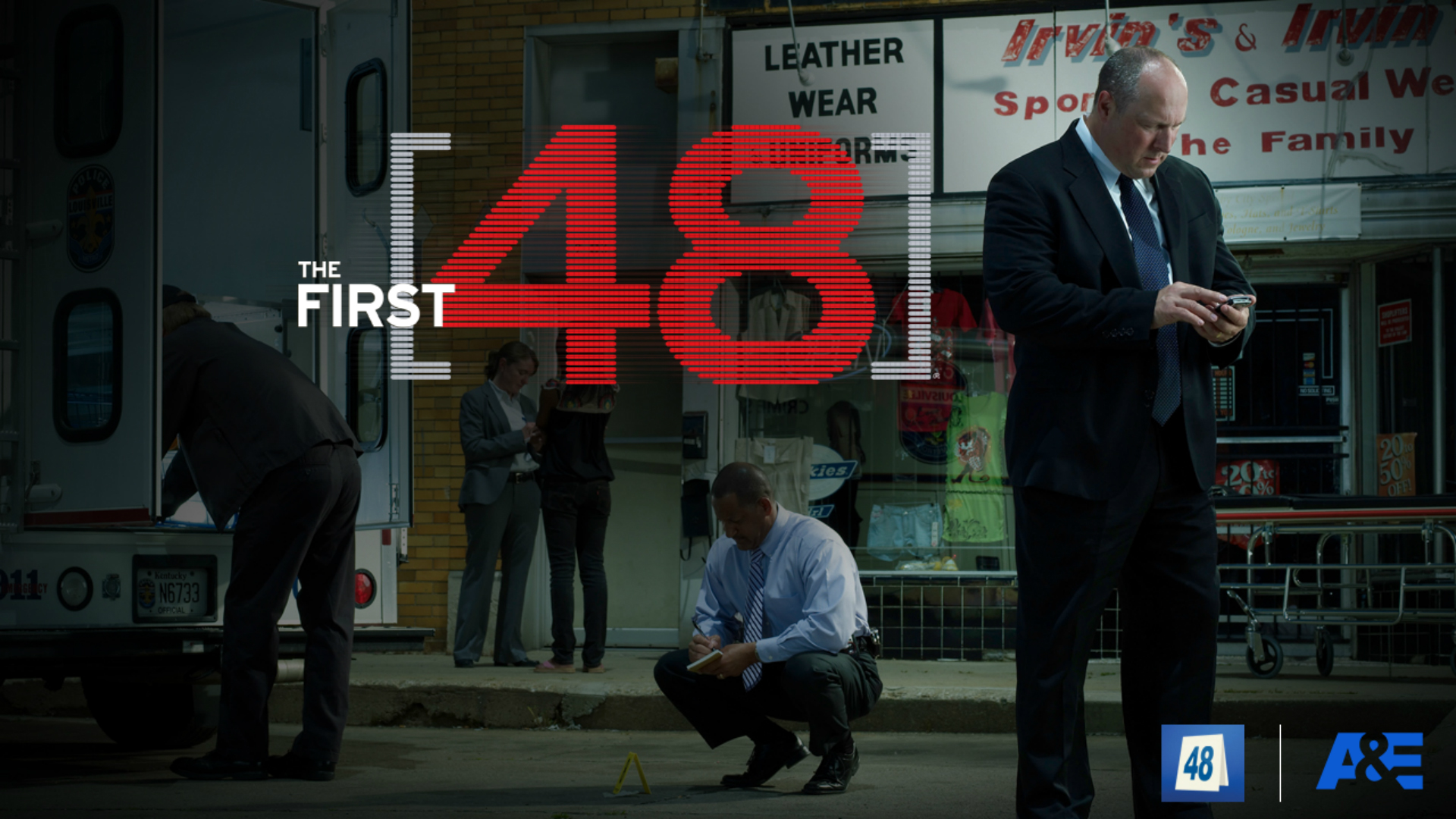
The A&E Upfront Presentation was created to portray the brand’s dark yet punchy tone, and unique view on dramatic reality. Like HISTORY, their advertising packages were distilled down to simple, easy to understand slides, further unifying the A+E Networks style. A&E’s new branding, which included unique iconography and a bold color palette, was utilized throughout all slides to ensure cohesion. Please click or swipe through the slides below:
BRAND SLIDES
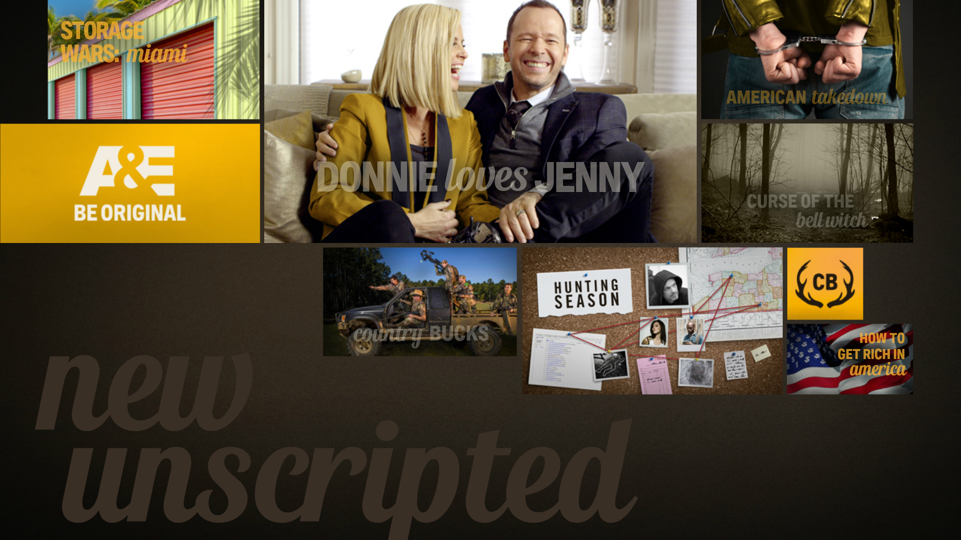
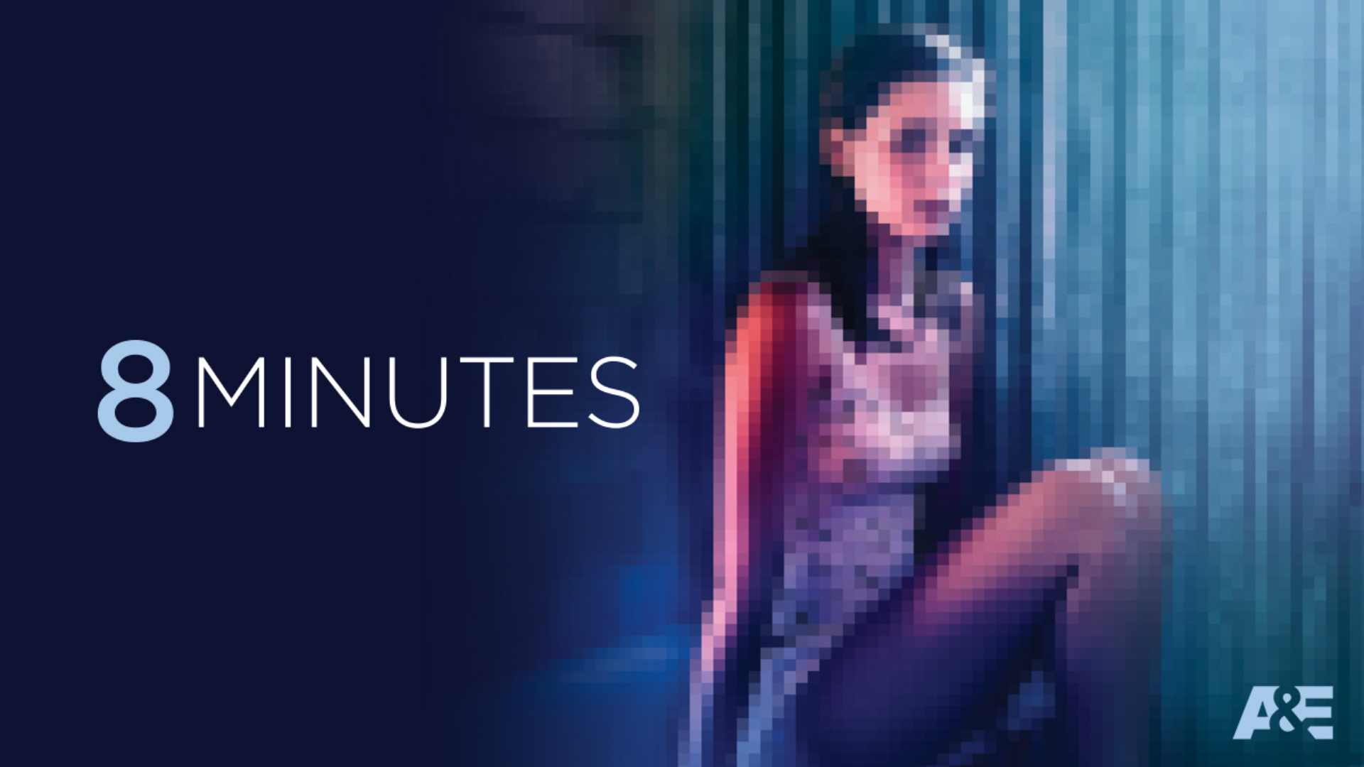
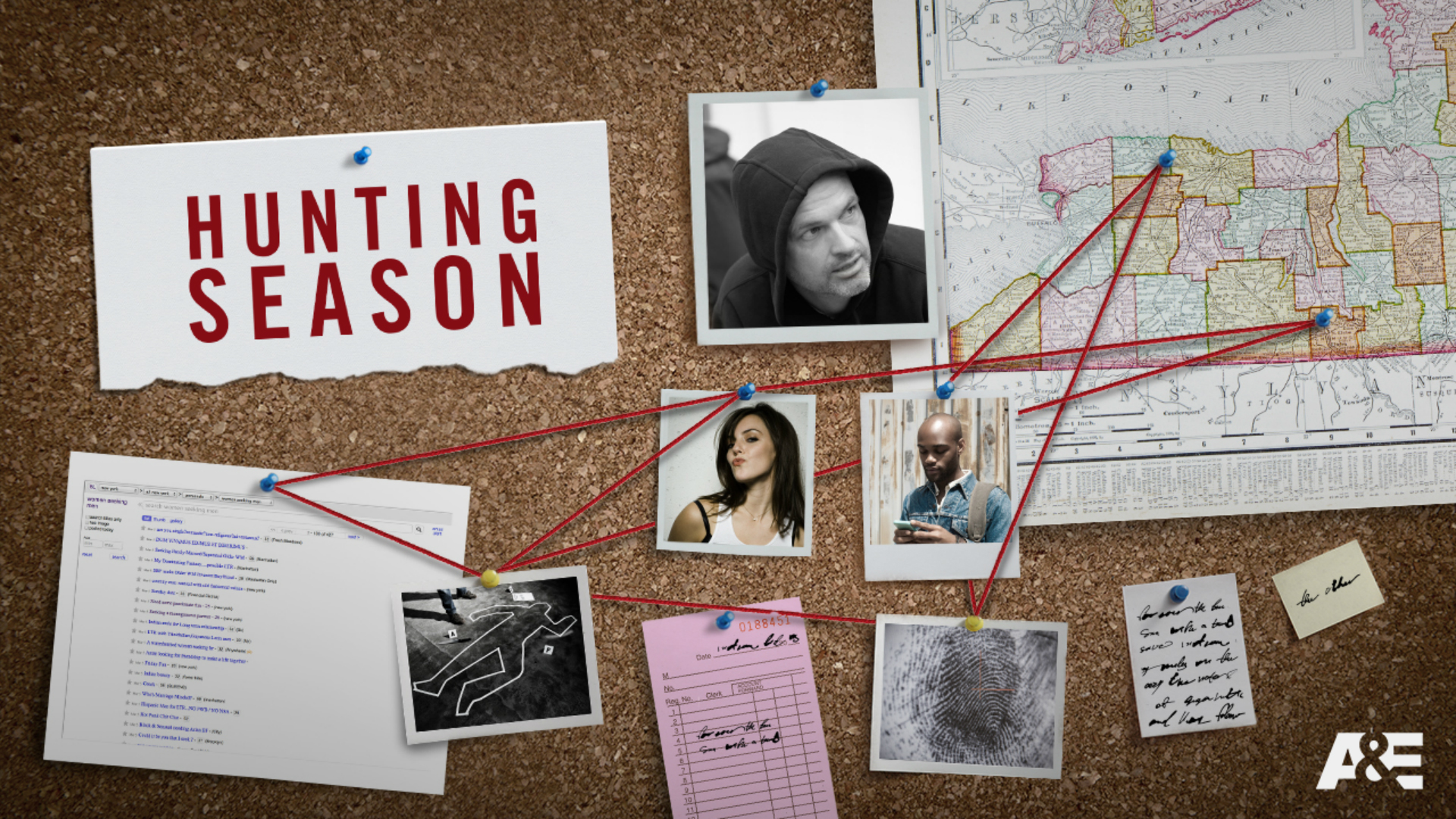
PROGRAM SLIDES
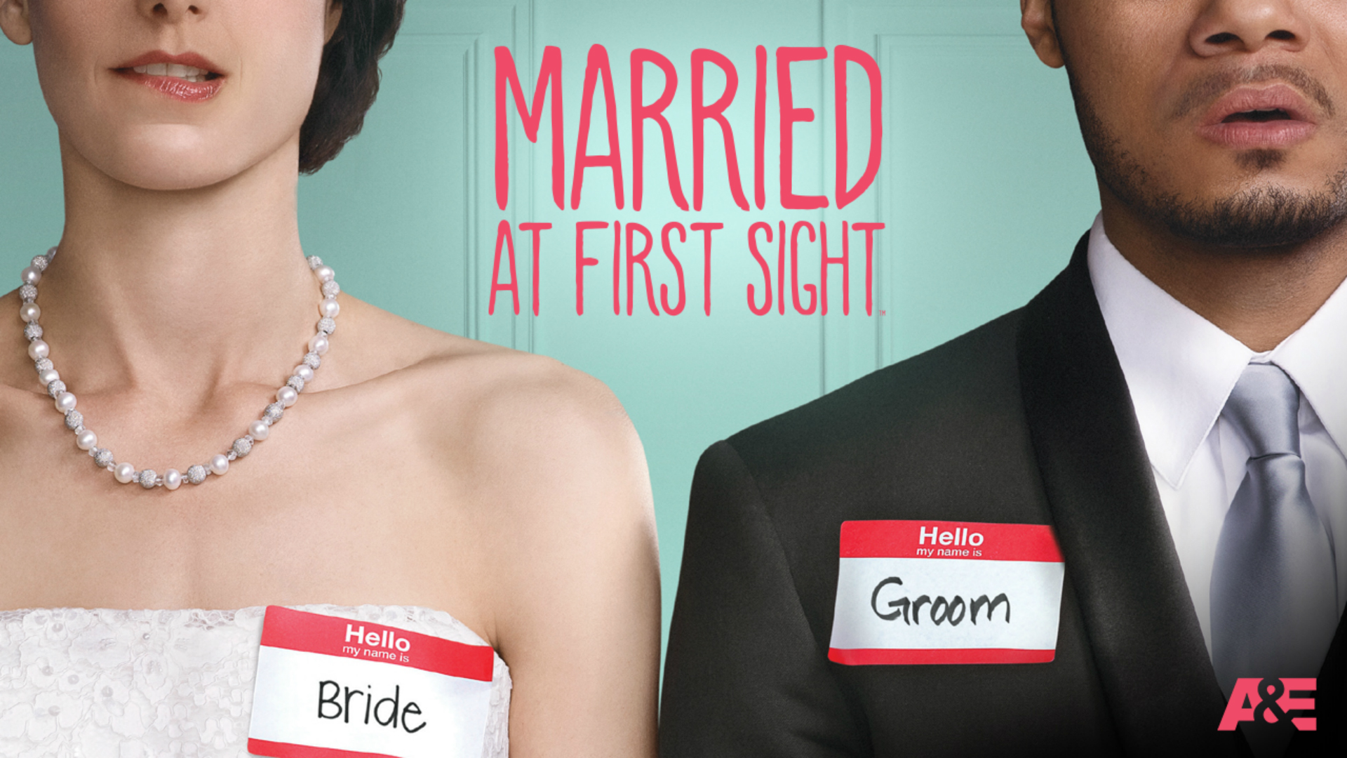
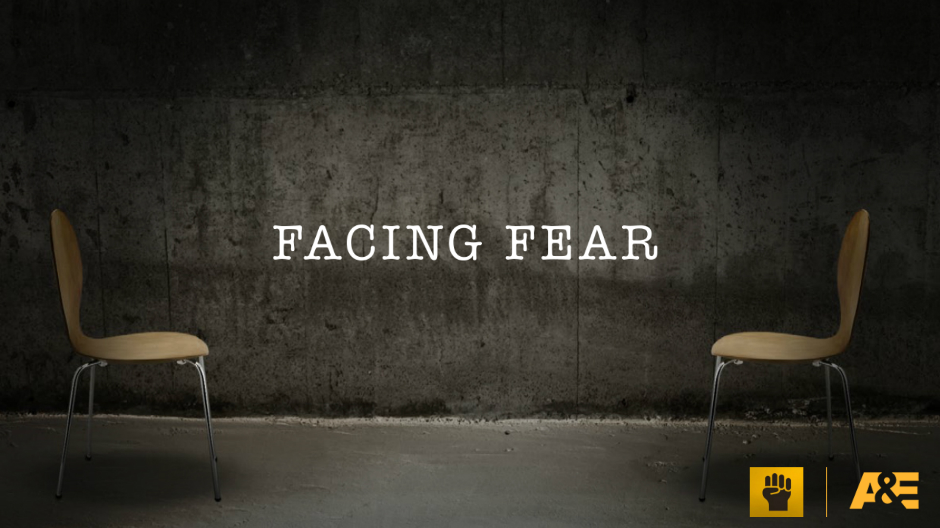
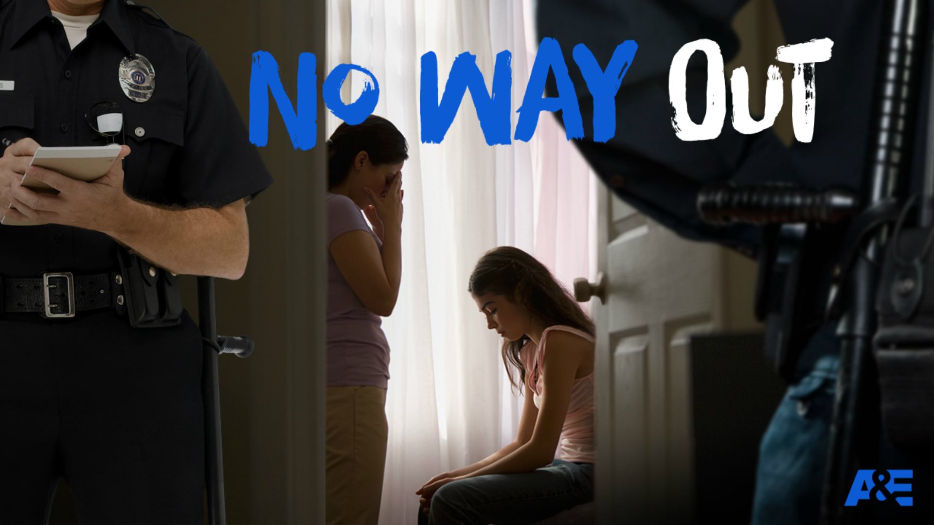
A&E’s program slides were created with the same “at a glance” thinking as HISTORY in mind, but through their darker more visceral lens. And just like HISTORY, some shows were still in the concept phase with no images or film available. With just a text description of the show, we developed slides that brought these concepts to life – and often influenced the way they ultimately looked. Please click or swipe through the slides below:
ANIMATIONS
We also created a dynamic animation style for the presentation, and developed various short transitions and clips to bring it to life and create more interest.
FYI
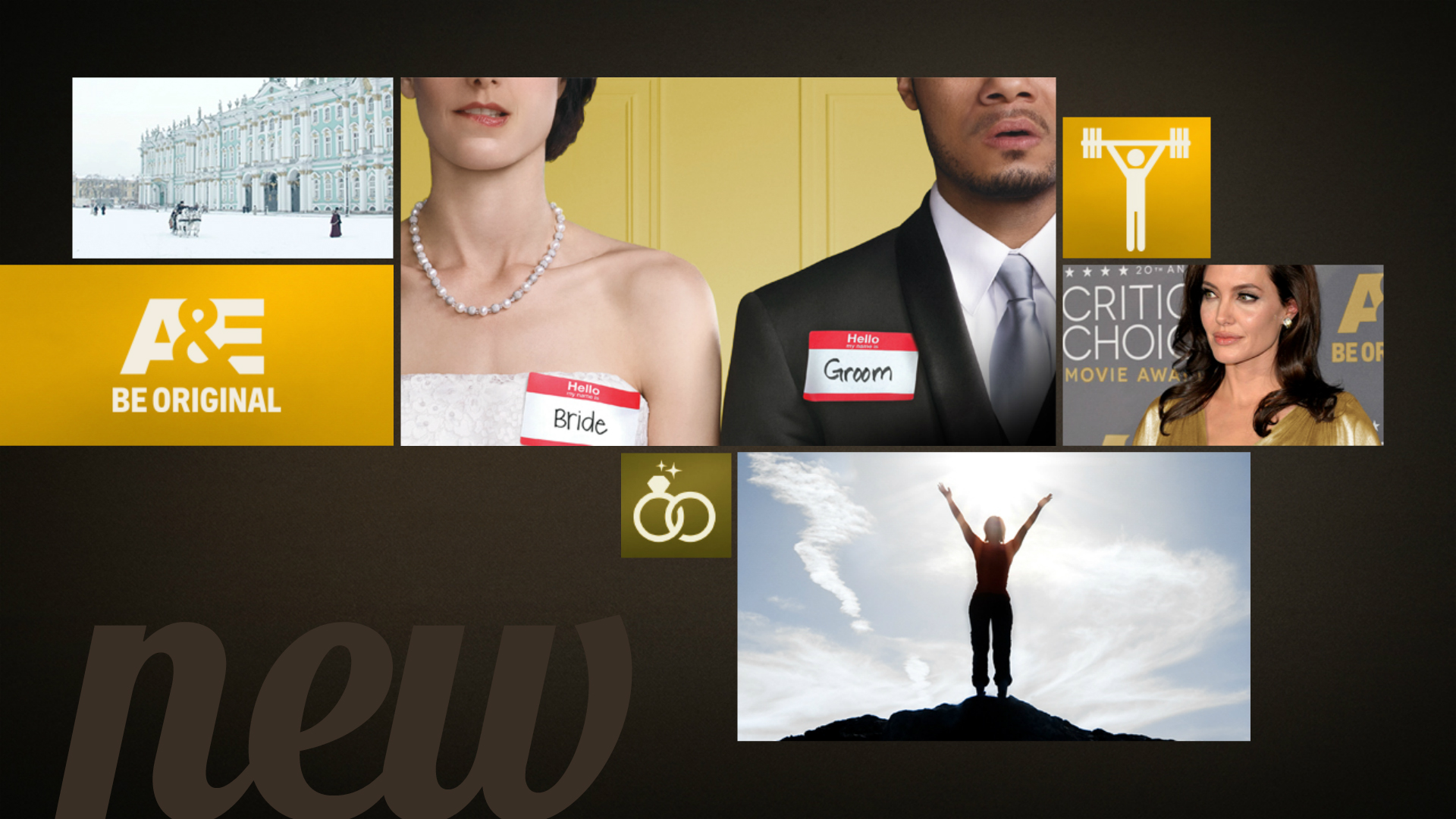
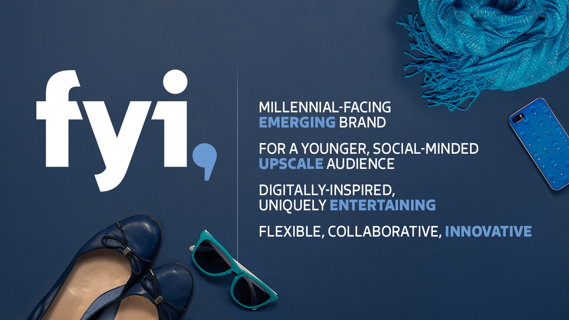
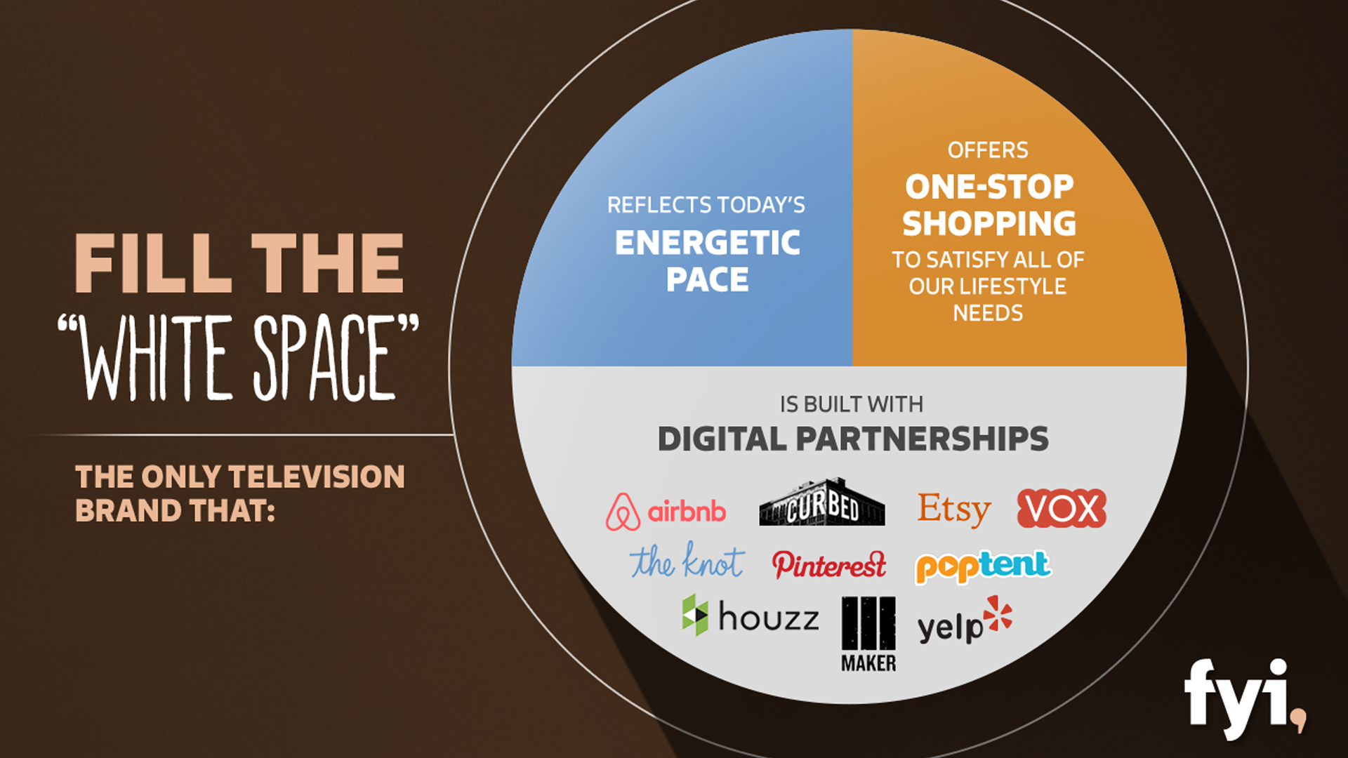
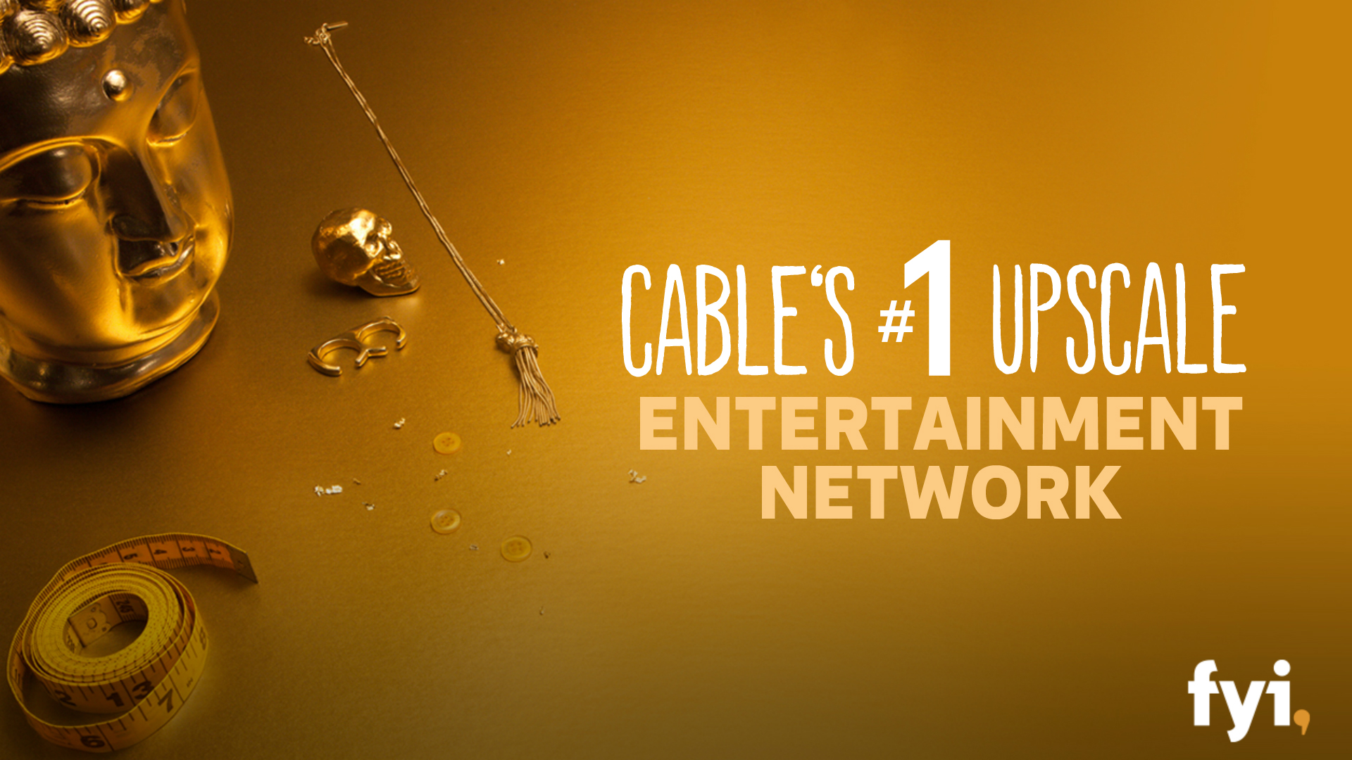
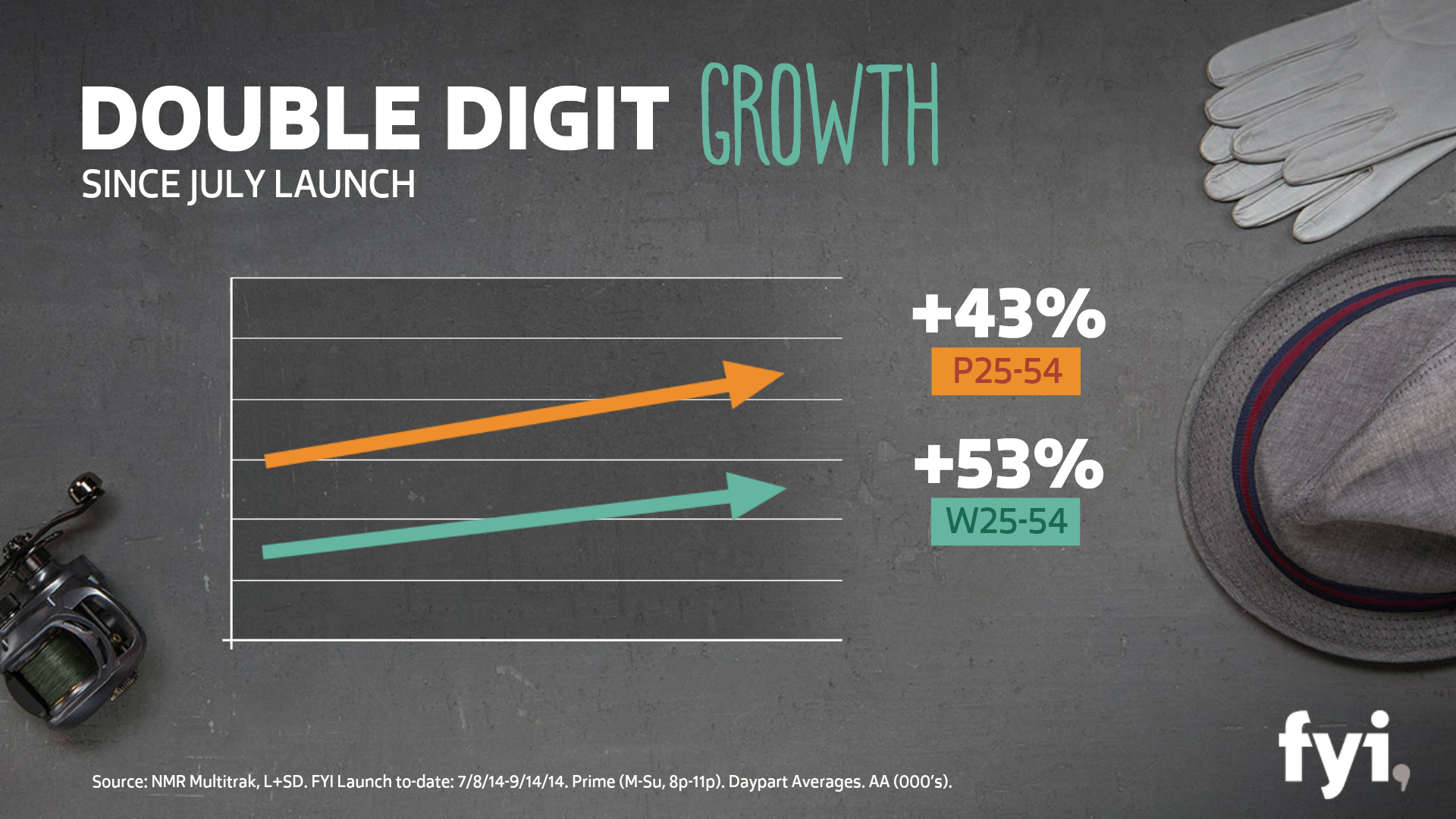
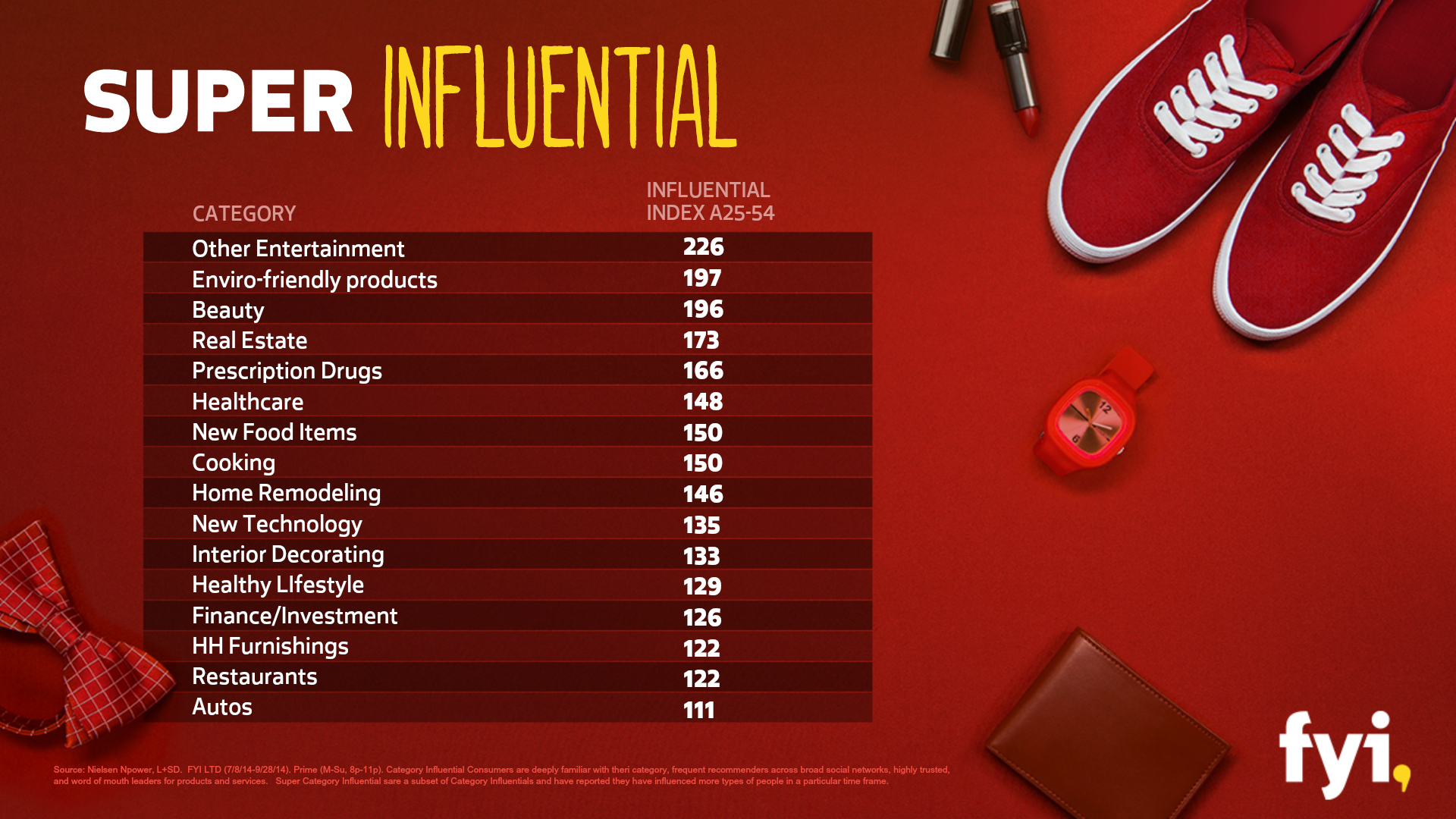
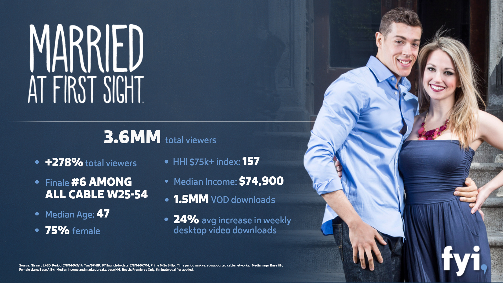
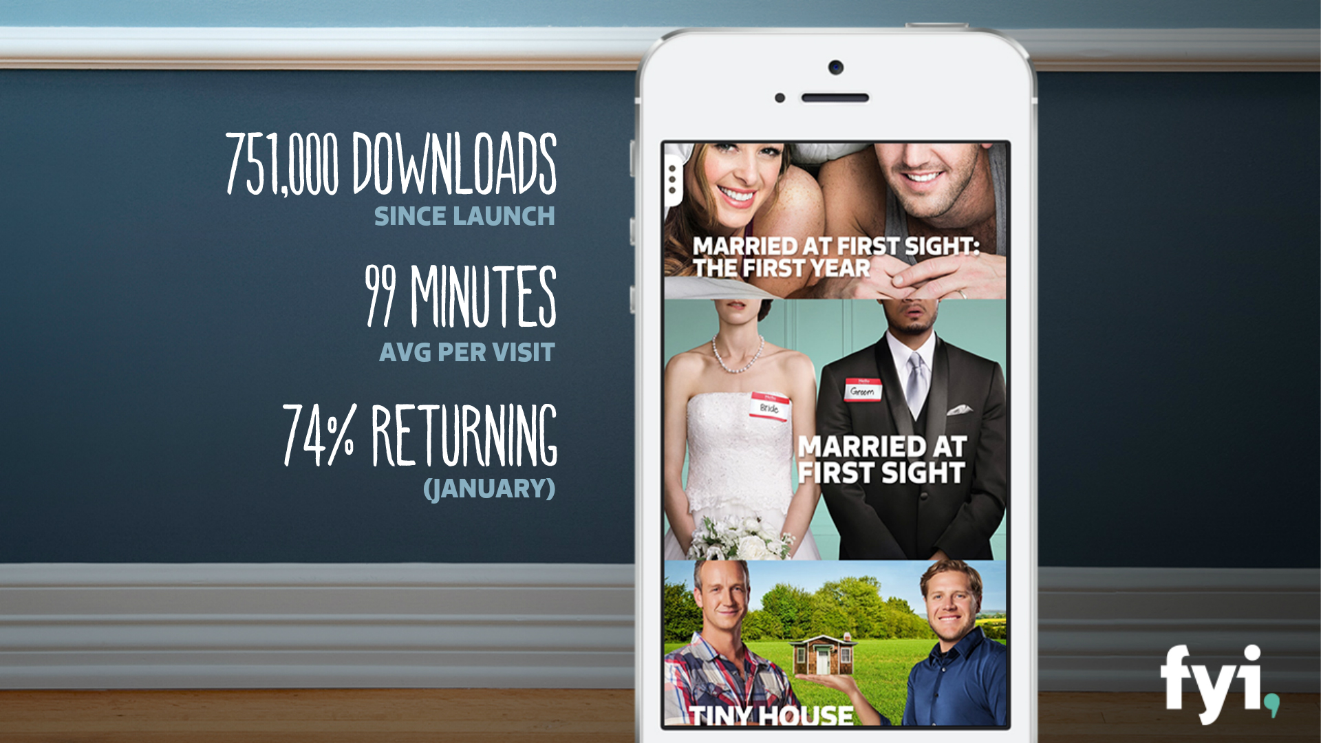
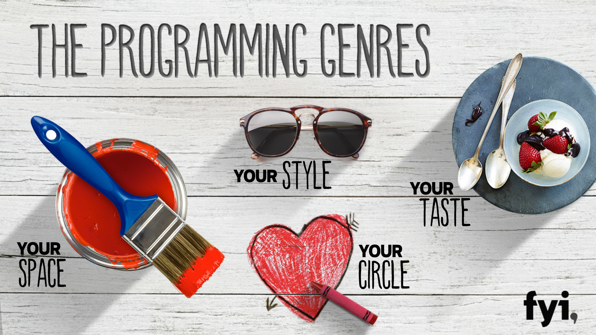
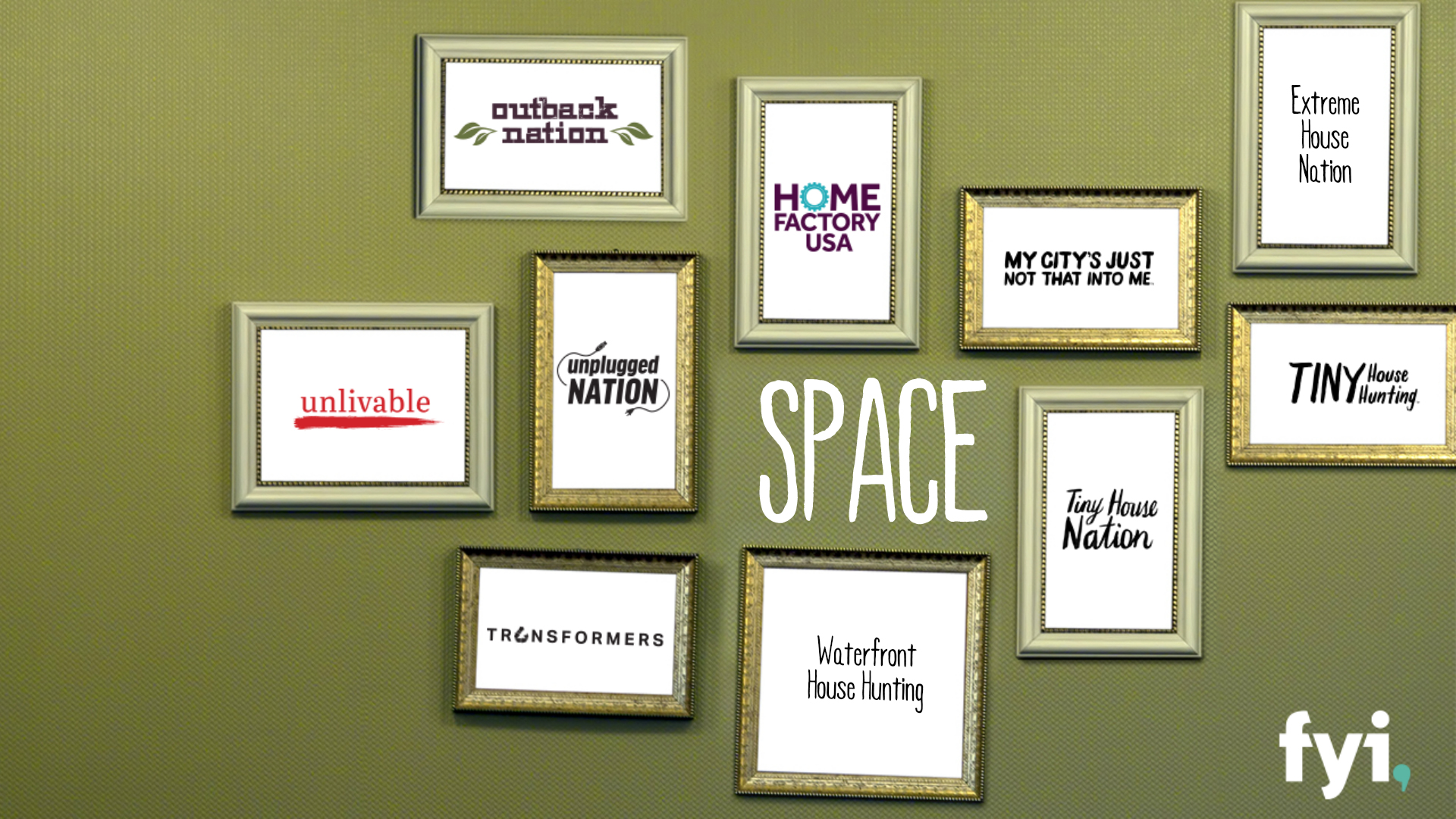
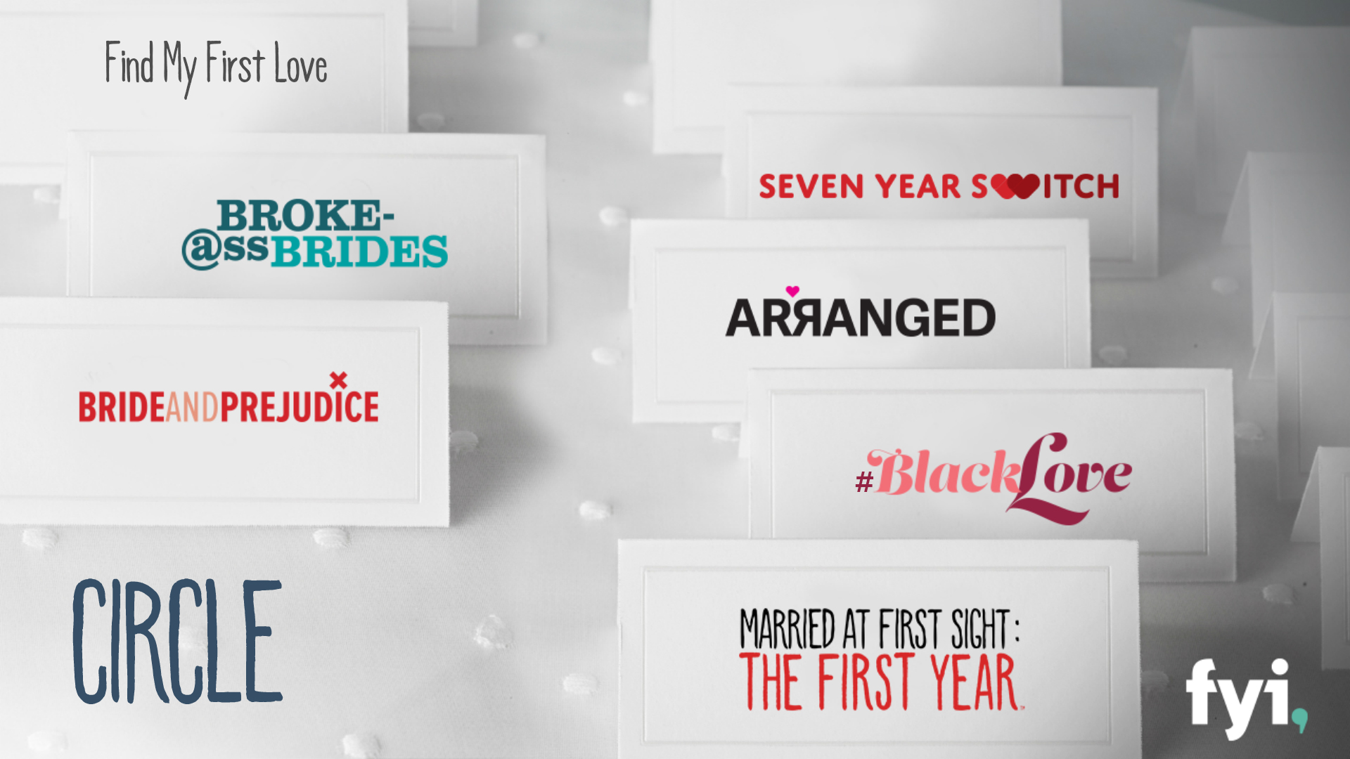
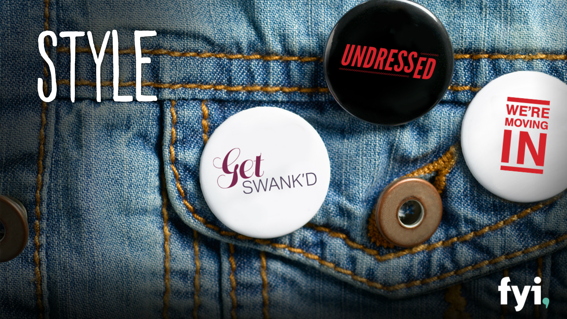
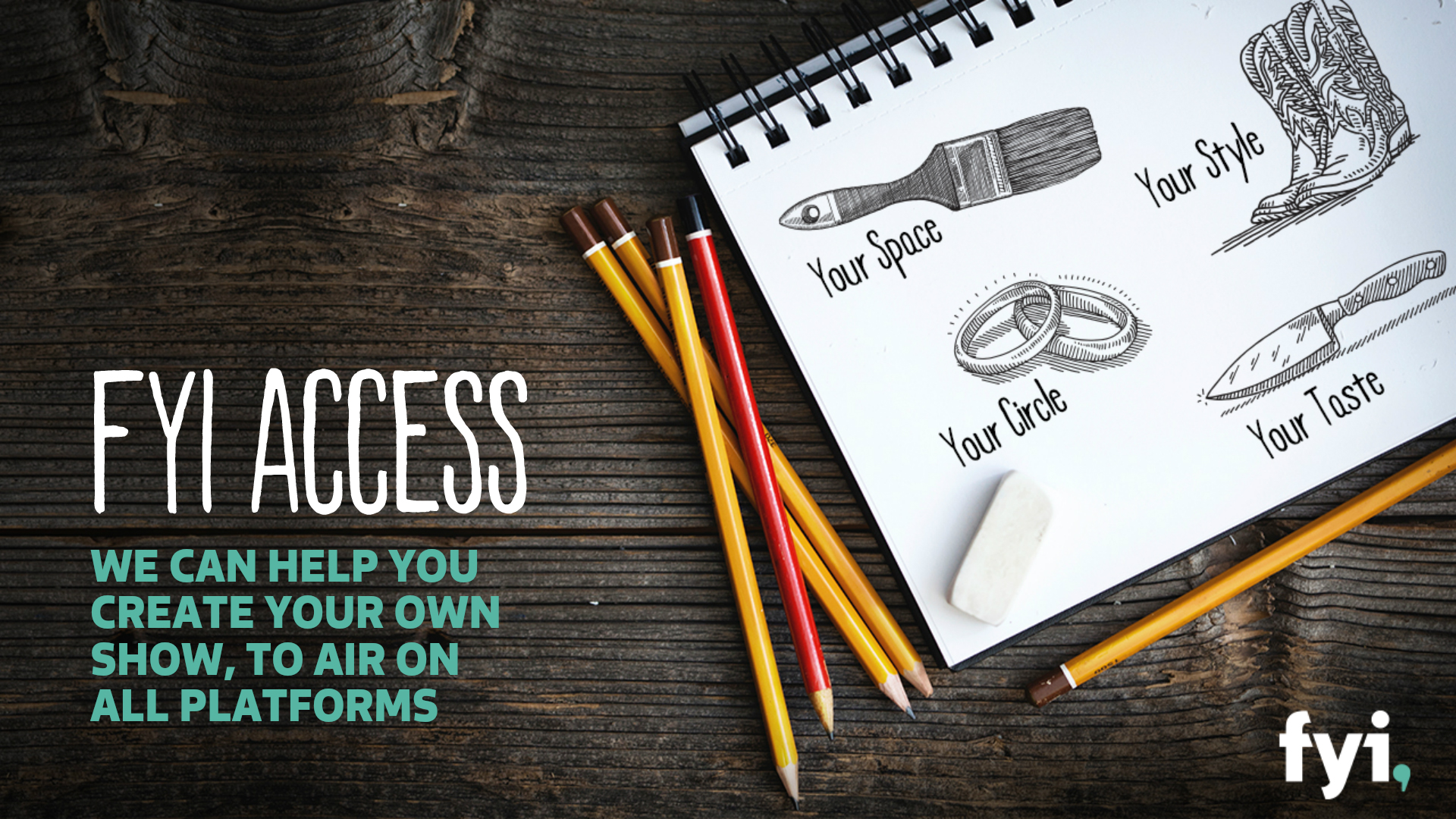
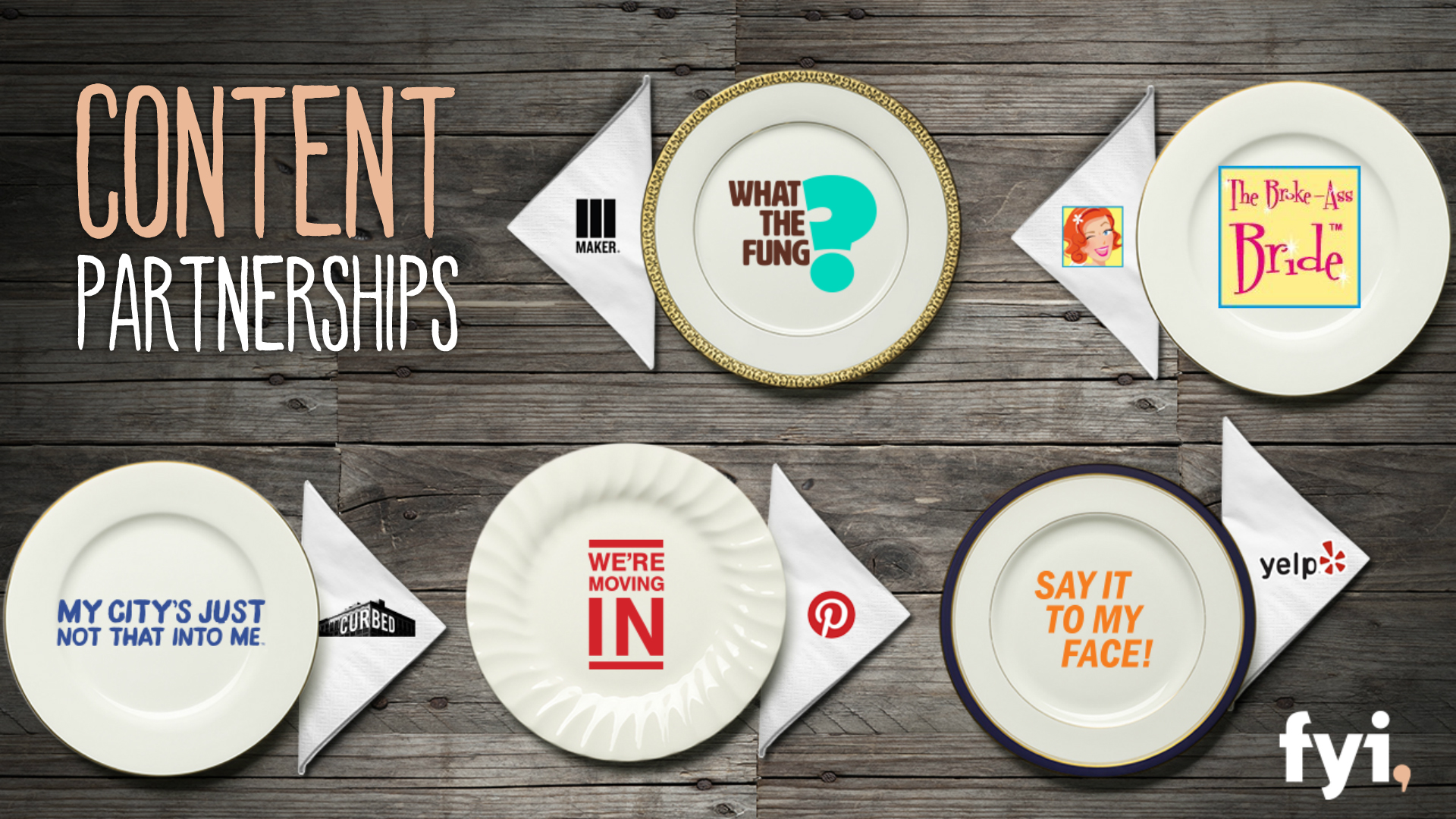
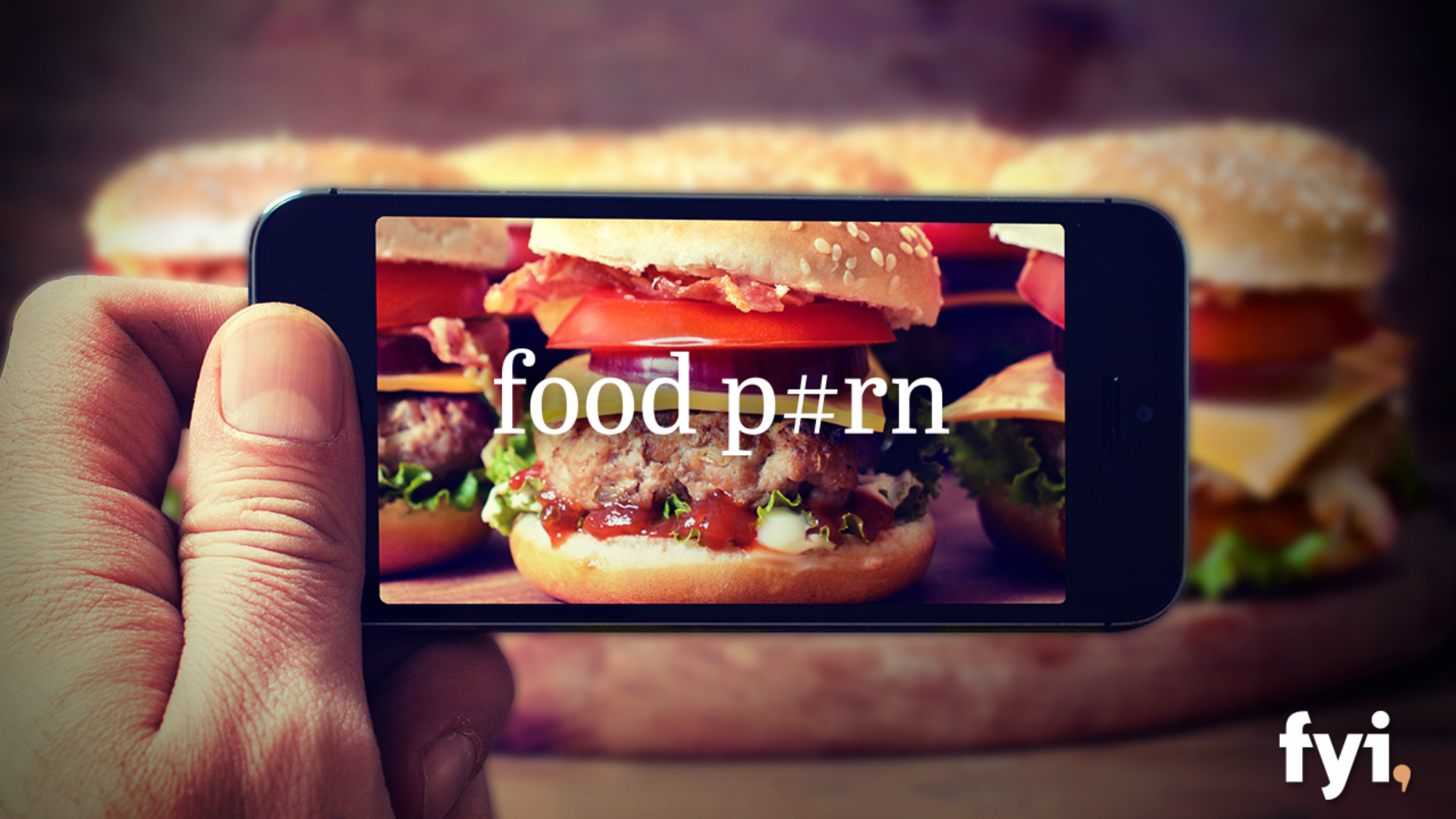
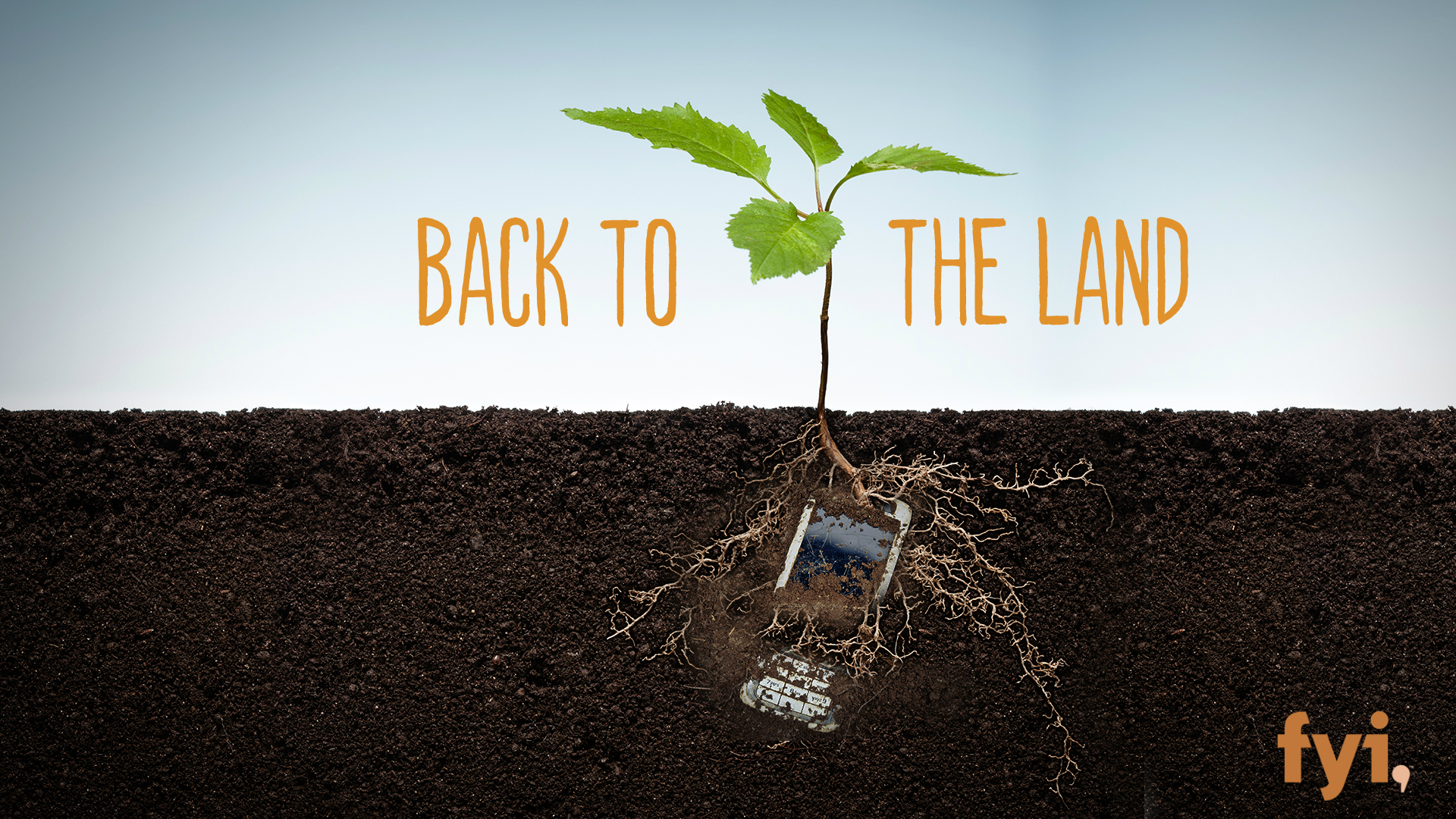
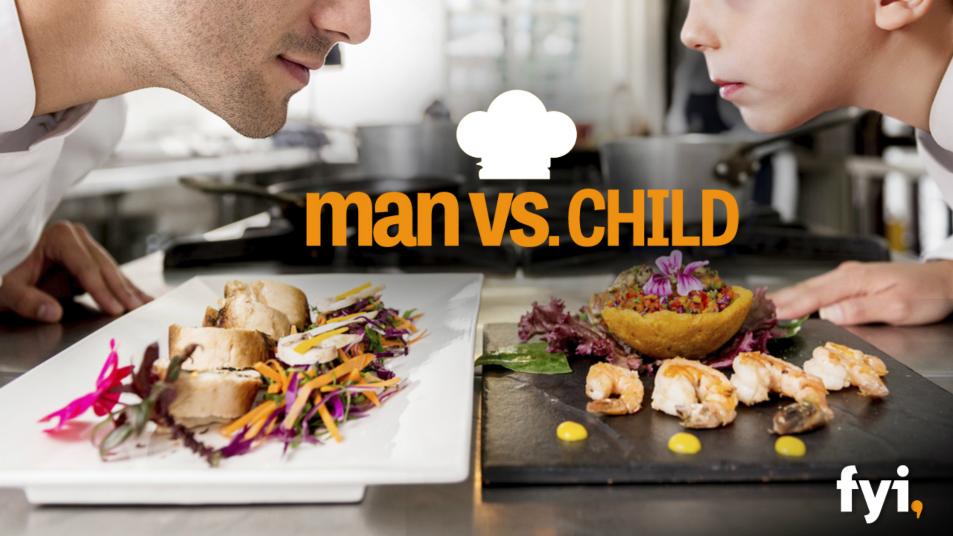
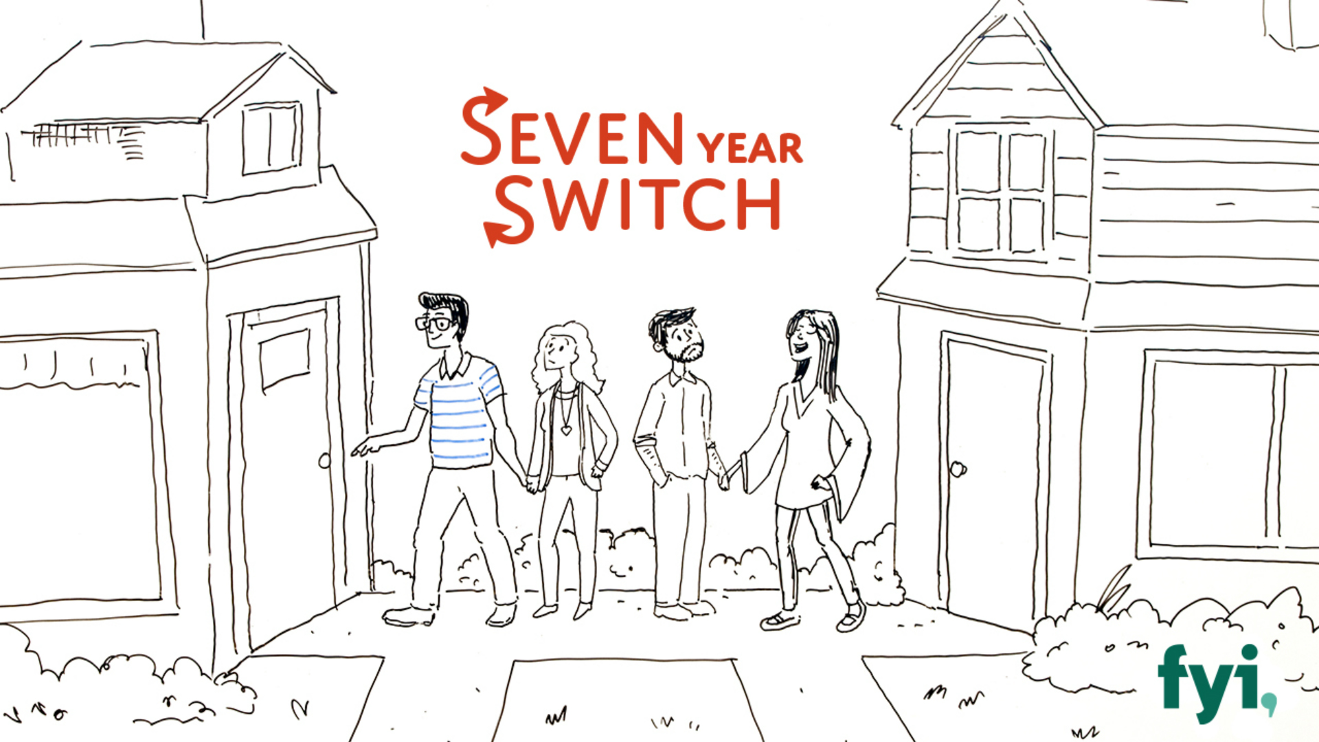
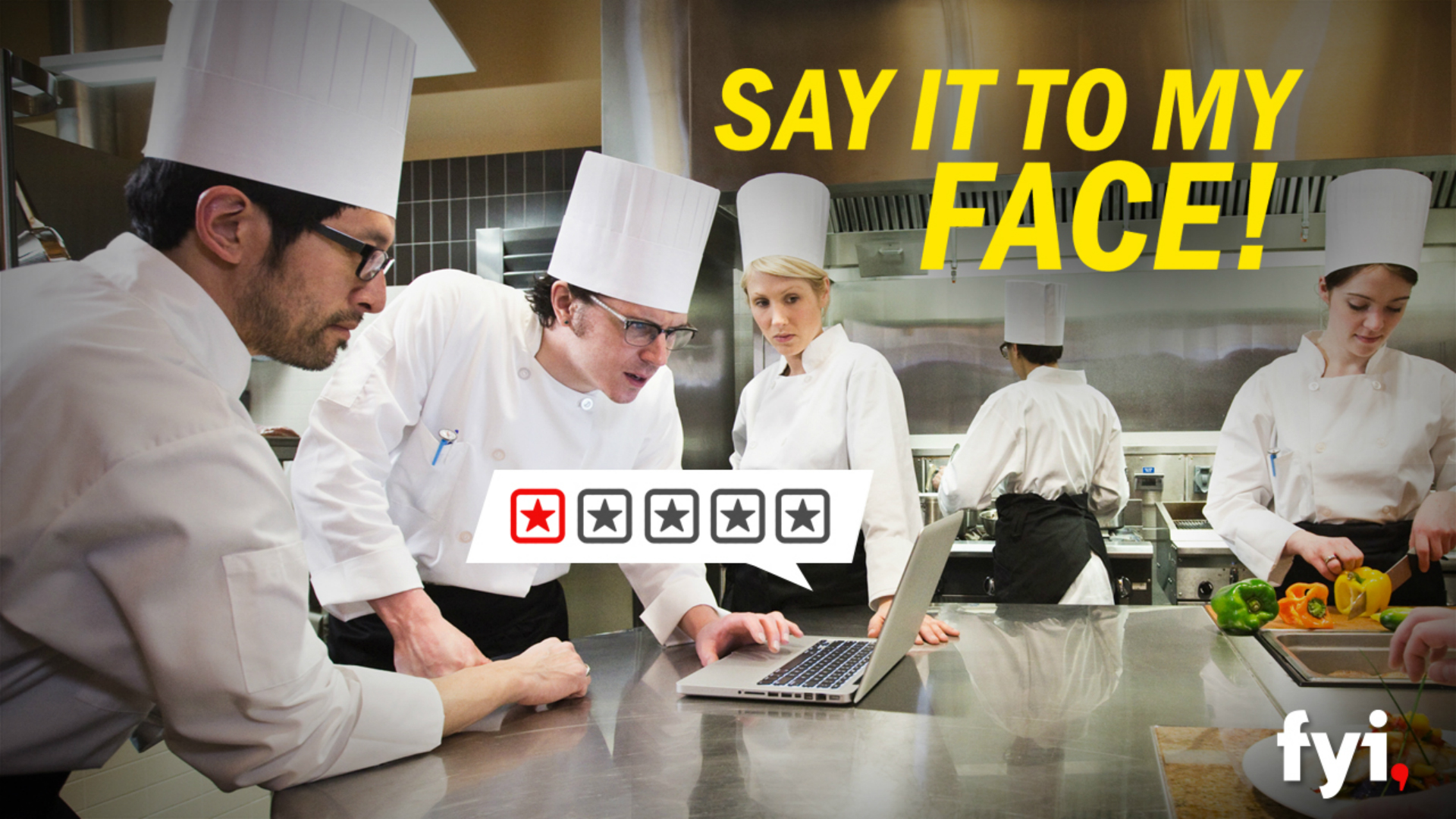
The FYI Upfront Presentation told the story of the newly launched brand and its millennial-facing, social minded, digitally inspired, DIY flavor. Rich textural imagery, and top-down shots of expressive objects and accessories, and kitschy hand-rendered elements were used to communicate the brand’s positioning and its advertising opportunities. Please click or swipe through the slides below:
BRAND SLIDES
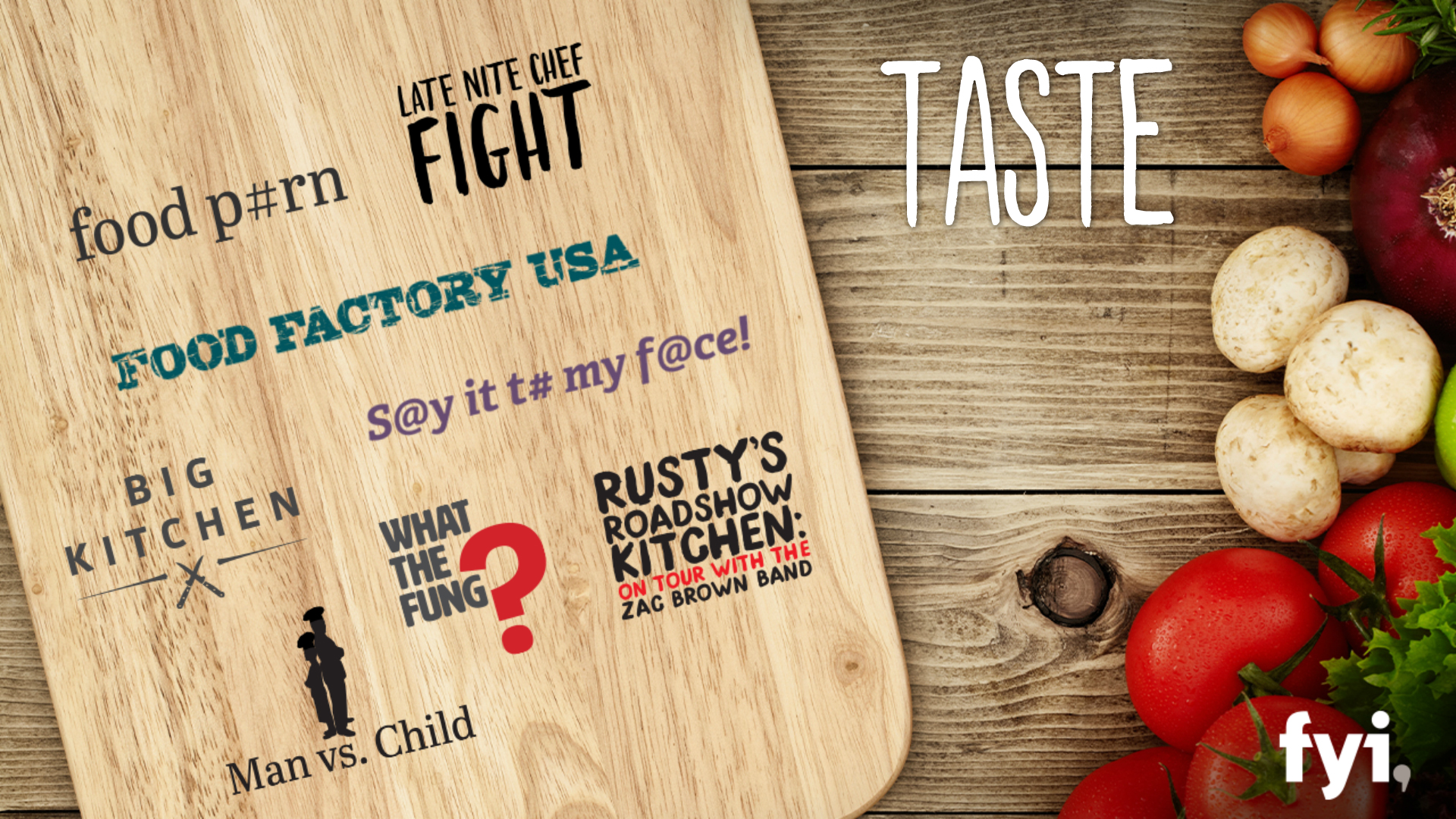
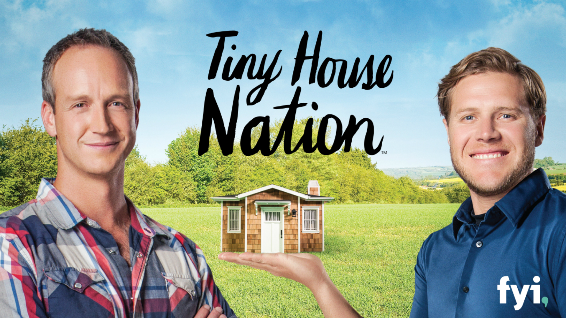
PROGRAM SLIDES
The FYI program slides were created with the same “at a glance” thinking as HISTORY and A&E. And again, we created many of these slides based on just a text description. By following the formula we developed, all materials felt like A+E Networks, while maintaining FYI’s unique brand identity. Please click or swipe through the slides below:
LIFETIME
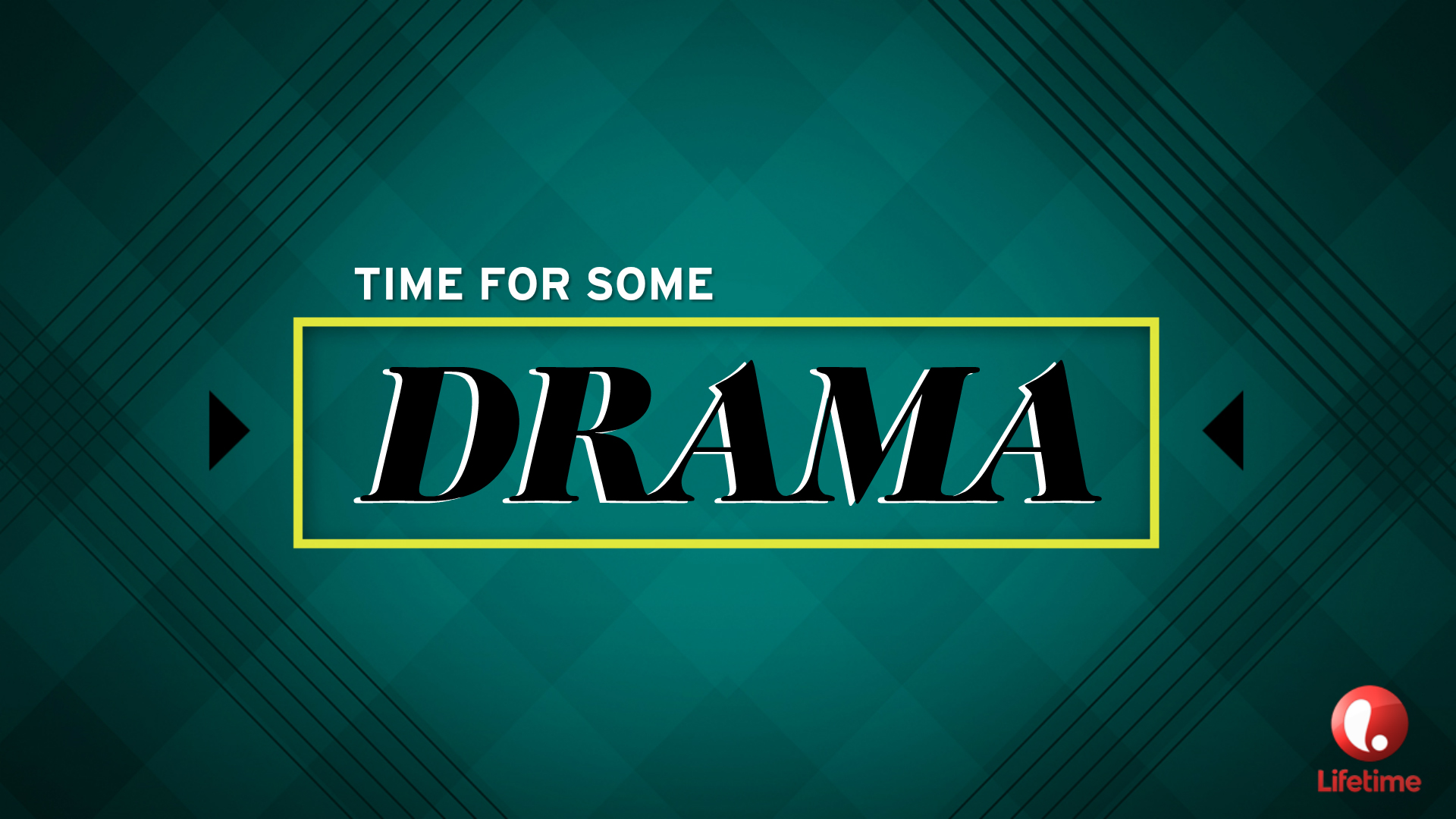
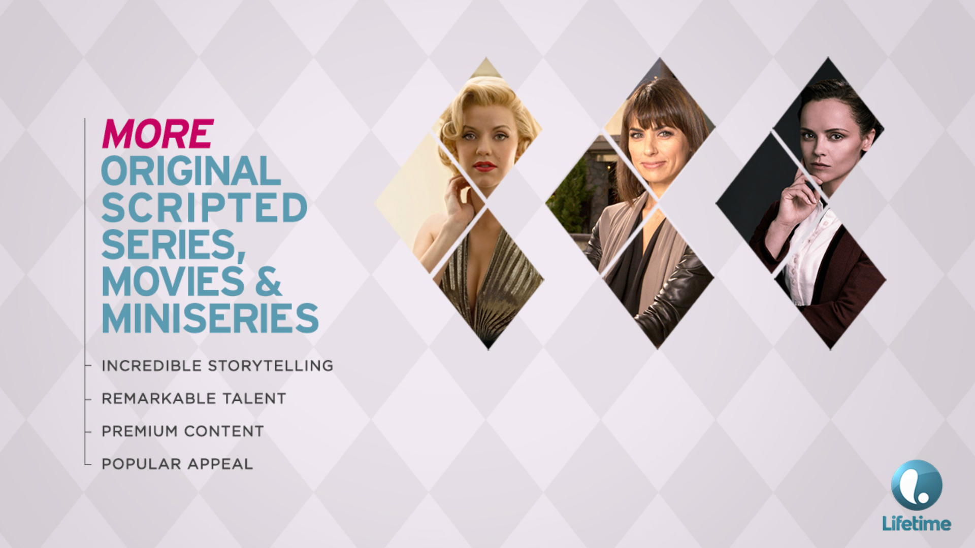
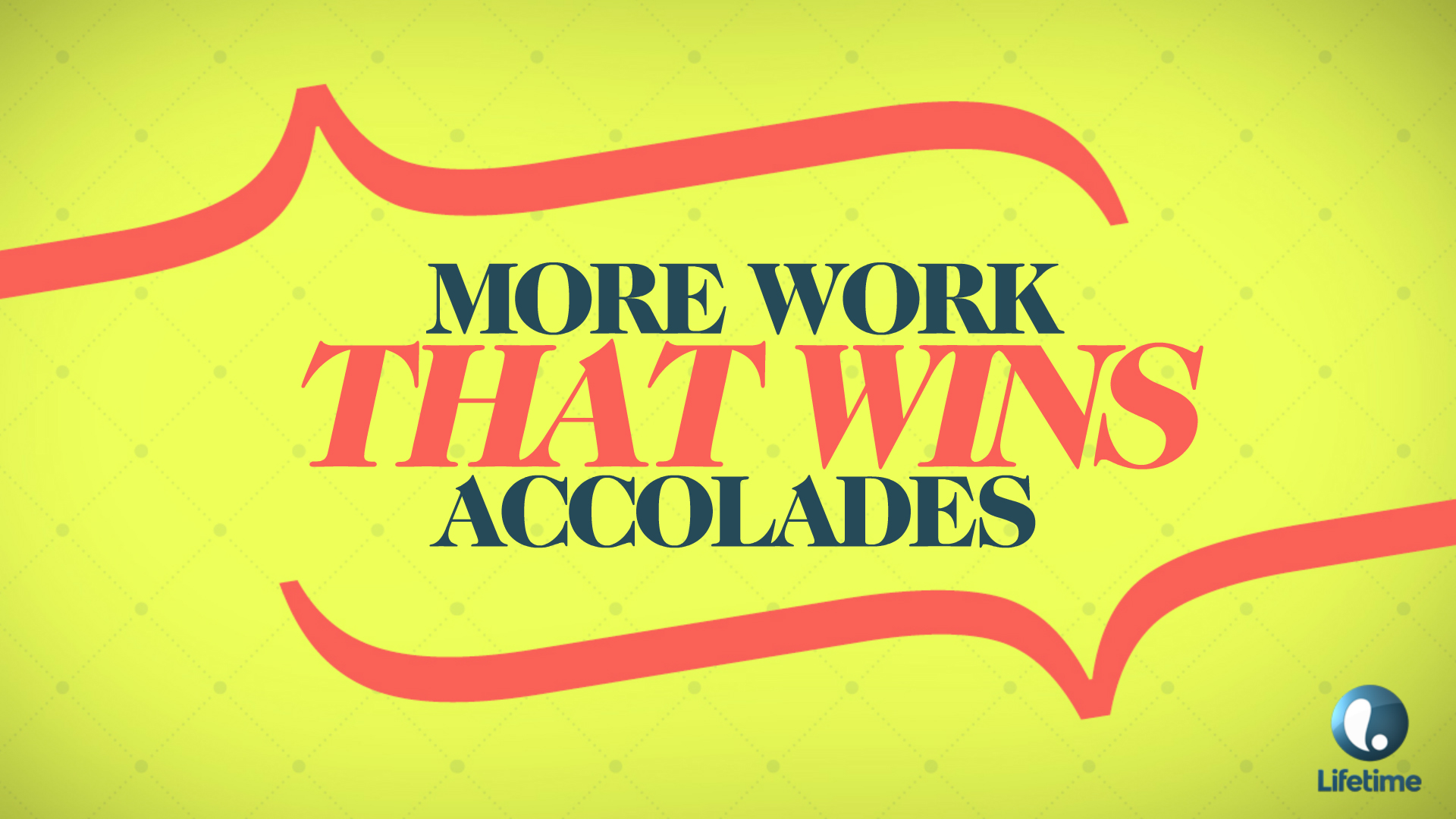
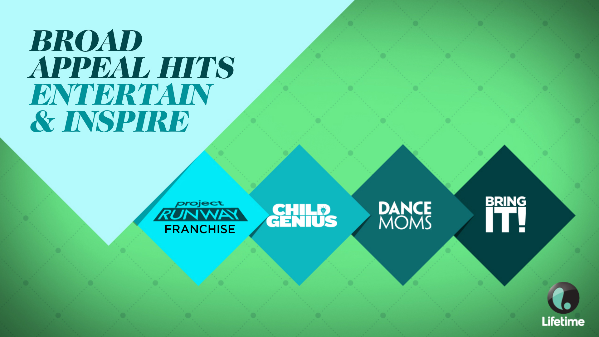
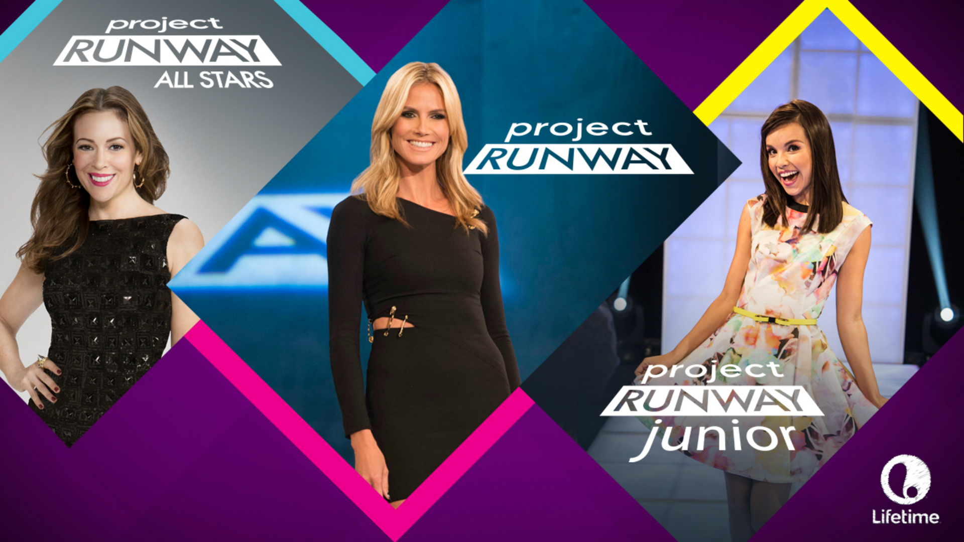
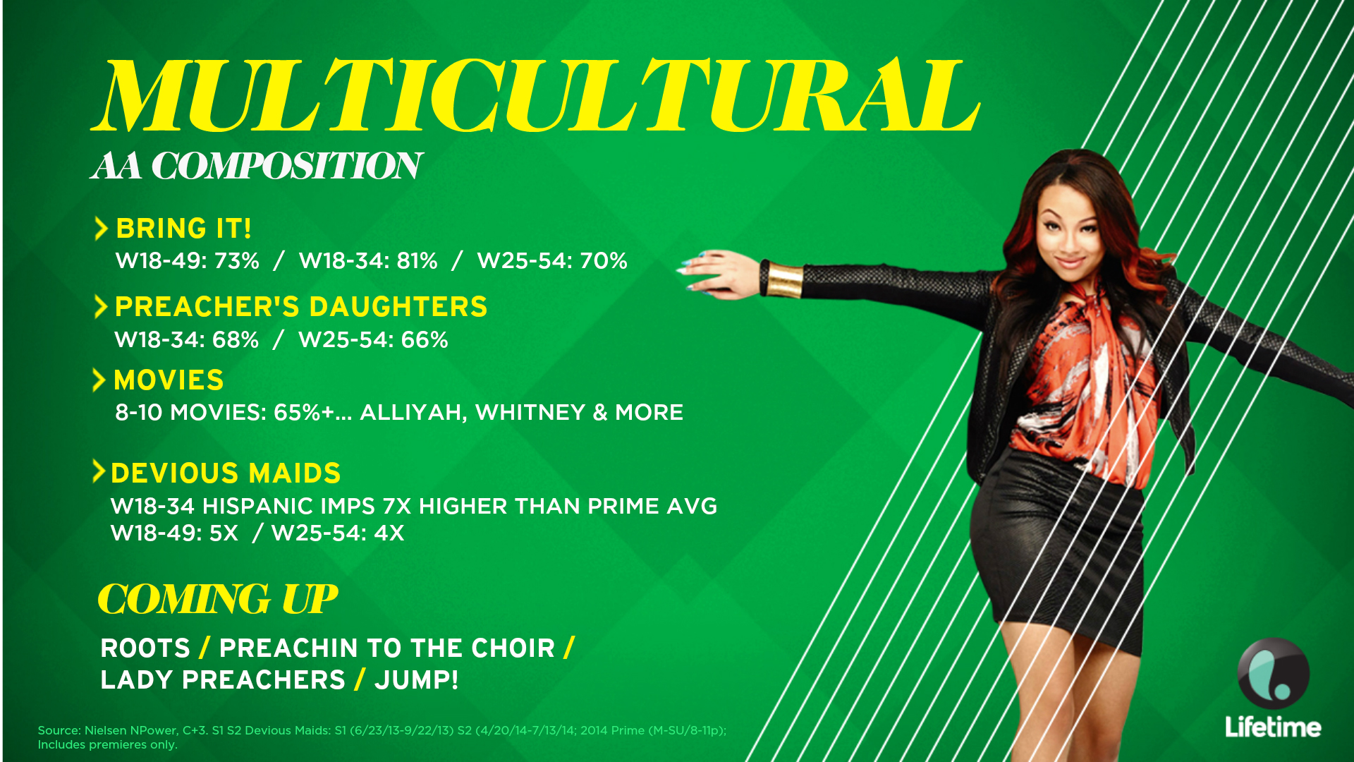
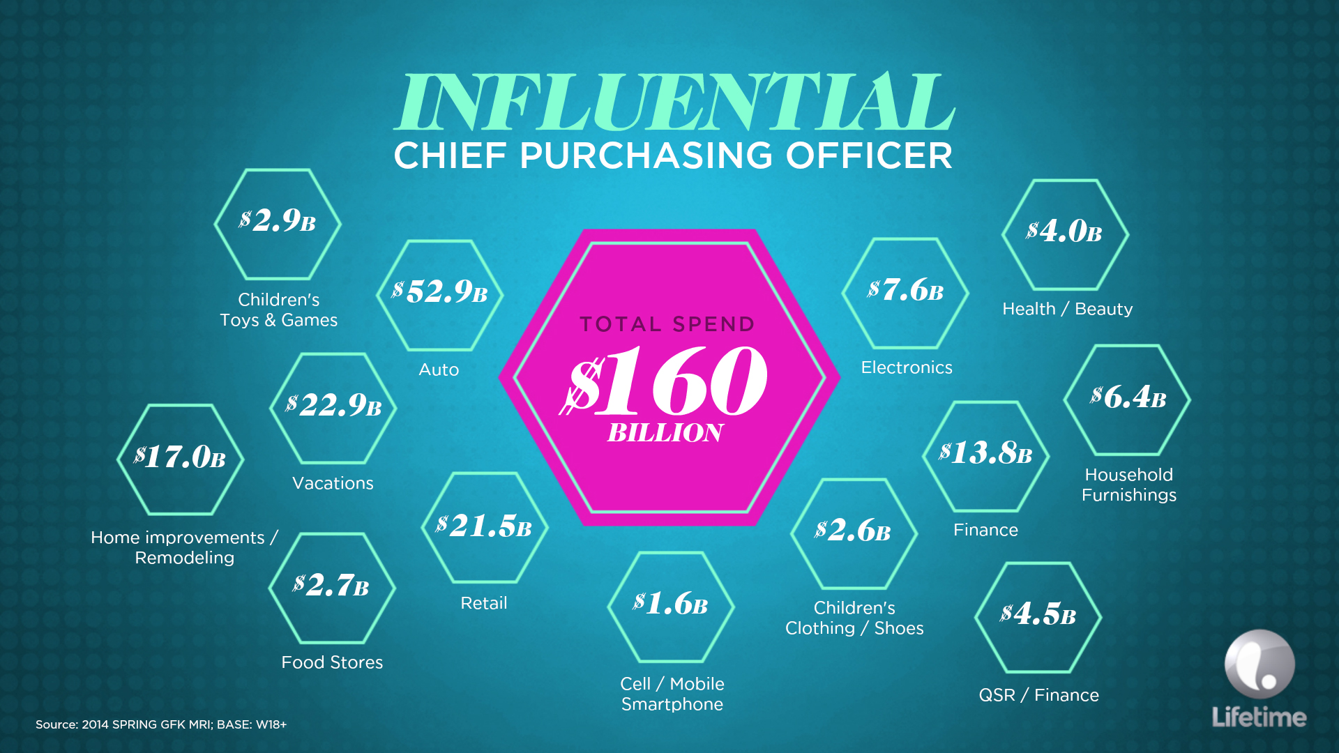
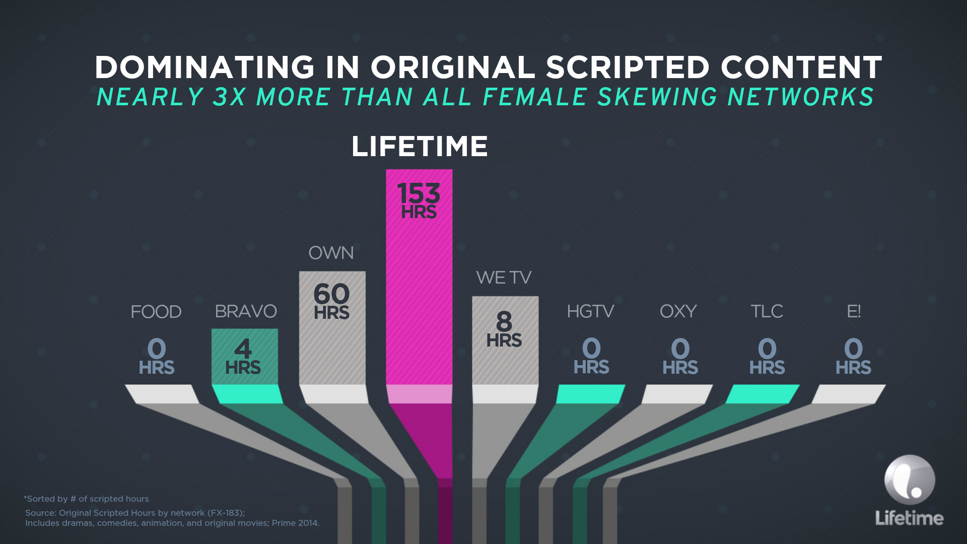
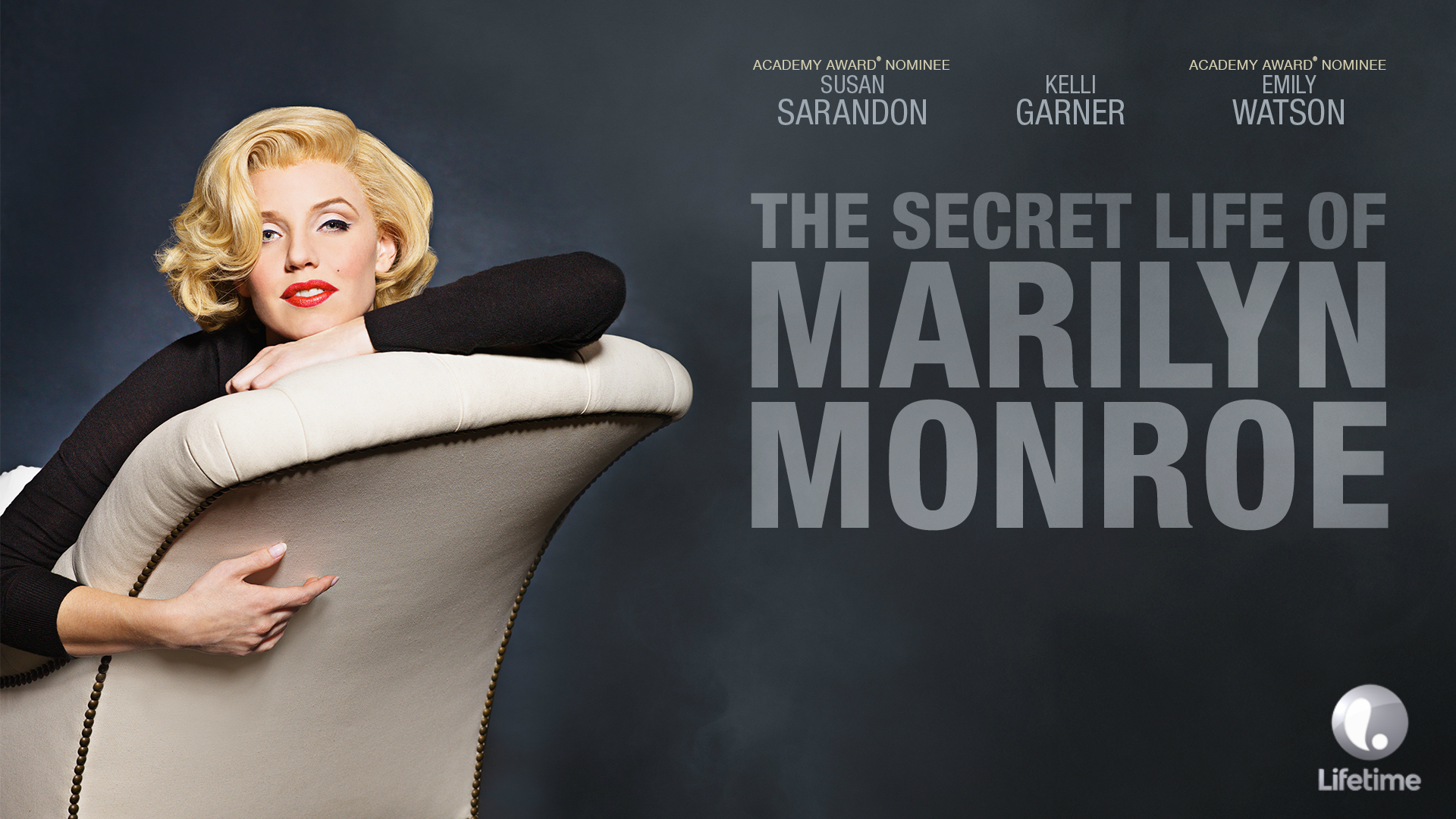
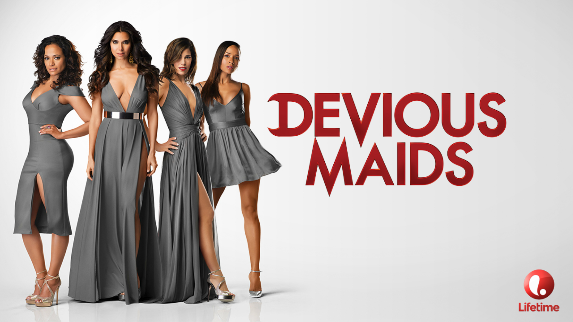
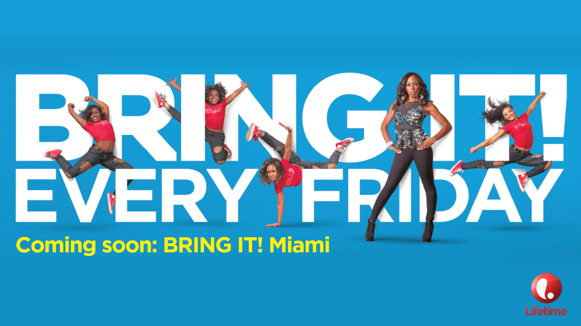
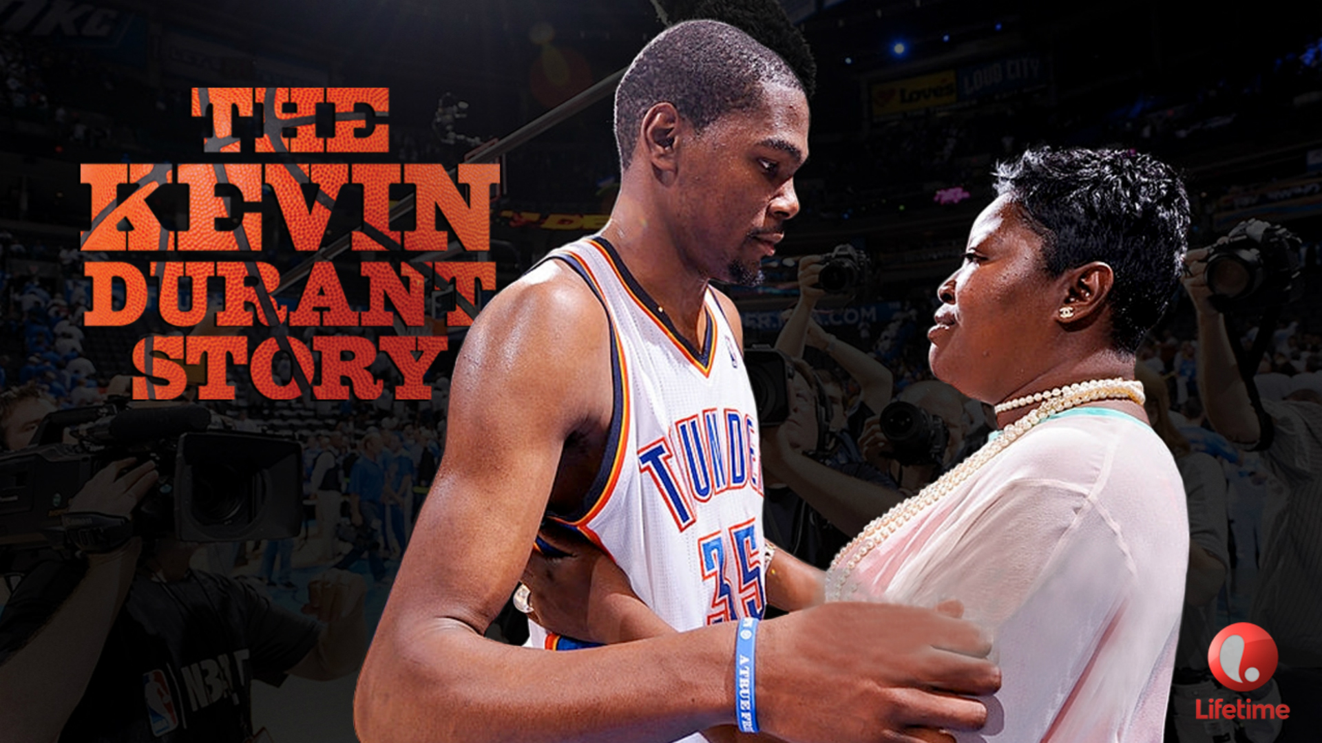
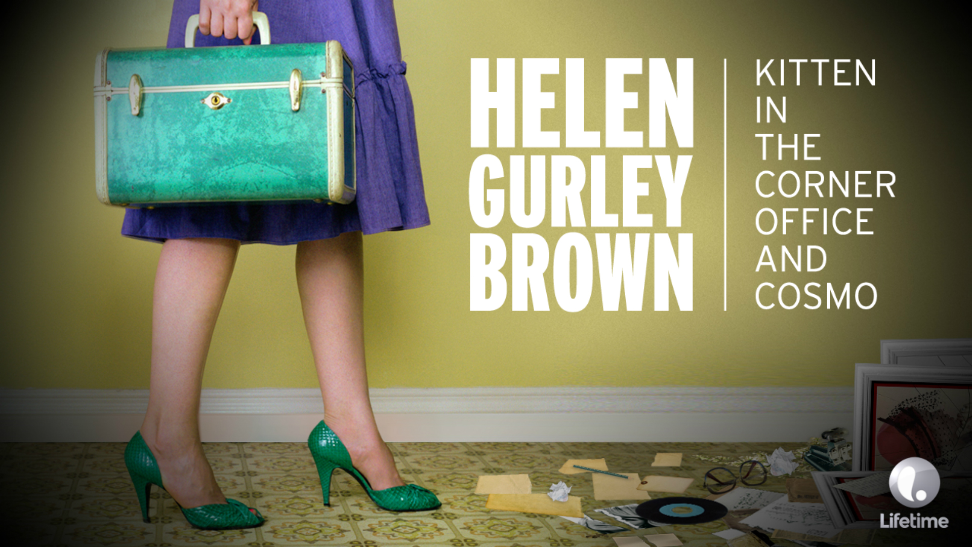
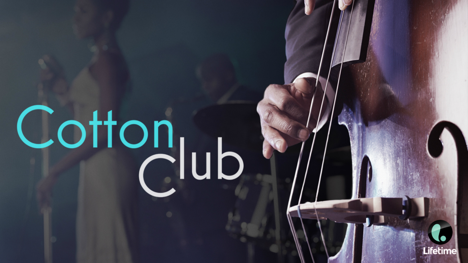
The Lifetime Upfront Presentation communicated a slew of advertising opportunities and arsenal of new & exciting programming through the lens of a refreshed brand. Loud, colorful palettes and patterns combined with sleek typography announced the arrival of the new Lifetime with thundering impact. Unexpected compositions and engaging imagery were used throughout the presentation to grab the viewers’ attention and disrupt the norm. Please click or swipe through the slides below:
BRAND SLIDES
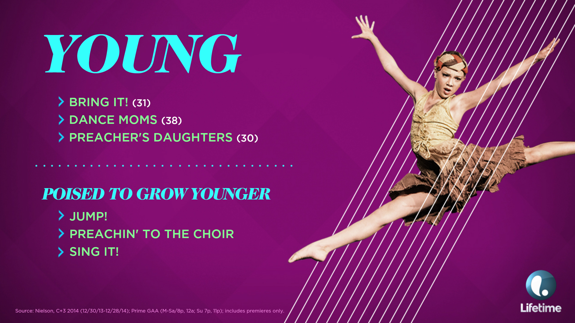
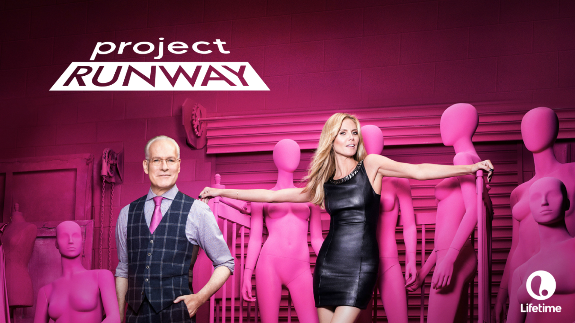
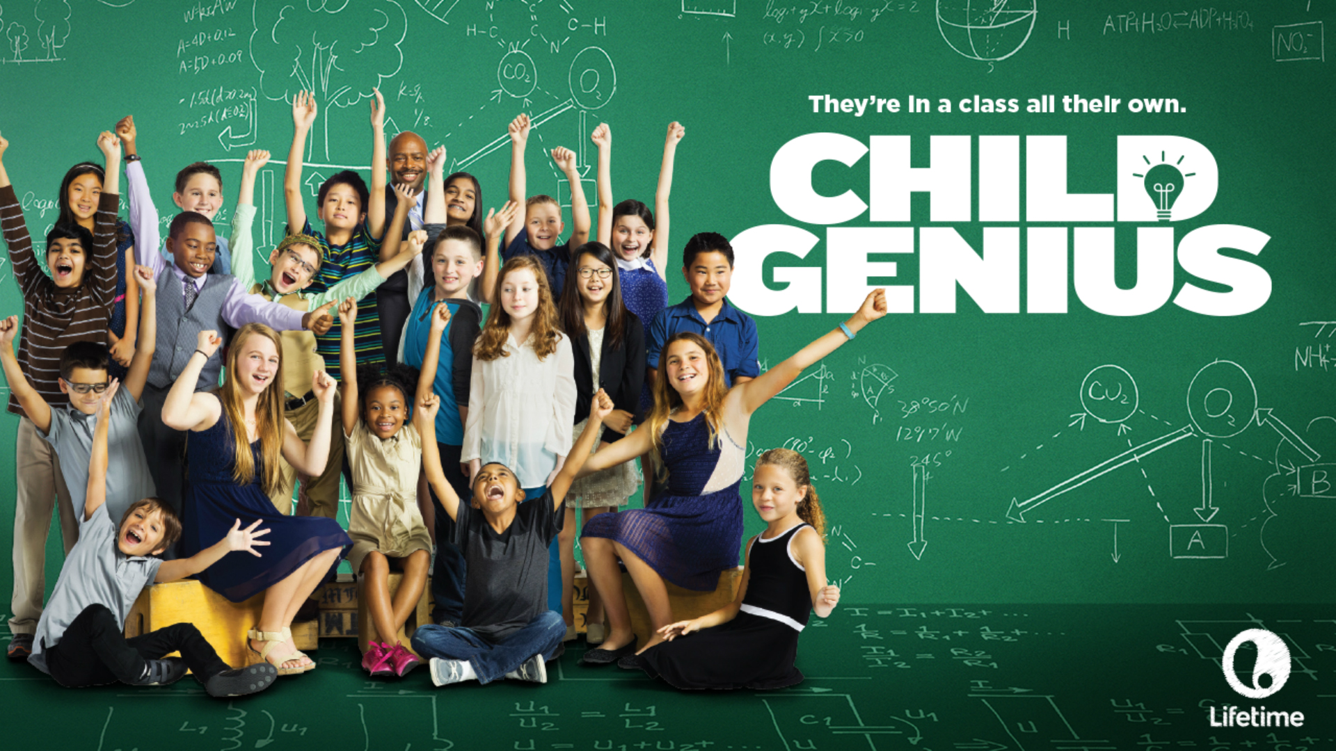
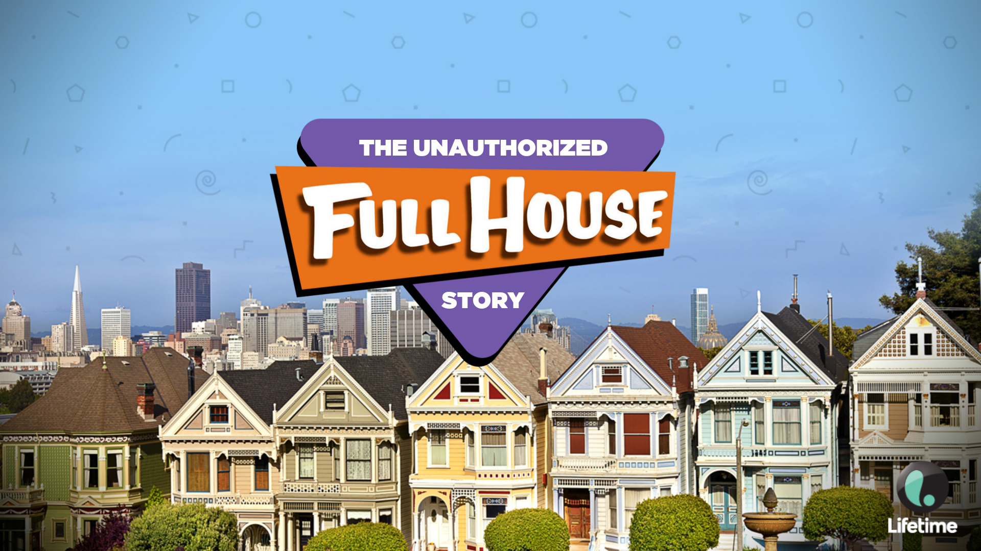
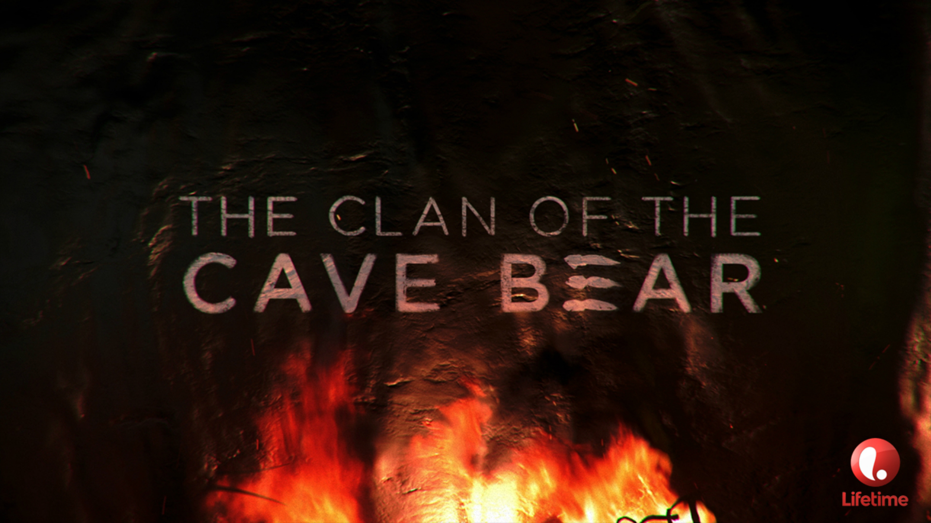
PROGRAM SLIDES
The Lifetime program slides were created with the same “at a glance” thinking as HISTORY, A&E and FYI. And again, we created many of these slides based on just a text description. By following the formula we developed, all materials felt like A+E Networks, while maintaining Lifetime’s unique brand identity. Please click or swipe through the slides below:
PRESENTATION EVOLUTION
A+E Networks and their sales teams were blown away with all of the presentations we created. They told us that we understand some of their brands better than they do! Because of this success, we have refreshed and/or developed new Upfront presentations for them every year since. Below is the 2017 A+E Networks Intro Animation, as well as some elements from the 2017 HISTORY Upfront to give you an idea of how we consistently reinvent and evolve the brands’ materials.
INTRO ANIMATION
BRAND SLIDES
We developed a new style for HISTORY’s Upfront in which desaturated imagery was integrated into one-color backgrounds, semi-transparent typography bled off the screen, and key talent and/or content was shown in full color – highlighting the key takeaway for each slide. Please click or swipe through the slides below:
PROGRAM SLIDES
ANIMATIONS
MY ROLE
I created the overarching theme and Intro Animations (storyboard and management of animation teams), created the overall look and feel of the HISTORY and A&E Presentations, and oversaw the Lifetime and FYI presentation development to ensure brand cohesion, developed numerous slide templates, led and managed the design teams as they created all materials, and I worked with the client and internal brand teams to collect, organize and catalog a vast amount of content and assets.
RESULTS:
HUGELY SUCCESSFUL UPFRONTS THAT GENERATED TONS OF AD SALES & PRESS. THIS LED TO OUR AGENCY WINNING THE UPFRONT PRESENTATIONS EVERY YEAR, AND TAKING ON MUCH MORE CAMPAIGN WORK FOR ALL FOUR BRANDS.
© 2018 Benjamin Delfin. All Rights Reserved.
