BRAVO SALES PRESENTATIONS
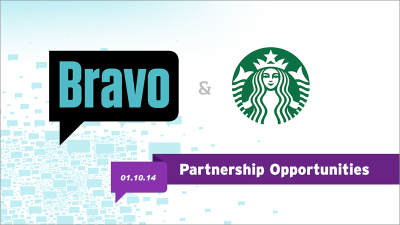
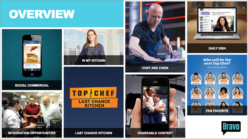
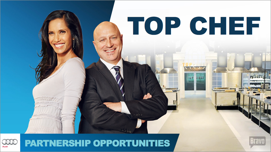
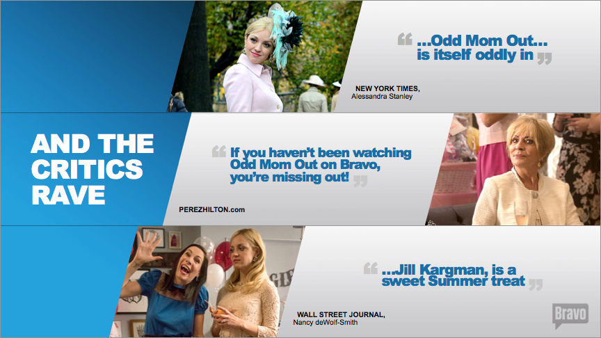
Bravo asked us to design a presentation that followed their yearly brand strategy, but had a unique look & feel catered towards ad sales. At that time, Bravo account executives were hitting the field with very dry, data-heavy presentations. They relied on long text descriptions to explain complex offerings, and a limited image bank of mostly silhouetted talent photography. We developed a powerful, modular presentation system that was flexible, easy to use and meshed perfectly with their other brand collateral. This project led to us becoming an important creative partner to Bravo, and we’ve helped them sell their offerings and evolve their marketing materials ever since.
DISCOVERY
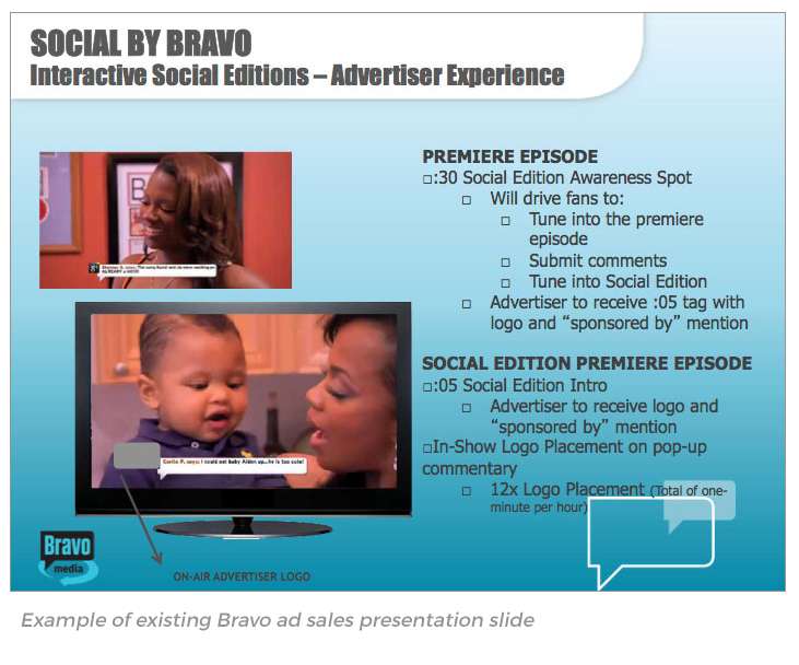
The project began with a discovery phase where we sifted through many of Bravo’s existing ad sales presentations, and spoke with their AE’s to identify which parts worked for them, and which parts they struggled with. We noticed that the presentations created by different AE’s lacked overall consistency – they varied greatly from show to show, and from presenter to presenter. Our solution was to create a unique presentation system, broken down into three categories – the Presentation Template, Show Packages and Offering Packages.
PRESENTATION TEMPLATE
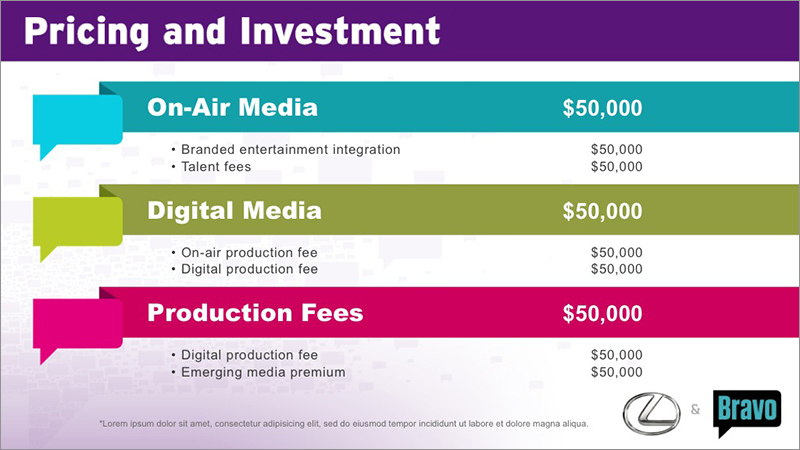
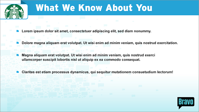
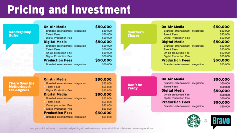
The Presentation Template is a series of editable slides we developed so that Bravo AEs could use them to create their sales decks. These client-specific slides are the framework of the sales presentation, and the other category slides are designed to integrate into this framework. The Template was built using Masters in PowerPoint, so it was extremely easy to customize on the fly while maintaining the overall look and feel. Client logos and program-specific artwork were also a breeze to incorporate using ‘click to add’ image boxes. It was completely plug-and-play in its design.
We also addressed another big issue for Bravo – the use of their proprietary fonts in sharable PPT files. Since Bravo’s brand uses a typeface that is not a ‘system font,’ they found that when they include it in PowerPoint files that are shared with clients, a font replacement would occur and throw everything out of whack. Our solution for this problem was to create static graphic headers using the Bravo typeface – and then pair it with a common system font for use in editable bodies of copy.
SHOW PACKAGES
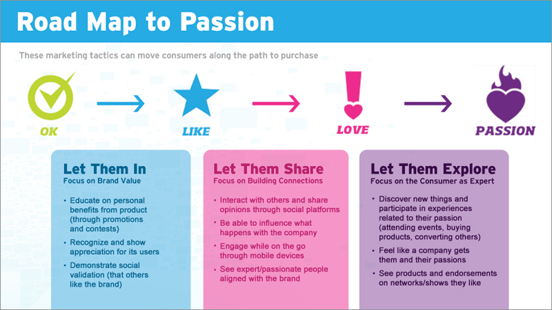
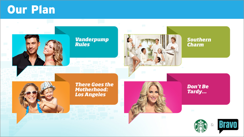
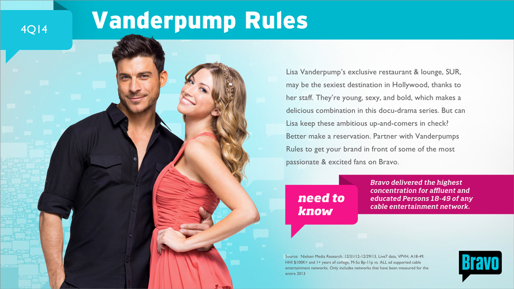
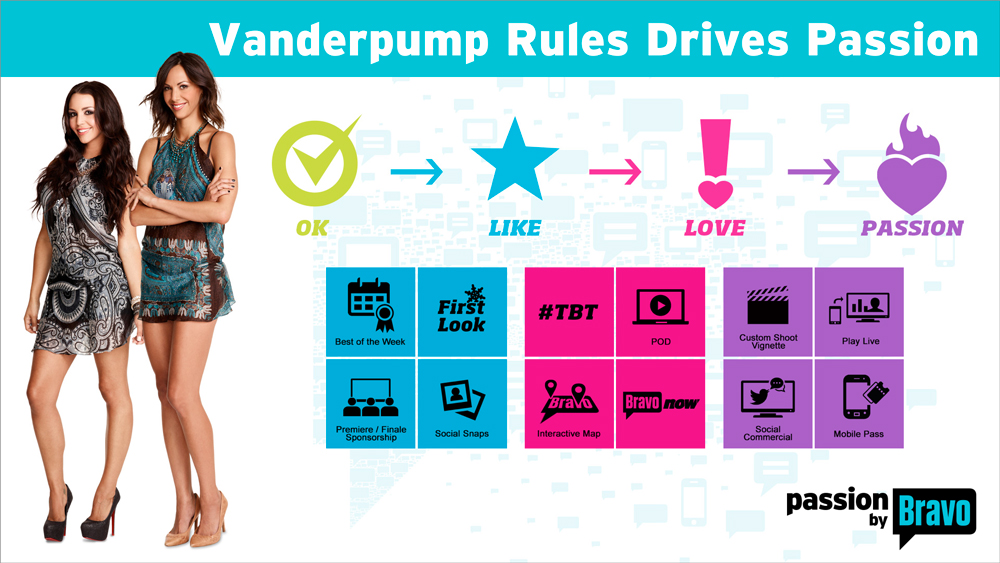
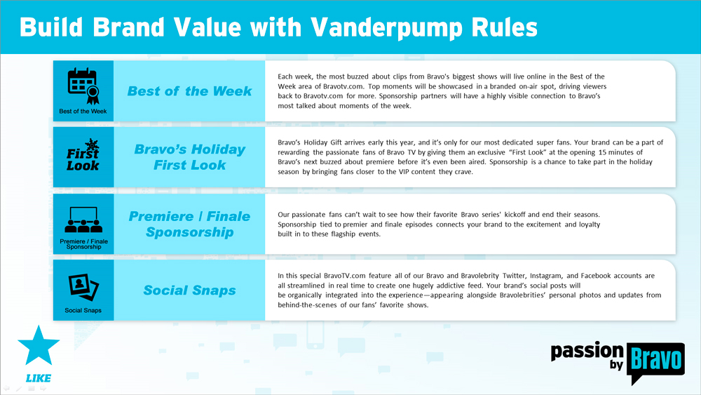
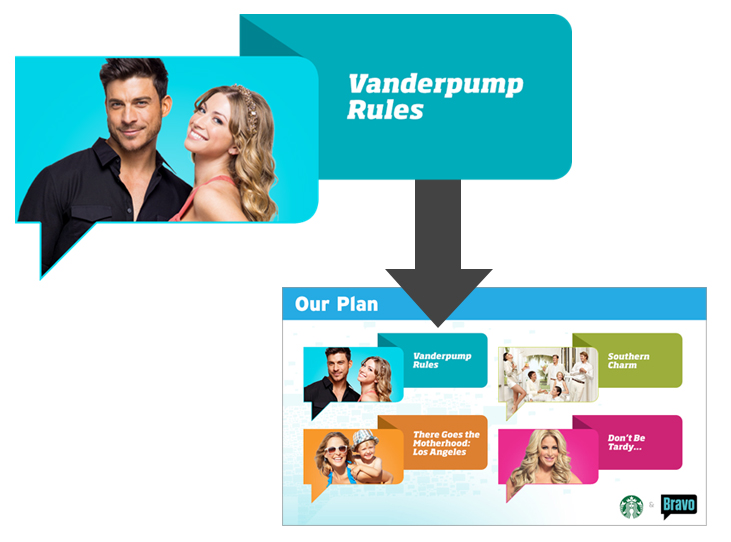
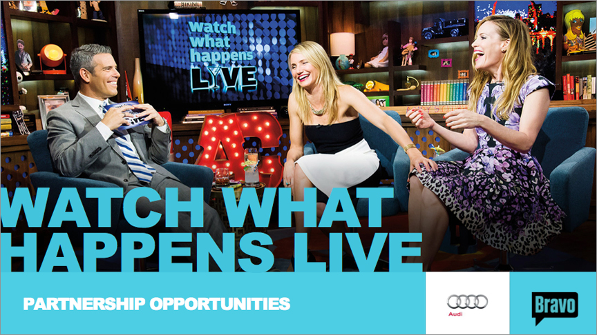
To populate the Presentation Template in the easiest way possible, we created ‘Show Packages’ for each show Bravo was promoting. The title slide included talent photography, a brief show description and air dates. We also helped develop interchangeable ‘tasty tidbits,’ which were graphic flags that delivered impressive industry-specific stats on either the network or the programming, to further promote the reach of the brand. We developed graphic icons for each advertising opportunity offered by the network (i.e.: First Look, #TBT, etc.), which acted as wayfinding identifiers throughout the presentation. Bravo would then curate the opportunities for each program, and categorize them using their own ranking system – from “OK” which was a more minimal buy, to “Passion” which was a more aggressive buy, resulting in more viewer immersion. We also created a color coding system for these levels to show their hierarchy. A quick reference slide, which was a deeper dive into each advertising opportunity, provided short descriptions and peaked the interests of advertisers and marketing clients. And we also created a thumbnail image system for each show to be used on the Plan Overview slide within the Template. All Show Packages were neatly organized within individual folders, so they were easily accessed and managed as changes developed.
OFFERING PACKAGES
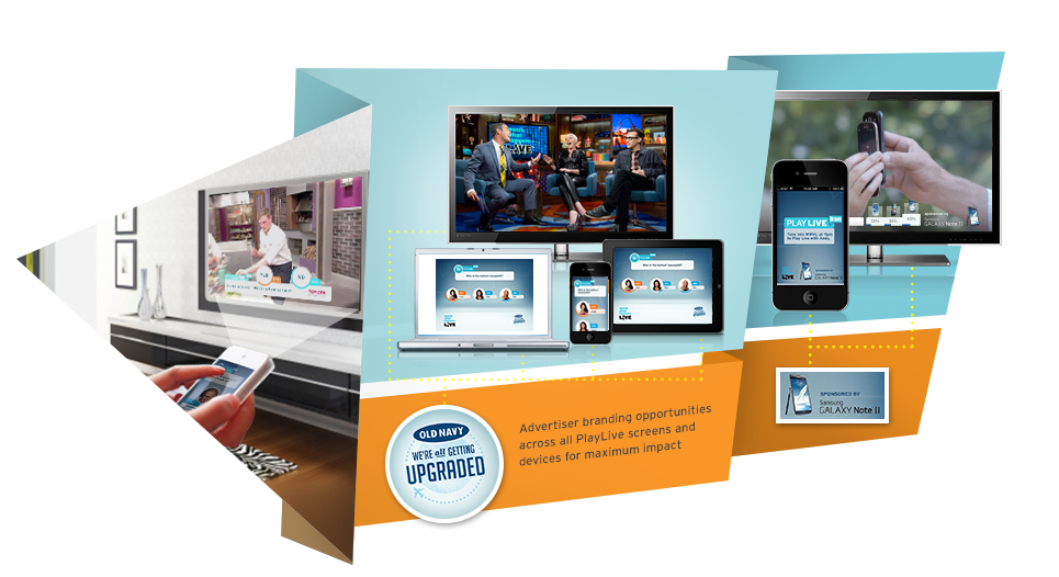
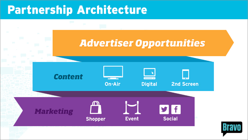
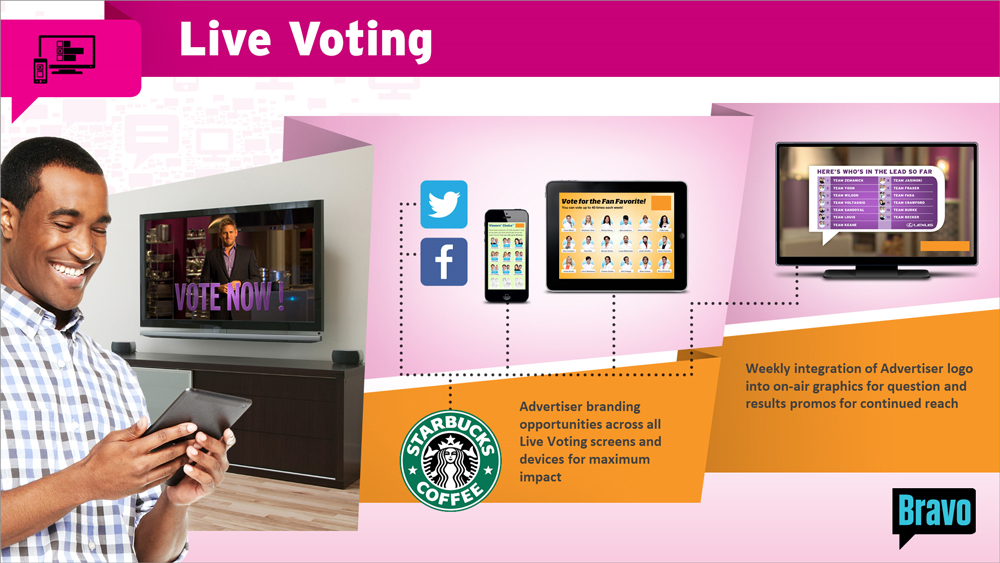
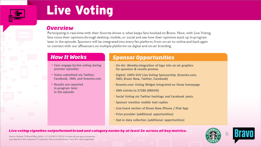
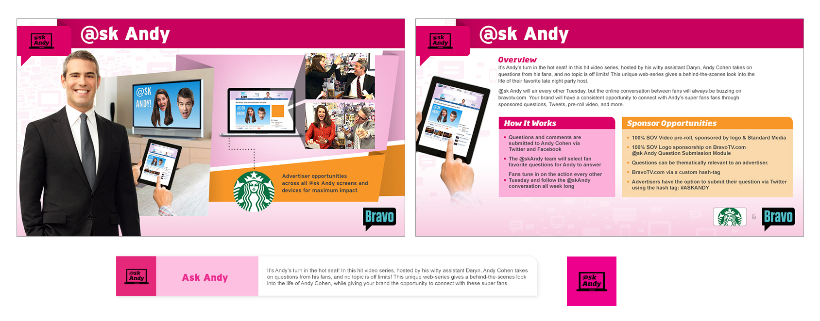
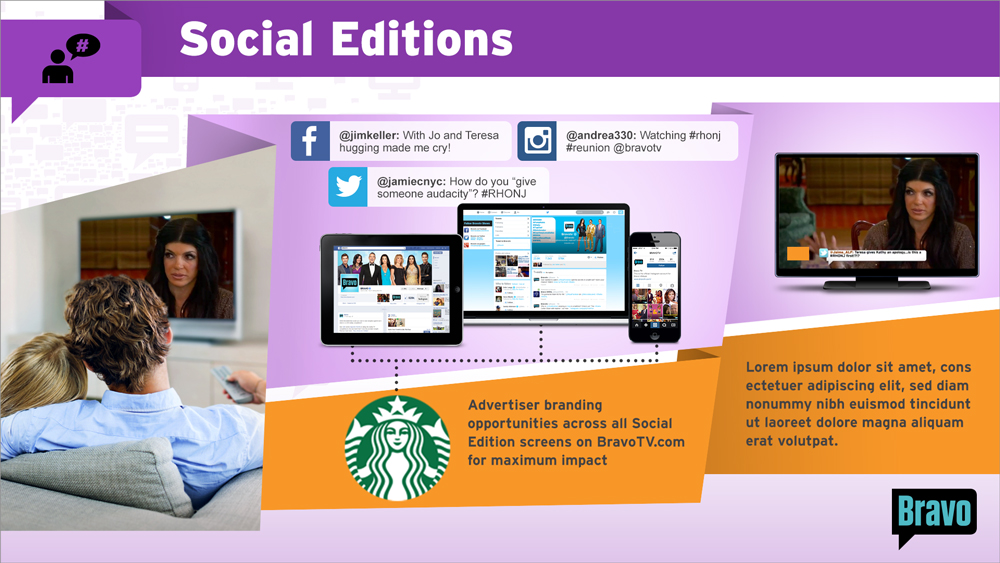
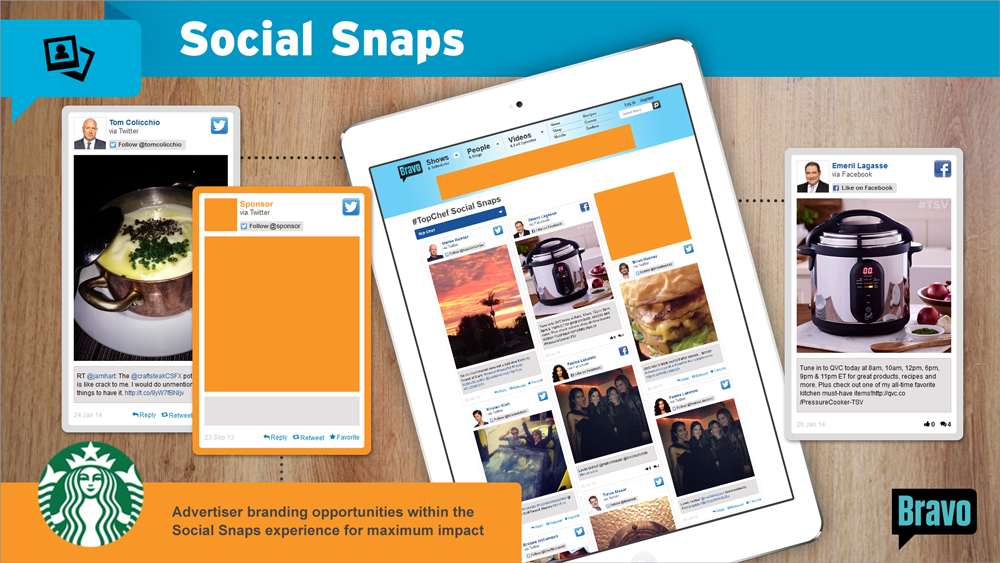
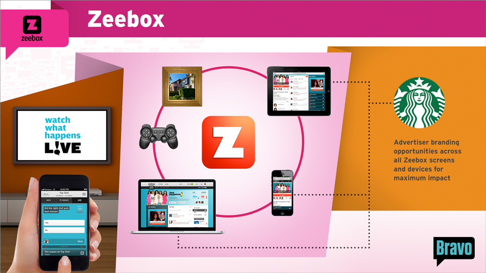
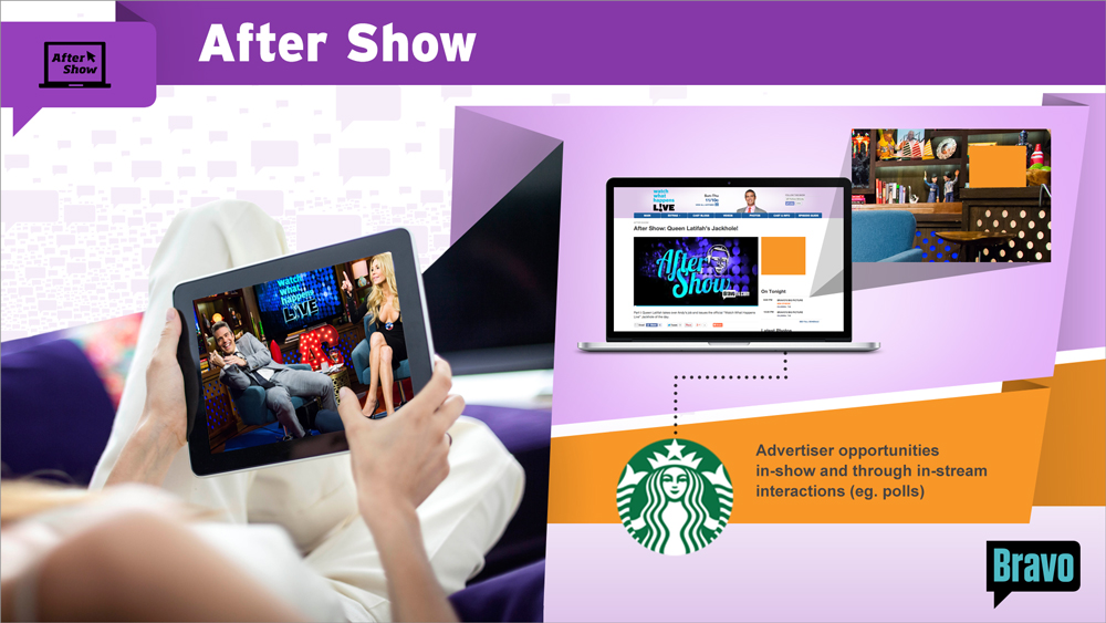
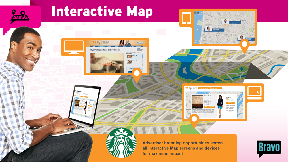
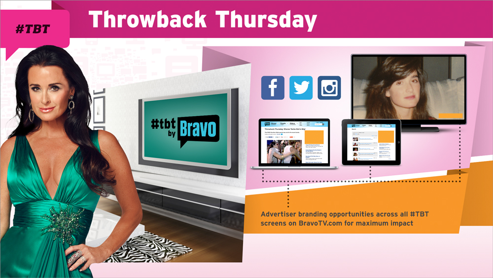
A more detailed view of the advertising opportunities came in the form of our customized Offering Packages. Rather than spelling out their complex offerings using long text descriptions (as they did in the past), we mapped out a clear and concise visual overview using illustrations, images, and easy to understand experience paths. On top was the viewer experience path, and on the bottom was the advertiser path. So at a glance, advertisers were able to visualize where they fit in by following the orange bar, and looking for orange opportunities within the viewer’s devices. We designated orange as the official advertiser color throughout the presentation so it is very easy to recognize which parts of the opportunities are customizable and also where on screen they would be visible. AE’s had the ability to cater these slides to the clients they were presenting to by including logos, customizing text, even changing out the screens being shown on the devices. This slide was accompanied by an informational slide that broke down the details of the opportunity. All of this content was pre-populated with the exception of the Sponsor Opportunities (shown in orange – carrying over the color coding) which the AE’s catered specifically to the needs of the client. We also included a spot at the bottom for network or programming stats to further promote the brand at a time where it would count the most.
The Offering Packages were bundled along with the rest of the opportunity elements. So when an AE wanted to include ‘Ask Andy’ in their presentation, all they had to do was access a folder and they had everything they needed at their fingertips.
36 Offering Packages were developed in total. We created the graphics large enough so that AE’s were also able to print these out for some of their meetings and treat them as one-sheets. They made great leave behinds.
PRESENTATION EVOLUTION
We always say that we can measure the success of a project and the happiness of our clients by the amount of their repeat business. I am happy to say that we continue developing ad sales presentations annually for Bravo, and every year we refresh their design systems and overall look and feel to keep them feeling new and exciting.
MY ROLE
I collaborated with the client during the discovery phase to formulate our creative strategy, co-created the overall look and feel of all presentations, oversaw the design and production teams as they created all materials, and worked with the client curating, organizing and cataloging a massive amount of content as the project progressed.
RESULTS:
A BREAKTHROUGH SUCCESS! BRAVO’S SALES TEAM WAS OVERJOYED WITH OUR WORK, WHICH HELPED THEM TO DRASTICALLY INCREASE AD SALES AND GREATLY REDUCE THEIR HEADACHES AND HESITATION TO CREATE NEW DECKS ON THEIR OWN. THIS ALSO LEAD TO A BIG REVENUE STREAM FOR US IN THESE ANNUAL PRESENTATIONS, SO IT WAS A WIN-WIN!
© 2018 Benjamin Delfin. All Rights Reserved.
