


PSNA BRAND IDENTITY SYSTEM
The Panasonic System Networks Company of America (PSNA) is a massive division that markets a huge range of products – and they had a big problem. With such a vast offering of products, how do you unify all of them under one brand, but still make each product group unique and recognizable? We rose to the challenge and developed a full brand identity system for PSNA, including a style guide and library of design templates.
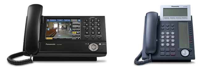
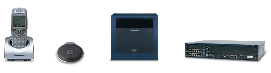
PRODUCT GROUP SIGNATURES
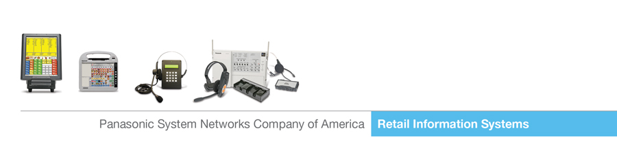
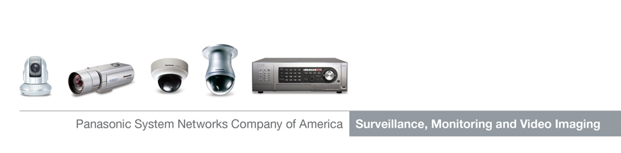

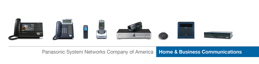
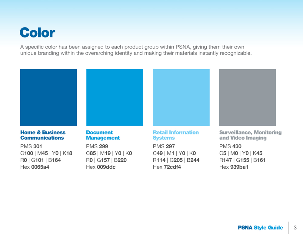
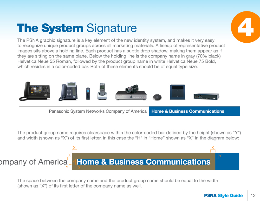
A unique color was assigned to each of PSNA’s four product groups, and these group signatures were developed. Each signature displayed a representative product lineup above a holding line, and its group name beneath it in a colored tab. The product images within each signature could be easily updated when a new model was released, or a new product was in focus.
BRAND IDENTITY SYSTEM

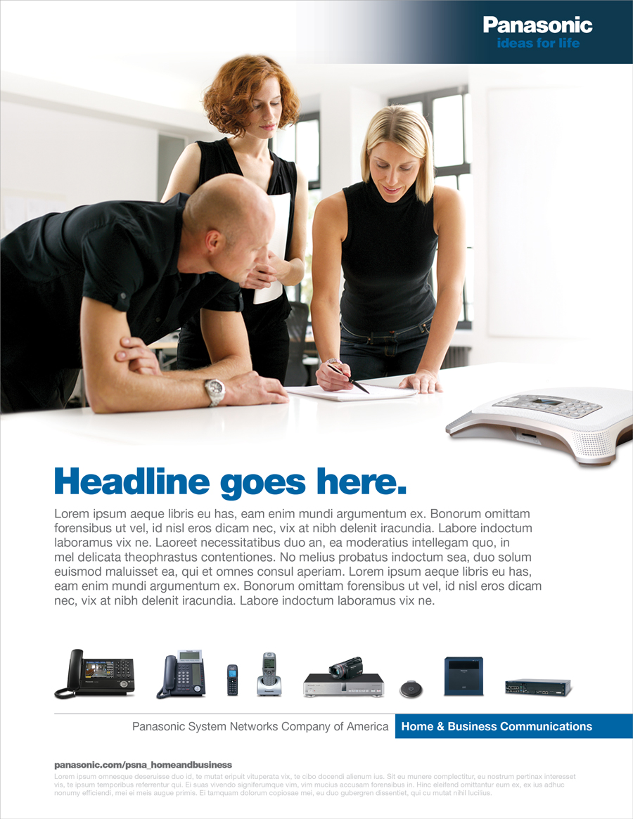
We created a complete brand identity system, as shown in the above page from the PSNA Style Guide. Customized treatments for the umbrella brand (Panasonic), a unique photography style, typography and overall design/layout rules were established. This all came together in an engaging and powerful system that made PSNA feel fresh and new, while still following the Panasonic house style and brand guidelines. Below are print ad templates following the PSNA style for each product group.


STYLE GUIDE
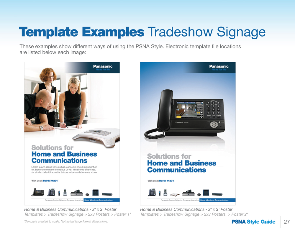
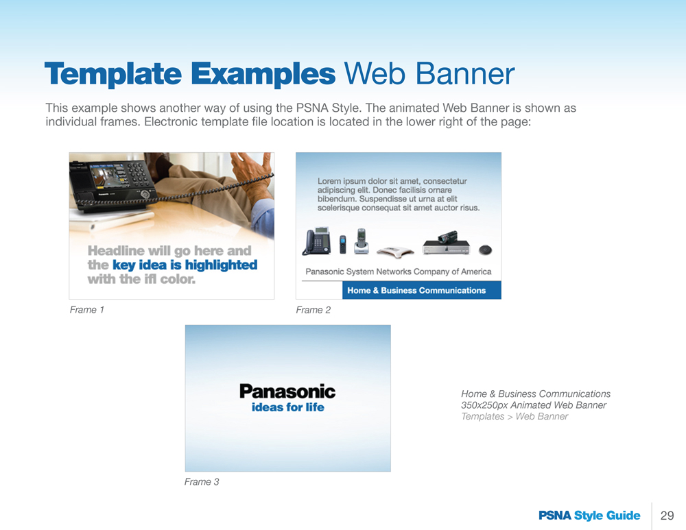
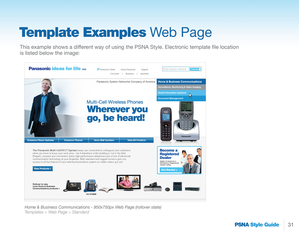
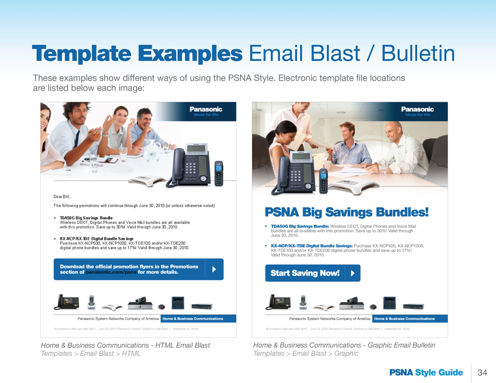
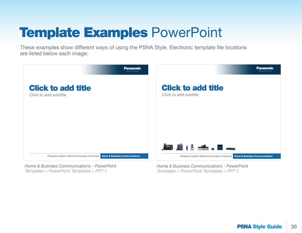
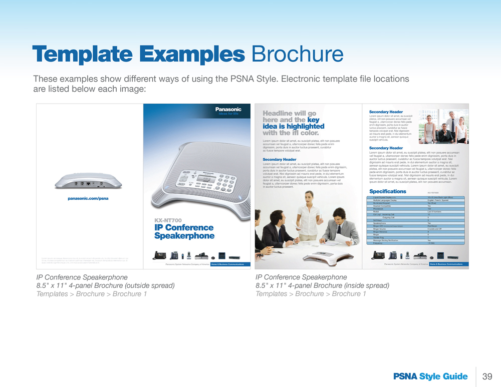
A Style Guide was created to ensure that all PSNA marketing materials developed by Panasonic staff members and/or third-party agencies would be cohesive and on-brand. We included detailed instructions and guidance on each element of the identity system – from color palette to clear space to creation of the unique photographic scenes which always show the product in the foreground, but still feel like one image. We also developed actual design templates for a wide range of PSNA marketing materials including print ads, sell sheets, digital ads and signage, websites, PPT presentations and more – which were available to download from within the Style Guide. Have a look through some of the Style Guide pages below, or browse the entire thing here:


IDENTITY SYSTEM ROLLOUT

Once the PSNA brand identity system was launched, Panasonic came back to us to develop real marketing materials using our new style. This print ad was created for Panaboard, their smart whiteboard product.

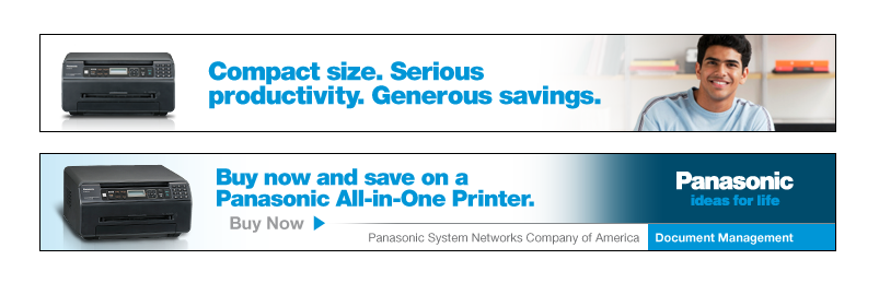
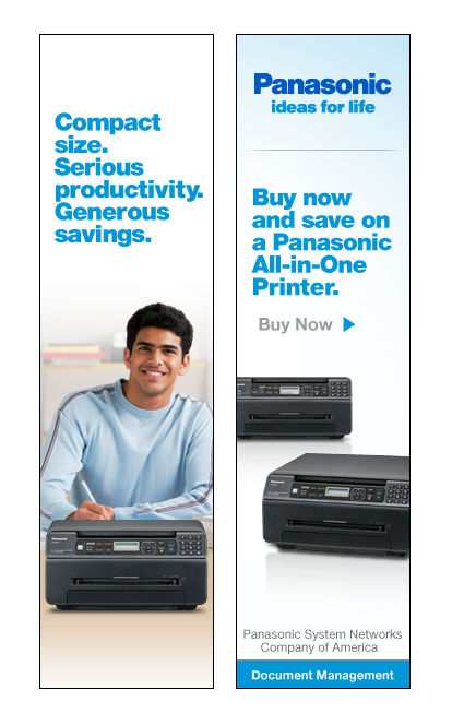
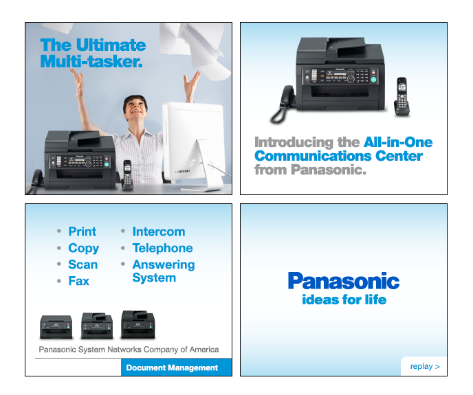
We also developed various digital ad campaigns for Panasonic utilizing the new PSNA brand identity. Here are two campaigns we created for Panasonic printers.

MY ROLE
I created the entire PSNA brand identity system – from concept & design to writing all of the rules and guidelines, developed the style guide and wrote all of its copy, oversaw the design team as they created all design templates, worked with the client on quality control and ensuring all opjectives were met across all product groups, and oversaw the development of all PSNA-related campaigns after the identity system was rolled out.
RESULTS:
A SUCCESSFUL BRAND IDENTITY SYSTEM WHICH GAINED PRAISE FROM PANASONIC’S INTERNAL & EXTERNAL CREATIVE AGENCIES FOR ITS EASE OF USE. THIS PROJECT WAS THE CATALYST FOR A HUGE AMOUNT OF BRANDING WORK WITH PANASONIC MOVING FORWARD, AND HELPED MAKE US THEIR GO-TO AGENCY FOR SUB-BRANDING.
© 2018 Benjamin Delfin. All Rights Reserved.